Article Text

Statistics from Altmetric.com
‘The Problem with…’ series covers controversial topics related to efforts to improve healthcare quality, including widely recommended but deceptively difficult strategies for improvement and pervasive problems that seem to resist solution.
Introduction
Many healthcare organisations now track a number of performance measures like infection and complication rates, waiting times, staff adherence to guidelines, etc. Our own organisation, The Capital Region of Denmark, provides healthcare for 1.7 million people and runs 6 hospitals and 11 mental health centres. Measures of clinical quality have been widely used in our region locally at hospitals and departments for many years. Recently, our region started to systematically define and track strategical key performance measures also at the top management level. Approximately 25 measures on a wide range of subjects from hospital infections to public transportation are being tracked by the top management and the Regional Council.
The measurement strategy for hospitals involves a bottom–up approach allowing each hospital and department to, if needed, define its own performance measures that feed into one or more of the overall measures. For example, bacteraemia is one of the overall measures, and some acute-care departments, who rarely see hospital-acquired bacteraemia, have started to work on reducing the use of bladder catheters in order to reduce the risk of bacteraemia from catheter-related urinary tract infections diagnosed after their patients have been transferred to other departments. To support their work, they have developed a handful of measures that track the use of catheters and staff compliance with standard procedures related to catheter use.
We welcome this development very much. The choice of relatively few overall measures combined with the bottom–up approach is a helpful strategy that focuses and aligns improvement work and stimulates the use of data at all levels of the organisation while leaving room for meaningful local adaptations of performance measures.
However, we do not at all welcome the widespread use of red, amber, green approaches to data analysis that is everywhere in our organisation.
By ‘red, amber, green’, we are referring to graphical data displays that use colour coding of individual data values based on whether this value is on the right (green) or wrong (red) side of a target value. Often amber or yellow is used to indicate data values that are somewhere between ‘right’ and ‘wrong’.
The problem with red, amber, green management is that at best is it useless, at worst it is harmful.
The problem with red, amber, green
Figure 1 was captured from the February 2015 report on regional performance measures. It shows the monthly count of a certain type of unwanted incident in mental healthcare. The horizontal line represents the target value of 10.5. That is, we do not want more than 10 incidents per month. Red bars show months above target. Green bars show months below target.
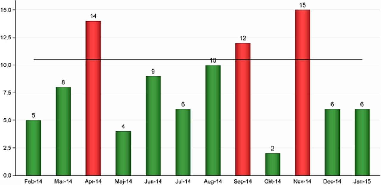
Monthly counts of unwanted events. Horizontal line: upper acceptance limit. Red bars: unacceptable values. Green bars: acceptable values.
The data display in figure 1 is formally correct (green is better than red). However, it fails to convey a very important message while at the same time suggesting a false message. Figure 1 does not tell to what degree chance may be responsible for the observed variation between monthly counts. On the contrary, it suggests that different, assignable causes are producing red and green results. In our experience, this often leads to actions being taken on red results, while green results are left alone or even celebrated. In its worst form, red, amber, green is used not even in conjunction with a time series but simply showing the last data point (week, month or quarter). However, if red and green results are all products of the same random process, this strategy is pointless—like tossing a coin and celebrating heads as achievements of a skilled coin tosser while castigating tails.
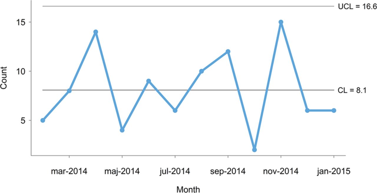
This is best illustrated using a control chart, which is a point-and-line graph with control limits that represent the limits of the random variation in data (figure 2). Walther A Shewhart, who invented the control chart in 1924, distinguished between chance cause and assignable cause variation.1 Today, these are often referred to as common cause and special cause variation. Common cause variation is present in all processes and is represented by data points between the control limits. Special cause variation is present in some processes when forces that are not inherent in the process act on parts of the process leaving some data points outside the control limits. In contrast to target lines, control limits are determined by the common cause variation that is actually present in data and are not subject to negotiation.

Control chart of data from figure 1 showing common cause variation (C-chart[3, formula 7.17]). CL, centre line (mean); UCL, upper control limit.
Mohammed et al2 provide a good introduction to the use of control charts in healthcare including formulas for calculating control limits of the most common control chart types (please be aware of the typo in the print version of the appendix table: the constant 2.26 should read 2.66). For an in-depth explanation of statistical quality control theory and practice, we recommend Montgomery's book.3 The control charts in this article (figures 2, 4 and 5) were produced with the software package qicharts for R.4
The control chart in figure 2 shows that the monthly number of incidents is consistent with common cause variation because all data points are between the control lines (the lower control line is negative and not shown). That is, there is no reason to believe that the 3 months that are above target represent special causes—they are just as typical of the current process as the rest of the months on the chart. It follows that an improvement strategy should target the process as a whole investigating the common causes that affect all the incidents rather than look for special causes. Furthermore, taking separate action on months above target with no special cause may be harmful for at least two reasons. First, actions that are applied in an on-off manner based on common cause variation will in fact increase the variation. This fact has been demonstrated by W Edwards Deming in his famous funnel experiments.5 ,6 Second, this strategy will inevitably create confusion and frustration within the organisation because it will not work and because the staff is repeatedly asked to change procedures and working habits without results getting any better. Deming demonstrated this in his equally famous red bead experiment.5 ,6
The distinction between common and special cause variation is crucial because the two types of variation require different improvement strategies. Unless the process of interest is stable (common cause variation) and is functioning at a satisfactory level, improvement is needed. However, improving a common cause process is very different from improving a special cause process. In general, special causes should be investigated and their root causes identified in order to stabilise the process before applying a common cause improvement strategy, which always addresses the stabilised process as a whole rather than individual data points. Sometimes special cause variation may actually represent ongoing improvement—intended or not. In those cases, a wait-and-see strategy may be justified. However, one should still seek to identify the root causes of the special cause variation in order to understand the drivers of improvement.
We believe that red, amber, green (mis)management is pointless, potentially harmful and responsible for much of the improvement fatigue that is present in our and many other healthcare organisations.
Case study: improving waiting times
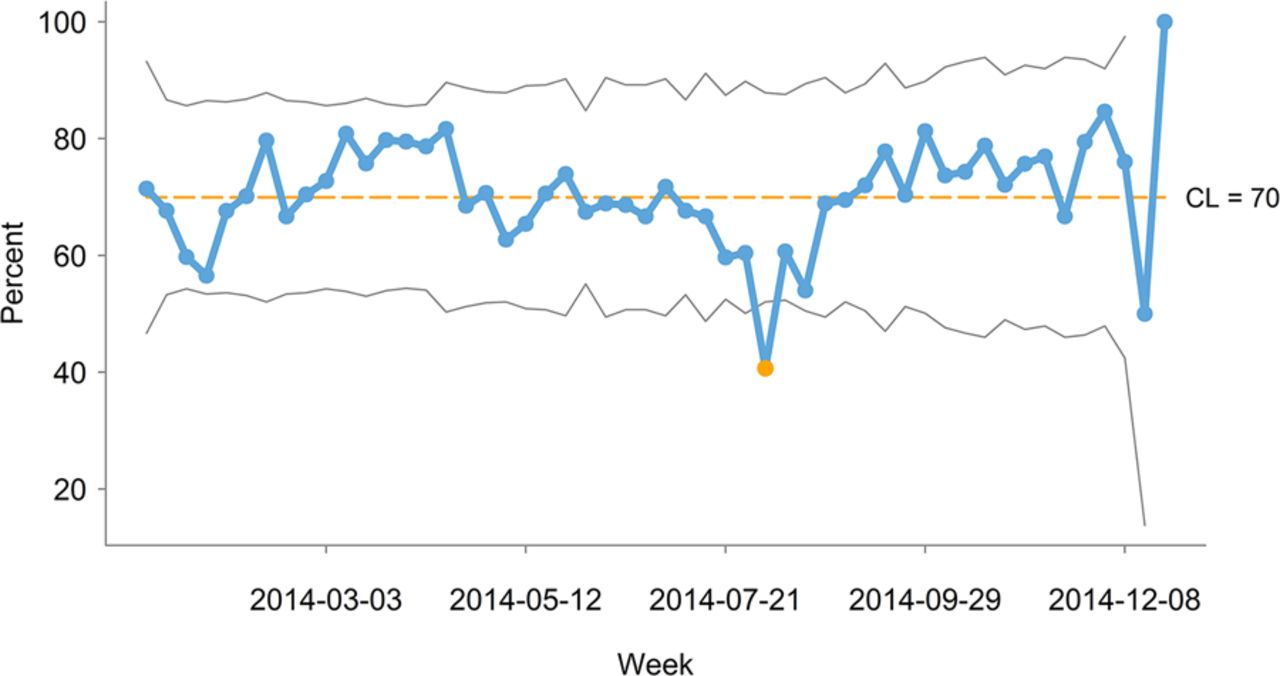
Figure 3 shows a small, anonymised part of a larger spreadsheet on waiting times for certain defined patient groups at a large university hospital. The measure of interest is the percentage of patients with acceptable waiting times according to standards given by the Danish National Board of Health. In this case, red, amber and green are applied to weekly data according to whether the percentage is above 75% (green), below 61% (red) or in-between (amber).

Red, amber, green display of weekly percentage of patients with acceptable waiting times. Red: below 61%. Amber: between 61% and 75%. Green: above 75%.
Following our suggestions from above, it would be useful to present these data in a control chart in order to help management distinguish between common and special cause variation rather than make weekly decisions based on random red, amber and green values.
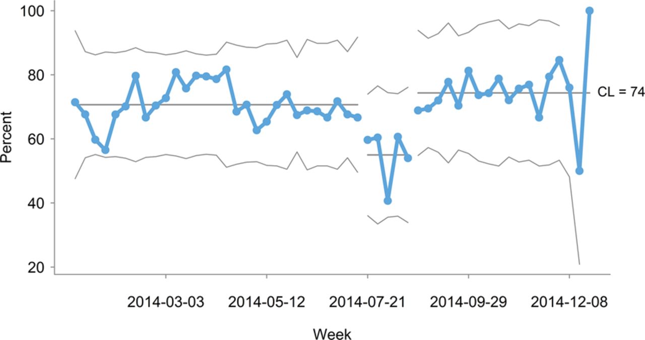
Figure 4 is a control chart of weekly waiting-time data covering a whole year. One data point is below the lower control limit indicating special cause variation. The special cause or causes seem located around the first week of August, which is in the official summer vacation period in Denmark. It is therefore reasonable to investigate if the vacation period could explain some or all of the special cause variation.

Control chart of percentage of patients with acceptable waiting times showing special cause variation (P-chart[3, formula 7.7]. CL, centre line.
Figure 5 shows the same data as figure 4 but now split into three parts: before, during and after the vacation period. Now all data points fall between the control limits. The interpretation is that the summer vacation period is different from the rest of the year. This leaves us with two distinctly different processes that should be improved separately using common cause strategies targeting the causes that result in patients not being treated timely during and outside vacation periods, respectively.

Control chart with data from figure 4 split into three time periods, each showing common cause variation (P-chart[3, formula 7.7]. CL, centre line.
This strategy is a long-term strategy that may seem more complex and less intuitive than the red, amber, green strategy. However, continuing to follow the red, amber, green strategy, we should expect to see no improvement while still creating confusion and improvement fatigue in the organisation. Also, if the special cause variation caused by the vacation period was misinterpreted as common cause (part of the usual process), then actions might be taken that in fact have a negative effect on the usual process.
Discussion
It strikes us as curious that harmful red, amber, green displays are so popular. When talking to managers, we often get responses like this: we appreciate control charts for specialist purposes, but they are too complicated for us, and all we really need to know is how our measures compare with our targets so we can take action when targets are not met.
This position is interesting for two reasons. First, control charts are considered too complex to be used by healthcare managers, when really they were developed and successfully used to help unschooled assembly line workers control production processes in the 1920s. Second, taking separate action on individual data points based solely on whether they are on the right or wrong side of a target is, as we have argued, pointless and potentially harmful.
We fully recognise the need for simple displays of data but we dispute the perceived complexity of control charts and the simplicity of red, amber, green displays. It is no more complicated to tell special from common cause variation than it is to tell red from amber and green. Still, the explanatory and diagnostic power of control charts exceed that of red, amber, green displays, which only tell us whether or not a process complies with a standard, and encourage poor decision-making. Control charts provide a sound basis for action by distinguishing common and special cause variation.
We urge managers to start using control charts to help distinguish between common and special cause variation in healthcare data before deciding what actions to take on data that do not meet their target.
To the point
Red, amber, green displays are popular with healthcare managers.
Red, amber, green displays are intended to help managers make quick data-driven decisions according to whether a measure meets its target or not.
Red, amber, green is a waste of time and resources and potentially harmful because it hides important information while conveying false messages.
Control charts are simple diagnostic tools that help managers make sound data-driven decisions.
Footnotes
Contributors JA and A-MBH developed the idea, and wrote the article together. JA programmed the figures.
Competing interests None declared.
Provenance and peer review Not commissioned; externally peer reviewed.