Article Text

Statistics from Altmetric.com
Key messages
Better process-based performance measures do not always correlate with better outcomes. For instance, hospitals that reduce door-to-balloon (D2B) time do not necessarily reduce 30-day mortality for patients with acute myocardial infarction (MI) treated with primary percutaneous coronary intervention.
This disconnect may represent an ‘ecological fallacy’. For individual patients, a shorter D2B reduces the risk of death. But, hospitals that have reduced their D2B also tend to treat complex patients with a higher risk of death, hence the apparent failure to translate improved processes into better outcomes.
A further problem relates to the denominators of eligible patients for a given process measure. Hospitals may generate different denominators for the relevant patient population if more complex patients are included, particularly in hospitals excluding more patients. This may explain the worse performance on process measures for acute MI patients in hospitals excluding more patients, rather than reduced quality of care.
Variations in case-mix between hospitals may affect interpretation of process-based quality measures, not just patient outcomes.
Efforts to improve quality of care in hospitals often start by comparing clinical processes between hospitals. However, earlier studies have suggested that better performance in process measures believed to be clinically meaningful may not always be linked to improved patient outcomes. At times, this unexpected finding has led to enormous confusion between quality experts and clinicians. In this issue, Bruckel et al1 use data on patients with acute myocardial infarction to tackle a potentially key aspect of this paradox by focusing on the ‘denominator problem’—the observation that large numbers of patient exclusions from many process measures may erode the ability to judge hospitals on the quality of care delivered.
Some allowance for exclusions is widely seen as necessary to ensure enough homogeneity in patients to allow for meaningful comparisons between hospitals. However, the use of exclusions may also raise concerns for process measures. For example, a large number of exclusions may prevent a comprehensive understanding of quality of care in important patient subgroups not captured by the measure. In addition, a novel and less obvious finding by Bruckel et al was that higher rates of exclusions generally correlated with worse performance for the process measures, suggesting that hospitals with large exclusions may have important gaps in quality. Taken together, the authors recommend public reporting of the number and reasons for exclusions as a means to better facilitate comparisons across hospitals.
We largely agree. These findings may explain the ‘missing link’ between why hospital performance in process measures is not always correlated with patient outcomes by postulating that hospitals with large numbers of exclusions are worse performers possibly attempting to ‘game’ the system. However, there is another key factor that may need to be considered as well and could lead to an opposite conclusion: the ecological fallacy. Several examples have been described, both outside and inside healthcare, on how the wrong conclusion could be drawn by assuming that the relationship observed at the hospital (ie, group) level would be the same at the individual level. Indeed, it may be that hospitals with larger exclusions are providing better care.
The ecological fallacy
The ecological fallacy refers to an erroneous inference about individuals on the basis of findings for the group to which those individuals belong.2 The term was first coined by Selvin in 1958, but earlier papers had already described the phenomenon with the earliest example by Émile Durkheim in 1897, who found that suicide rates in 19th-century Europe were higher in provinces that were heavily Protestant and concluded that stronger social control among Catholics resulted in lower suicide rates.3 However, as pointed out by Morgenstern, none of the regions were entirely Protestant or Catholic, so it may in fact have been the Catholics living in a predominantly Protestant area who were committing suicide.4 It seems quite plausible that members from a minority may have been more likely to commit suicide. So Morgenstern pointed to the possibility of the ecological fallacy, but others have questioned the presence of the ecological fallacy in Durkheim's work.5
Another compelling example was described in 1950 by Robinson.6 Using data from 48 US states, he showed that states with a higher proportion of immigrants also had higher literacy rates (correlation of 0.53). However, at the individual level, the correlation was inverted with immigrants being less literate than native citizens (correlation of −0.11). So the aggregated state-level correlation gave the incorrect inference of the correlation for the individuals in those states. It was caused by the fact that immigrants tended to settle in states where the native population was relatively more literate, thereby reversing the association.
Similarly, a New England Journal of Medicine paper reported a strong (r=0.79) correlation between countries' annual per capita chocolate consumption and the number of Nobel laureates per 10 million persons.7 Perhaps to no surprise, Switzerland was the top performer in both chocolate consumption and Nobel laureates. Interpreting the slope of the fitted regression line, it was estimated that about 0.4 kg of chocolate per capita per year was needed to increase the number of Nobel laureates in a given country by 1, which would amount to 125 million kg per year for the USA. However, before accepting that this would be a causal relationship that also exists at the individual level and grossly stimulating chocolate consumption, we have to consider whether the aggregate consumption is in fact a good predictor of the individual chocolate consumption by the Nobel laureates (besides possible confounders such as differences in socio-economic status between countries).8 Based on these (aggregate) data, we cannot exclude the possibility that the ecological fallacy is operating and that within each country academics in fact have the lowest chocolate consumption, thus an inverse association compared with that observed on the aggregate country level.
Figure 1 illustrates how the ecological fallacy works in these examples, with the hypothetical data points showing the negative association within each country or state, and the fitted line illustrating how this might give a strong positive association across countries or states when only considering the average (aggregate) exposure and ignoring the (individual) distribution.
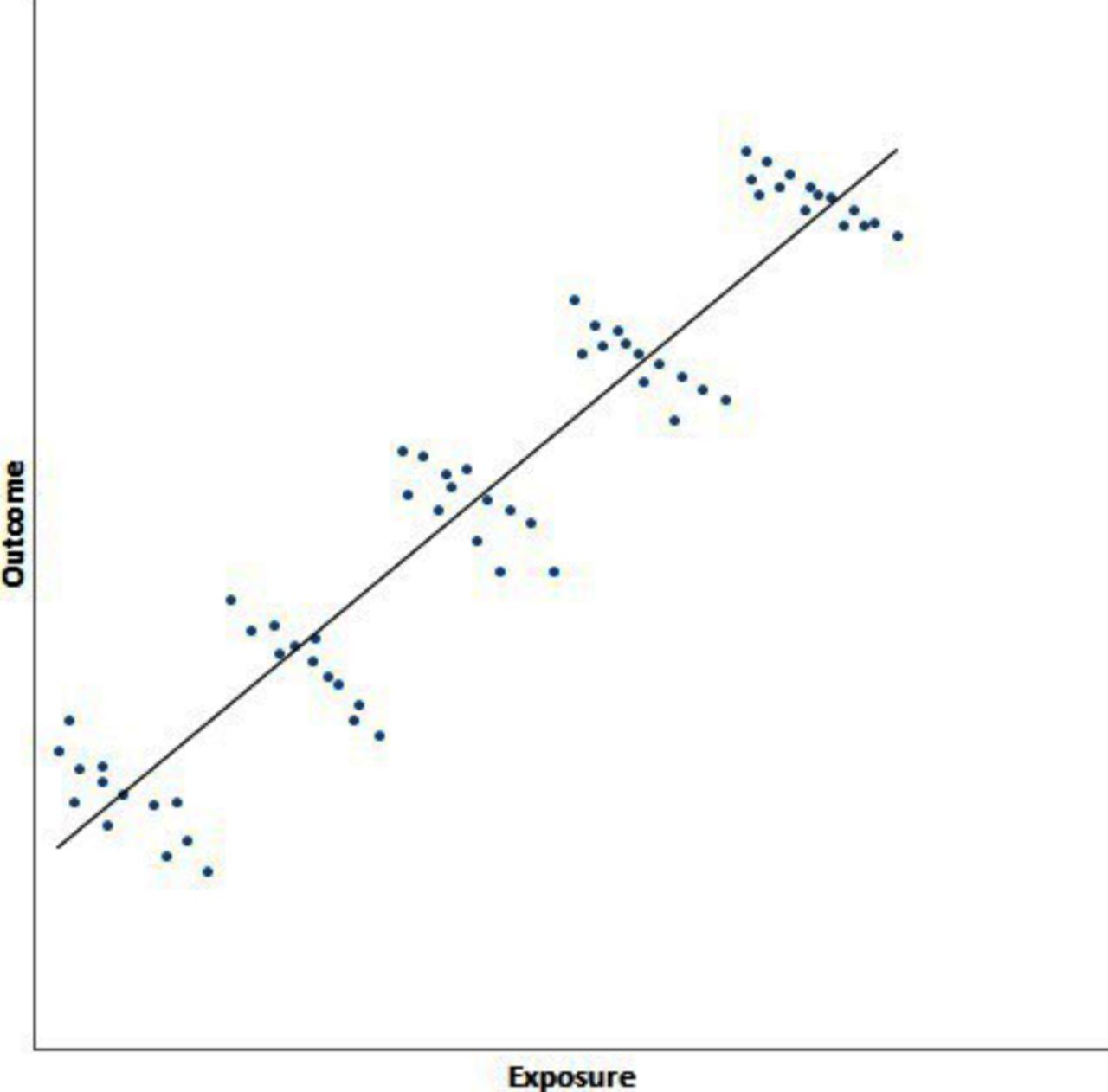
Example of ecological fallacy with hypothetical data. The graph shows the relationship between a hypothetical outcome and exposure of interest in five countries (each cluster of data points corresponds to a different country). Within each country, higher exposure is associated with worse outcomes, hence the decrease from left to right within each cluster. However, using group-level data, the opposite picture emerges (represented by the fitted black line). Countries with greater average exposure also have better average outcomes. The ecological fallacy in this example is thus quite striking as the group-level data (country averages) suggest that more exposure produces better outcomes, whereas within each country, patients with greater exposure tend to have worse outcomes.
Relevance of ecological fallacy for quality improvement
How is the ecological fallacy relevant for quality improvement? As mentioned above, we often hope to learn from variation between outcomes of hospitals at the aggregate level in relation to differences at the individual level in patients and clinical processes. Thus, it is important to realise that outcomes and processes do not necessarily have to occur in the same individual patients, given what we know about the ecological fallacy. Among the reasons for different relationships at different levels of analysis are loss of information within higher levels of analysis (aggregation bias), different confounders at different levels of analysis and effect modification.9 For example, a hospital may have a higher mortality rate in patients with ST-segment-elevated myocardial infarction (STEMI) undergoing percutaneous coronary intervention (PCI) compared with other hospitals as well as a higher door-to-balloon (D2B) time. This does not necessarily mean that the patients dying were those with higher D2B times. Such conclusion can only be drawn when analysing the individual patient-level data, as illustrated recently.
D2B time is known to predict survival in patients with STEMI undergoing primary PCI10–12 and is considered to be a causal relationship based on animal13 and observational studies.14 As a result, guidelines in many countries, for example, the USA,15 require a D2B <90 min for all patients undergoing primary PCI to ensure good quality of care. However, the cardiovascular community was recently alarmed by reports that contemporary decreases in annual D2B times have not been associated with lower mortality over time in patients undergoing primary PCI,16 ,17 which raised uncertainty whether quality initiatives were directed at the right processes. Nallamothu et al18 have cautioned against inferring from these (aggregate level) results that a decrease in D2B time would not improve outcomes for individual patients, which would be another example of the ecological fallacy. They distinguished the relationship between D2B time and mortality on a patient level from the (aggregate-level) secular trends over time and showed a consistent relationship between D2B time and mortality in all years but that the relationship had become steeper over time. This resulted in annual mortality—on an aggregate level—to remain the same or even increase over time. Explanations for the secular trends towards higher mortality in the population undergoing primary PCI include the expanded use of primary PCI over time in more complex patients with STEMI that would not have reached the cardiac catheterisation laboratory in earlier years.
Exclusions and the denominator problem: missing link or ecological fallacy?
In the present issue, Bruckel et al1 add to this debate by focusing on the denominator population used to calculate six different National Hospital Quality Measures. This includes the percentage of patients with a D2B time <90 min until PCI—the metric described above. Indeed, due to the large number of exclusions in this group, Bruckel et al focus much of their attention on this process measure in their paper.
To ensure a homogeneous patient population and accurate comparison of these quality measures between hospitals, specific reasons for exclusions are allowed. When the ECG shows that the patient has no STEMI, for example, D2B time makes no clinical sense as a metric. Other exclusions are for practical purposes or are related to attribution (eg, when the patient is received as a transfer and delays may be due to the referring hospital). Using data from 172 University HealthSystem Consortium hospitals between 2008 and 2013, they show that such exclusions vary across the six quality measures from 18% for ensuring aspirin prescription at discharge to 90% for a D2B time <90 min. Patients most likely to be excluded were the more complex, high-risk patients: older, more likely to have Medicare, more documented comorbidities, more likely to be transfers, higher admission severity of illness and mortality scores, and higher in-hospital mortality rate (10% vs 1.6%). This is consistent with results previously reported by McCabe et al19 for patients in three hospitals, who showed the exclusion percentage for patients having a PCI within 90 min to increase considerably over time and excluded patients having longer D2B times and fewer PCIs within 90 min. In addition, Bruckel et al1 showed that the percentage of exclusions varied considerably across hospitals for all measures. This has important implications in terms of how representative those measures are for the quality of care provided to the total population of patients treated in that specific hospital. In addition, when exclusion rates are very high, the resulting sample size for calculation of the quality measures becomes very small and results in imprecise estimates. Bruckel et al recommend that hospitals publish the percentage of exclusions as well as the demographics of the initial measurement population and the final denominator population to enable better interpretation of these quality measures.
Interestingly, Bruckel et al showed the hospital exclusion rates to be negatively correlated with performance on all six quality measures, with the strongest correlation (r=−0.69) observed for the percentage of patients having a PCI within 90 min (other correlations in the range between −0.33 and −0.47). So what does it mean if a hospital has high exclusion rates, and how should we interpret the on average worse performance scores? Are these exclusion rates merely the missing link for a valid interpretation of the relationship between the clinical process and outcome or is this another example of the ecological fallacy?
Under the hypothesis of the ecological fallacy, we have to be careful not to conclude that the on average worse performance scores, for example, lower percentages of patients having a PCI within 90 min, hold true for all patients treated in that hospital. It may well be that there are innovative hospitals caring for sicker patients, which will thus have higher exclusion rates but possibly also expand the use of PCI in these patients (who would have been excluded by other hospitals). For instance, hospitals that are regional centres for STEMI will have high rates of hospital-to-hospital transfer for PCI and thus high rates of exclusions. However, these hospitals may also have higher rates of direct admission from local emergency medical service networks that will bring potentially more complex patients to them for PCI. This is consistent with the results from Bruckel et al,1 where more complex patients were far more likely to be excluded in the quality measures but some of these patients were still included at some hospitals. If these more complex patients cluster in specific hospitals, this might explain the worse performance score in hospitals with high exclusion rates. Given that data from several years (2008–2013) were included, a similar expanded use of primary PCI in more complex patients with STEMI as suggested by Nallamothu et al18 might also be present in these data. Clustering of patients is particularly likely for STEMI and D2B time as the development of national systems of care has tended to regionalise the care of these patients.
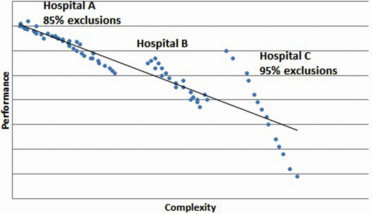
This possibility can be more easily appreciated through a figure. Suppose that exclusion rates vary between 85% and 95%, as shown by Bruckel et al, but that hospitals with the higher exclusion rates would also have relatively more complex patients within the included patients. This is illustrated in figure 2 containing hypothetical performances of individual patients treated in three hospitals, in which hospital A excludes 85% of the patients and treats less complex patients than hospital C. If we would assume that 95% of the non-complex patients would undergo a PCI within 90 min (following the national average) versus only 57% for those complex patients,19 then the reported negative association between exclusion rates and percentage of patients with PCI≤90 min would be explained by the percentage of complex patients ranging between 5% in low-exclusion hospitals and 23% for hospitals with high exclusion rates. If the difference in performance between non-complex and complex patients would be larger than 95% vs 57%, an even smaller range in percentage of complex patients would explain the association.

Example of ecological fallacy if complex patients cluster in hospitals with higher exclusion rates. The graph shows three hospitals that vary in the percentage of patients excluded from a performance measure, ranging from 85% of patients excluded in hospital A to 95% in hospital C. Suppose that at the same time these hospitals also differ in the complexity of patients that they treat, such that hospital C has the highest rate of exclusion and also treats the most complex patients. Within each hospital, worse performance occurs for more complex patients, represented by the blue dots. However, because hospital C treats more complex patients than hospital A, the average performance is worse in hospital C (represented by the fitted black line) even though the performance for some of the patients in hospital C is far better than for the less complex patients in hospital A. An ecological fallacy in this example would consist of inferring from the group-level association between higher hospital exclusion rates and worse hospital performance, without taking into account the complexity of treated patients, that performance for individual patients is worse in hospital C than in hospital A.
The weaker correlation shown by Bruckel et al for the other quality measures is likely to reflect a smaller difference in performance between complex and non-complex patients compared with 95% vs 57%, for example, for aspirin description at discharge. Hospitals treating complex patients might in fact have far better performance on PCI within 90 min among the slightly less complex patients than other hospitals not used to treating such complex patients, as also illustrated by figure 2. Hospital C has a wider range of performance, in part due to the higher exclusion rate (fewer data points) but also because of the more complex patients that they treat. Within hospital C, they may even achieve better or similar performance for some of these very complex patients than some of the less complex patients treated in hospital A. We would draw the wrong conclusion about the quality of care based on the average performance score of these hospitals without taking into account the complexity of patients.
If it is true that PCI use is expanded over time towards more complex patients particularly in some hospitals, then it is not enough to report the hospital exclusion rates for interpretation of quality measures like the percentage of patients having a PCI within 90 min. We would need some measure on the complexity of the denominator population, which is more than can be done by just presenting demographics. It would also mean that risk adjustment of these process measures is necessary to have fair hospital comparisons, as is done for outcome measures, which for long has been regarded as being less necessary for process measures and put forward as one of the advantages of process measurement. Future research is needed to assess how to capture this expanded use or the complexity of patients undergoing PCI. Alternatively, if such expanded use is randomly distributed and hospitals are actually quite comparable in terms of the type of patients that they treat, then the exclusion rate might function as a signal of hospitals delivering poor quality of care because they frequently defer to excluding patients at higher rates than other hospitals. In that situation, it might be considered the missing link needed to interpret these quality process measures.
For reporting of quality measures, this again teaches us that we have to be careful to draw conclusions on individual care based on aggregate hospital performance data. This is true for process measures just as much as outcome measures. We either need additional data on the type of population being measured or individual-level patient data to be able to evaluate the quality of care being delivered in that hospital.
References
Footnotes
Contributors PJM-vdM and BKN contributed to the conception of this paper, critically read and modified subsequent drafts and approved the final version. PJM-vdM is one of the editors at BMJ Quality & Safety.
Competing interests None declared.
Provenance and peer review Commissioned; internally peer reviewed.