Article Text

Abstract
Background Published reports suggest that there is considerable variation in improvement capacity and capability among participants in quality improvement collaboratives. Generating knowledge about why these complex initiatives do or do not work in different contexts requires both qualitative and quantitative approaches. Time-series analysis using line graphs and statistical process control is a rigorous quantitative approach with relatively unexplored potential in evaluating complex quality improvement interventions.
Aim The purpose of this study was to apply and illustrate the use of line graphs and statistical process control to identify variation in improvement among practices participating in the Saskatchewan Chronic Disease Management Collaborative.
Methods The authors used line graphs and regression analysis to determine whether improvement occurred at the aggregate level, and small multiples, rational ordering and rational subgrouping to examine differences in the level and rate of improvement among practices.
Results Small multiples allowed us to observe qualitative differences in patterns of improvement among practices. Stratifying data for all subgroups on one control chart using rational subgrouping provided quantitative evidence for these differences. Stratification by administrative health region using rational ordering showed consistent differences, indicating that the health region in which the practice was located may play a role in these differences. Results from the study are being used to inform a purposive sampling strategy for interviews with participants to explore why these differences occurred.
- Quality improvement collaborative
- statistical process control
- evaluation
- healthcare quality improvement
- collaborative
- complexity
- control charts
Statistics from Altmetric.com
- Quality improvement collaborative
- statistical process control
- evaluation
- healthcare quality improvement
- collaborative
- complexity
- control charts
Introduction
A quality improvement collaborative is a method that brings together teams working on improving care in a particular area. Defining characteristics of quality improvement collaboratives are that teams: attend learning sessions, where they build quality improvement and clinical capacity; test and implement changes in their organisation during the action periods between workshops; and share lessons learnt with other participating organisations.1
A recent review found a small number of studies examining the effectiveness of collaboratives; results showed positive effects, although the evidence is not yet considered conclusive.2 Predominantly, evaluations of quality improvement collaboratives have used traditional experimental and quasi-experimental research designs—aggregated data from intervention and control groups, or before and after measurements, are compared using classical enumerative statistical methods.2 Evidence suggests, however, that there is considerable variation in improvement capacity and capability among collaborative participants. Ovretveit and colleagues found that up to 30% of organisations may drop out of collaboratives before they finish, and that only 30% may achieve significant improvements.3 Traditional evaluation designs, though widely seen as the gold standard in evidence of effectiveness,4 ,5 may not provide the answers we are looking for because they ignore this variation within the intervention group. Investigators have noted that the important challenge is not to generate widely generalisable findings about whether or not quality improvement collaboratives ‘work,’ but rather to understand why they do or do not work in different contexts.2 ,6 ,7 Examining this variation requires using evaluative methodologies that are informative in understanding complex situations, incorporating both qualitative and quantitative approaches. Time-series analysis using statistical process control (SPC) is a rigorous quantitative approach highly suited to evaluate complex interventions like quality-improvement collaboratives.8 ,9
In 2006, Health Quality Council—an independent, publicly funded agency dedicated to monitoring, reporting, and improving healthcare quality in Saskatchewan, Canada (box 1)—launched the Saskatchewan Chronic Disease Management Collaborative (CDMC) to improve care for patients living with diabetes and coronary artery disease; participants were primary care practices from across the province. The CDMC is the largest quality-improvement initiative in Saskatchewan's history, with two waves of participants, each starting a year apart. The initiative involves more than 25% of Saskatchewan family physicians, hundreds of other healthcare workers, all 13 regional health authorities and more than 15 000 patients with diabetes and coronary artery disease.10
Saskatchewan, Canada
Saskatchewan is a Canadian province of approximately 1 million people, of which the median age is 36.7 years and 49.7% are female.16 There are 13 municipalities classified as cities in the province; 56% of the province's population live in these cities.16 Most residents of Saskatchewan, approximately 99%, receive universal medical coverage.17 The Government of Saskatchewan provides some prescription drug benefits, such as copayments when a family exceeds a deductible, to residents under the Prescription Drug Plan. Within the province, there is a population of approximately 1400 people per physician.16
Anecdotal field reports and early results from outcome and process of care measures suggested a variation in improvement among participating practices. Several investigators have called for alternative approaches to evaluate complex quality improvement interventions; therefore, we wanted to explore new ways of learning about and describing variation within our intervention group. The purpose of this study was to apply time-series methods (line graphs and SPC charts) for examining variation between groups over time to help us understand the patterns of improvement in the CDMC: did all practices improve? If not, were there groups of practices that appeared to have different levels or rates of improvement? Can we confirm that these practices were different from the system as a whole using SPC charts? If there were differences, what might have caused them? This information would then be used to inform a purposive sampling strategy for a qualitative study to better understand why any differences occurred.
Methods
Data collection
We examined improvements for diabetes care for practices completing the first wave of the CDMC from March 2006 to March 2008. Each of Saskatchewan's 13 regional health authorities11 formed a regional improvement team composed of a collaborative facilitator, all participating practices and allied health professionals, such as dietitians and diabetes educators, who work independently of the practices. Regional improvement teams were created to foster teamwork and communication between private providers and regional staff, and teams were encouraged to share ideas and resources. Our analysis includes data from the 33 practices that completed the full 24 months (table 1).
Saskatchewan Chronic Disease Management Collaborative, wave 1 practices*
Each practice entered clinical and demographic data on all patients with diabetes and coronary artery disease into the Chronic Disease Management (CDM) Toolkit, a secure, web-based patient registry and decision-support tool. Through its flow sheet-based application, the CDM Toolkit facilitated the tracking of clinical information at both the individual patient and population level. It enabled providers to share information with each other and provided reports to compare individual providers' performance with other providers and practices participating in the CDMC. We examined data on diabetes outcome and process of care measures extracted monthly from the CDM Toolkit (table 2). The University of Saskatchewan Behavioural Research Ethics Board approved the study.
Diabetes outcome and process measures extracted monthly from the CDM Toolkit
Analytical methods
The CDMC did not establish a stable baseline upon which to test improvement; therefore, we used line graphs to examine variation occurring at the aggregate level (data for all practices combined) and linear regression analysis to test for statistically significant slope (α=0.05). We used small multiples,12 rational ordering13 ,14 and rational subgrouping13 ,14 to examine differences in the level and rate of improvement between practices.
We examined line graphs for each measure at the practice level using a graphical analysis technique called small multiples. Small multiples repeat the same graphical design structure for each ‘slice’ of the data12; in this case, we examined the same measure, plotted on the same scale, for all 33 practices simultaneously in one graphic. The constant design allowed us to focus on patterns in the data, rather than the details of the graphs.12 Analysis of this chart was subjective; the authors examined it visually and noted, as a group, any qualitative differences and unusual patterns.
To examine these patterns quantitatively, we used a rational subgrouping chart to plot the average month to month improvement for each practice on an Xbar-S chart. The Xbar chart plots the average change from month to month (Xi-Xi-1, where X is the monthly measure and i is months); a value of 0 indicated no change, and a value greater than 0 indicated improvement. The S Chart plots the standard deviations (ie, SD(Xi-Xi-1); an SD of 0 indicates no variation and no change, and an SD greater than 0 indicates that change is taking place. Points outside the control limits on the Xbar chart indicated a practice whose average month-to-month improvement was beyond what would be predicted by random (common cause) variation over time among the practices: higher than expected if the point was above the upper control limit, and lower than expected if the point was below the lower control limit. Points outside the limits on the S chart indicated a practice whose variation in month-to-month improvements was higher (above the upper control limit) or lower (below the lower control limit) than would be predicted by random variation over time among the practices. The S chart was particularly informative for examining variation, because the Xbar chart was susceptible to contamination effects when very rapid improvements were followed by a plateau.
Rational subgrouping is a variation on rational ordering (described below) and is used when there are enough data points to form subgroups of the data points and create an Xbar-S chart, rather than just an individual chart.14 In a rational subgrouping chart, data for each subgroup are aggregated and plotted as one data point per subgroup; points are not connected because they are not in time order.13 ,14 The centreline and control limits are calculated using all data points; subgroups with points outside the control limits are considered different from the system as a whole.13 ,14
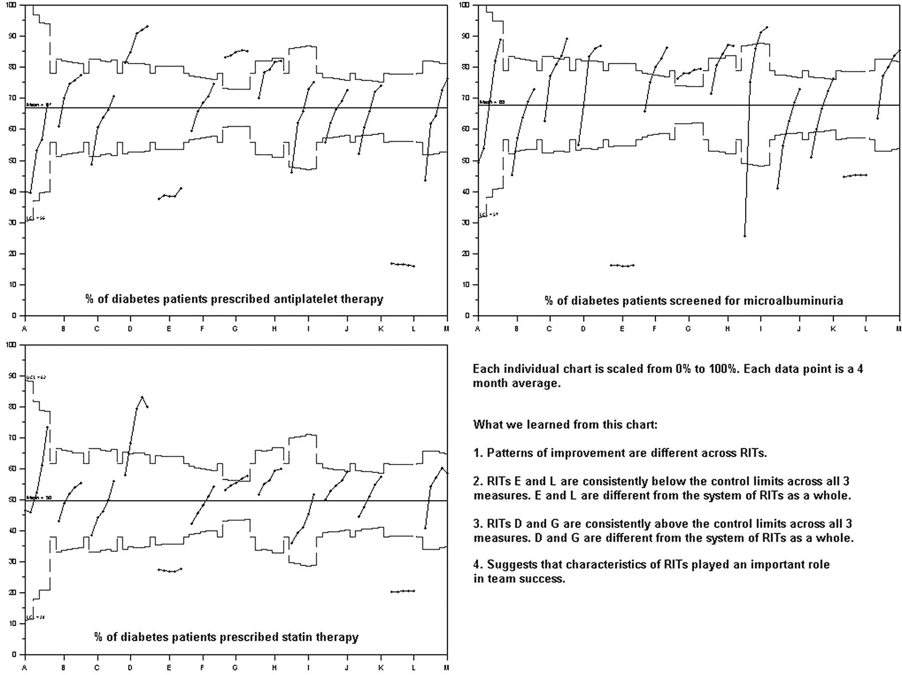
To further explore the reasons why any differences occurred, we used rational ordering to group and compared practices by regional improvement team. Rational ordering charts allowed us to compare each subgroup in an analysis with the system as a whole, by stratifying data for all subgroups on one control chart. Data for all subgroups are presented sequentially and in time order, and are grouped so that there are at least 20 points on the chart; the centreline and control limits are calculated using all data points.14 A point outside the control limits signifies a subgroup that is different from the system as a whole.13 ,14
All control charts used three sigma limits and were created using CHARTrunner software version 3.0 (PQ Systems, Dayton, Ohio, 2007). All statistical analyses were conducted with SAS software version 9.1 (SAS Institute, Cary, North Carolina).
Results and discussion
At the aggregate level (all practices combined), all outcome and process of care measures showed a significant upward slope, indicating that improvement had occurred (figures 1, 2).

Diabetes outcome measures, all practices combined, by month, April 2006–March 2008.
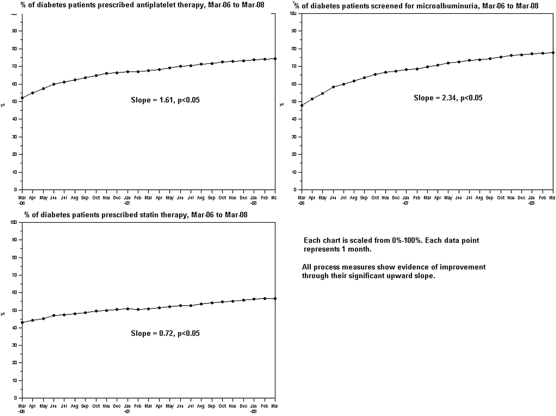
Diabetes process measures, all practices combined, by month, March 2006–March 2008.
Differences in improvement patterns among practices over time became visible when the data were arranged as small multiples. Figure 3 shows the small multiples chart for microalbuminuria screening. Qualitatively, we observed three groupings of patterns: rapid, steady and stationary (table 3). We observed a similar grouping pattern with the other two process measures but not with the outcome measures (data not shown). Further exploratory analyses were conducted only on the process measures.
Qualitative groupings of patterns observed in figure 3
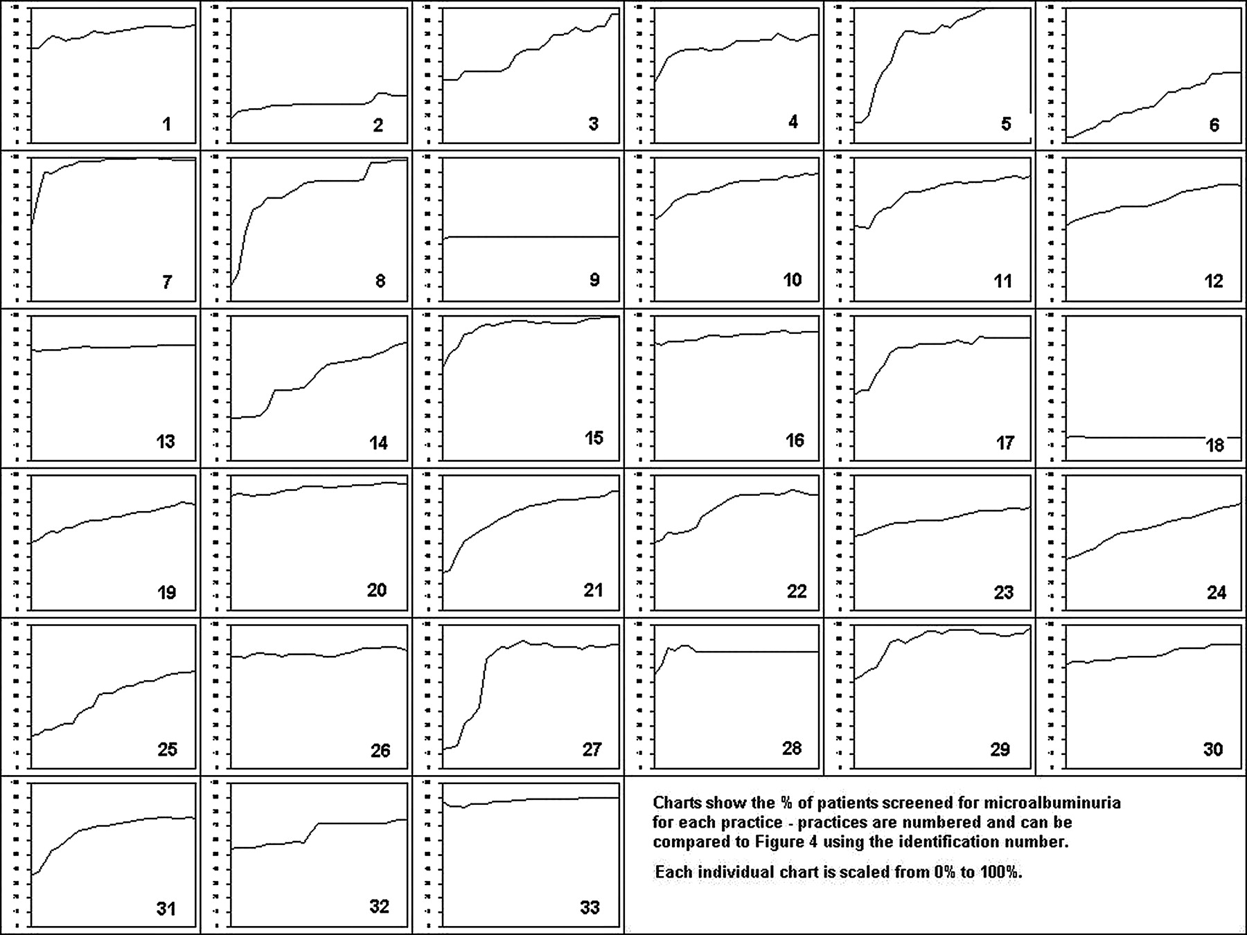
Small multiples chart for monthly percentage of patients with diabetes screened for microalbuminuria, all practices, March 2006–March 2008.
Plotting the average month-to-month change, stratified by practice (rational subgrouping), on an Xbar-S chart allowed us to determine whether the qualitative differences we observed in figure 3 would exist when each practice was compared quantitatively with the system of practices as a whole (figure 4).
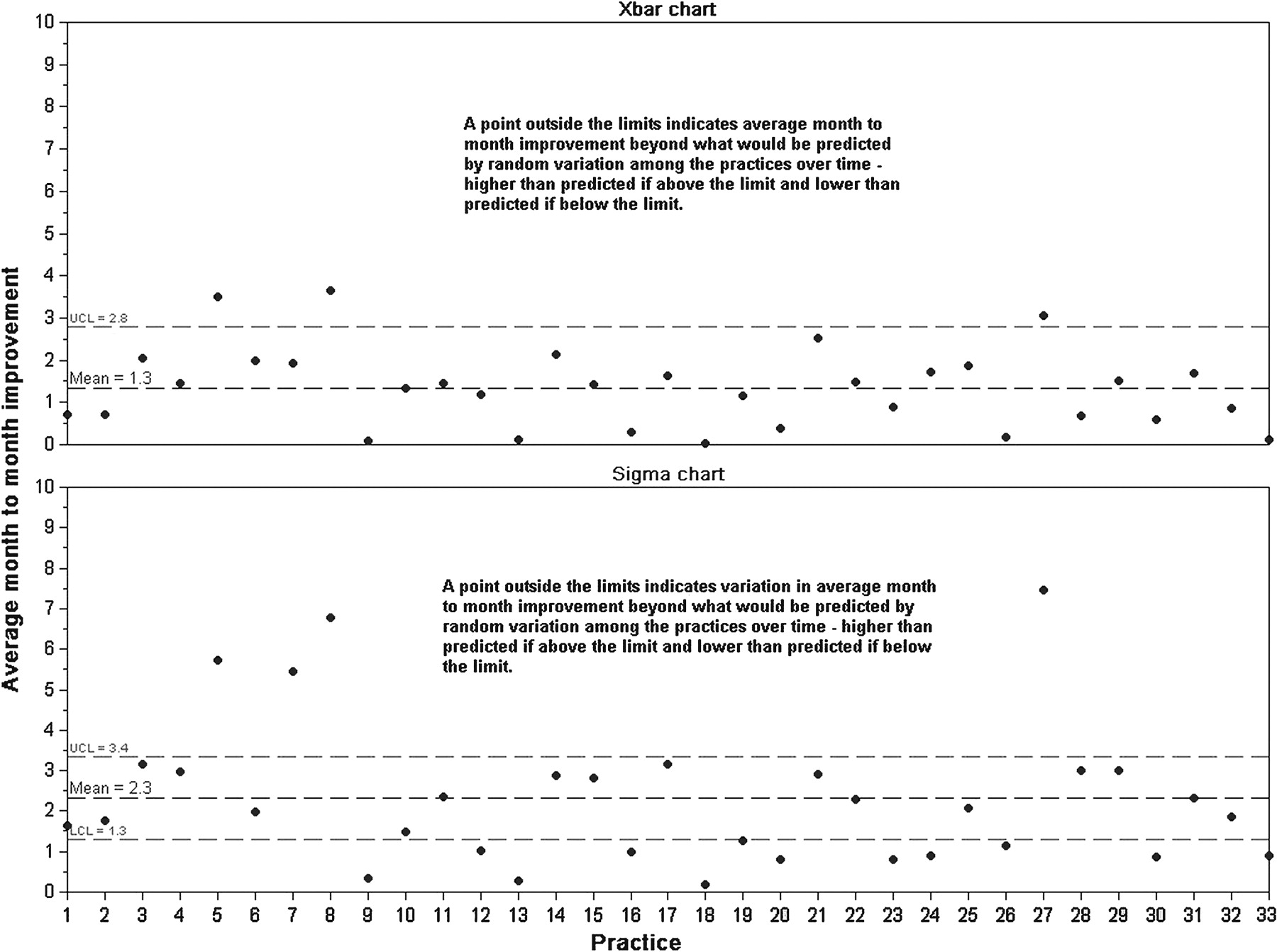
Average month-to-month improvement in percentage of patients with diabetes screened for microalbuminuria, rational subgrouping by practice, March 2006–March 2008, Xbar-S chart. Practices could not have negative average month-to-month improvements, because data values in the Chronic Disease Management (CDM) Toolkit were carried forward until new values were entered. Therefore, the Xbar chart must end at 0, and the lower control limit does not exist because its calculated value is less than 0, meaning we cannot judge whether a point falls below the lower control limit on the Xbar chart.
Figure 4 confirms that there are practices that were quantitatively different from the system as a whole. Based on whether they appeared within or outside the control limits on either the Xbar or S chart, practices again fell into three groupings: rapid improvers were those that fell above the upper control limit on the S chart regardless of where they fell on the Xbar chart; steady improvers were those that were within the control limits on the S chart; and stationary improvers were those within the control limits on the Xbar chart and below the control limits on the S chart. The groupings are shown in table 4; differences in the composition of the groupings between figures 3, 4 indicate the value of confirming the subjective differences with a quantitative analysis.
Quantitative rapid, steady and stationary groupings observed in figure 4
The percentage of patients prescribed statin therapy and percentage of patients prescribed antiplatelet therapy showed similar grouping patterns, although the composition of the groupings differed across measures (data not shown).
To begin learning about why these differences occurred—to start exploring why the CDMC did or did not work in certain contexts—we conducted further comparisons with regional improvement teams.
Figure 5 shows all process measures rationally ordered by regional improvement team. Stratifying them on one chart allowed us to see that patterns of improvement were different across teams. Specifically, groups E, L, D and G were different from the system of collaborative teams as a whole—E and L were consistently below the control limits on all three measures, and D and G were consistently above. This suggests that there were characteristics of regional improvement teams that played an important role in team success.
Diabetes process measures rationally ordered by regional improvement team, March 2006–March 2008, 4-month average time periods, p charts.
Conclusions
Reports in the published literature have observed, anecdotally, that different teams participating in the same quality improvement collaborative can vary considerably in the improvement they achieve.2 ,3 ,6 ,7 In this study, we applied time-series methods—line graphs and SPC charts—to quantitatively examine variation in improvement among primary care practices participating in a collaborative.
SPC methods are often used to look at variation within a process, but they can also be used to look at variation among processes in a system—in this case, among primary care practices (or among groups of practices aggregated by health region). Rational ordering and rational subgrouping allowed stratification of multiple subgroups on the same control chart and comparisons of subgroups to the system as a whole. Figures 3, 4 helped us to understand that, consistent with earlier reports in the literature, analysing data from all teams aggregated together hid a considerable amount of variation that was occurring among teams. The qualitative comparison in figure 3 provided the first evidence of this, and figure 4 allowed us to confirm it quantitatively. Drilling down into the data this way provided us with evidence that some practices and regional improvement teams did indeed have different patterns of improvement.
Despite widespread use of quality improvement collaboratives, little is known about their effectiveness and the factors that influence it.2 ,3 ,7 In this collaborative, outcome and process of care measures showed evidence of significant improvement over time, indicating that thousands of patients are receiving better care and experiencing better health outcomes.
We were not able to establish a stable baseline upon which to test improvement, and we did not compare participants with a control group of practices not participating in the collaborative, so the present analysis cannot rule out the contribution of secular trends. In addition, staff at the practices entered data into the CDM Toolkit; it is possible that data entry errors occurred, although automatic checks looked for common errors such as not converting a test result provided in decimal form to a percentage. Also, observations are carried forward until new ones are entered, so laboratory results and drug information extracted from the application may be out of date for some patients.
Our analysis was limited by the data available in the CDM Toolkit; additional data on factors that affect the implementation of evidence-based practice, such as context (culture, team efficiency, leadership) and facilitation (collaborative facilitator roles and skills), may have shed more light into why differences between practices (and groups of practices) occurred.15 To gain such information, results from this analysis have been used to inform a sampling strategy for a qualitative study (in progress) of the differences in context and facilitation among practices at the extremes of the improvement continuum.
Key messages
Variation between participants in complex quality improvement interventions can provide important insights into why they do or do not work in different contexts.
Differences existed in the level and rate of improvement among practices participating in the Saskatchewan Chronic Disease Management Collaborative.
Differences could be explored and confirmed quantitatively using statistical process control methods.
Educational points
Statistical process control charts can be used to learn about variation within a process; they can also be used to drill down into aggregate data to learn about variation among processes in a system.
Small multiples visually examine variation among many groups simultaneously; differences among the groups become visible when data are presented this way.
Rational ordering and rational subgrouping stratify subgroups on one control chart, which allows analysts to determine whether subgroups are different from the system as a whole.
Further research and development
Further application of SPC methods to understand patterns of variation among organisations undertaking improvement initiatives.
Application of SPC methods along with qualitative research methods to further illuminate contextual factors predictive of variation in improvement.
Build capacity of clinicians and improvement teams to use SPC methods, through education at the undergraduate, graduate and post-graduate levels.
Footnotes
Funding This project was funded through the operating budget of the Health Quality Council.
Competing interests None.
Ethics approval Ethics approval was provided by the University of Saskatchewan Behavioural Research Ethics Board.
Provenance and peer review Commissioned; externally peer reviewed.