Article Text

Abstract
When the degree of variation between healthcare organisations or geographical regions is quantified, there is often a failure to account for the role of chance, which can lead to an overestimation of the true variation. Mixed-effects models account for the role of chance and estimate the true/underlying variation between organisations or regions. In this paper, we explore how a random intercept model can be applied to rate or proportion indicators and how to interpret the estimated variance parameter.
- healthcare quality improvement
- performance measures
- quality measurement
- statistics
This is an open access article distributed in accordance with the Creative Commons Attribution Non Commercial (CC BY-NC 4.0) license, which permits others to distribute, remix, adapt, build upon this work non-commercially, and license their derivative works on different terms, provided the original work is properly cited, appropriate credit is given, any changes made indicated, and the use is non-commercial. See: http://creativecommons.org/licenses/by-nc/4.0/.
Statistics from Altmetric.com
Introduction
Identifying and quantifying variation in health and healthcare provision is commonplace in research, public health and healthcare delivery management.1 2 However, all too often methodological approaches that overstate how much variability is present misdirect policy and practice. In the extreme case where no real differences exist between organisations or geographies, insufficient methods may suggest that variation does exist when in fact the data simply reflect chance. If it is the case that no real variation exists, common practices such as ranking organisations, identifying outliers or quality improvement efforts focused on organisations with poor performance, have no basis in reality. Therefore, it is important to establish how much variation would exist in the absence of chance before implementing such consequential and costly practices. There has been a wealth of methodological research focused on how to identify unusually poor or good organisations, and how to best estimate the performance of individual organisations on metrics where both chance and real variation exist.3–9 However, what has garnered less attention is understanding how much variability exists between organisations which is not due to chance. Identification of unwarranted variation across healthcare providers is often the driver of media attention and improvement efforts,10 11 and as such variation needs to be quantified accurately. In this paper, we focus on the issue of overall variation rather than quantifying performance for individual organisations or geographies. In particular, we discuss why crude estimates of variation can be misleading and show how familiar statistical tools used in medical research can avoid these common problems by identifying true variation. While the modelling techniques discussed are not new, this paper addresses a need to make the motivation for such models and interpretation of them more accessible to researchers and others who are not statisticians well versed in these techniques.
The influence of chance
Assessment of variation between healthcare organisations and geographical regions has long been the subject of enquiry in public health monitoring and more recently in the service improvement agenda. It is a key tool in health services research where we are interested in both the existence and size of variation, but often also in understanding what is driving it.1 However, while it is often recognised that the use of small samples affects the precision of individual organisation or geographical region measures, the impact on the ability to quantify variation is less well appreciated.
Where measures for a reporting unit such as a practice, hospital or geographical region are based on aggregated individual measurements (eg, the percentage of patients with a certain outcome, or a mean value across a given population), chance will inflate the apparent variation between units of observation.12 To illustrate this, consider the example of flipping coins. We would not expect people flipping 10 coins to all record precisely five heads: some will record more and some less by chance. Similarly, if we are classifying organisations on a metric which over a long period has a performance level of 50% in every organisation, we would not expect every organisation to record exactly 50% over a limited period of time as the role of chance comes into play.
The effect of chance is larger when the numbers involved are small and it is this phenomenon which is often displayed in funnel plots where the ‘funnel’ is wider at the left of the graph where sample sizes are smaller.13Figure 1 shows an example of a funnel plot displaying this phenomenon. In this case, the data have been simulated assuming each geography or organisation (which, in general, we refer to as reporting units) had an underlying percentage of 80%. If the sample size for each reporting unit was very large (eg, if measured over a very long time period), we would expect to see indicator values very close to 80% for all reporting units. However, because we have used finite sample sizes, there is variability in the observed distribution of indicator values even though there is no variability in the underlying performance. This variability simply reflects the influence of chance and it can be seen that this influence is larger for smaller sample sizes, but it is still present even when the sample size becomes appreciable (ie, >200). It would be wrong to conclude that these reporting units are different on the basis of this level of variation.

Simulated data displayed in a funnel plot for 200 reporting units each of which have an underlying tendency to score 80%.
The influence of chance is ever present for indicators based on aggregate measures constructed from data on individual patients or events. The presence of chance variation is often attributed to the process of sampling. However, even when all patients in a hospital or all events in a geographical area are counted over a given period, such that there is no sampling error, there may still be variation in performance due to chance, particularly if the time period is short or the event frequency rare. Future performance, which is often of most interest, therefore might not be similar.14 For this reason, we use the term chance in this paper rather than error. The influence of chance will vary for different indicators in different setting but will always tend to inflate the apparent variation. Public health indicators for geographical regions often involve large numbers of individuals and so the influence of chance can be small. However, when outcomes are rare (eg, suicide), the influence of chance can be large. Indicators related to healthcare providers tend to involve smaller populations than public health indicators, but sample sizes and rarity of outcomes still vary substantially. With improvements in data gathering and timeliness, there is a push to smaller units of analysis and shorter reporting periods. This push will result in a greater influence of chance and a larger apparent variation between organisations or geographical regions. Often, we are interested in the underlying variation rather than that which is observed over a finite time period. The underlying variation is that which would be seen with a very large sample size or over very long observation periods. Similarly, we would expect to get very close to 50% heads if we flipped a million coins. While the magnitude of observed variation decreases as sample sizes increase, the magnitude of the underlying variation remains constant.
Mixed-effects regression models are a well-established tool which can be employed to partition observed variance into that which is due to chance and that which can be attributed to underlying differences between organisations. Here, we describe how they can be used to identify and quantify organisational or geographical variation in three principal types of metrics; proportions, rates and scores.
Terminology
Throughout this paper, we use the term reporting unit to apply to the organisation or geographical regions that are being profiled.
Random intercept models
Mixed-effects regression models (also known as multi-level models) have become a standard tool in medical research over recent decades and are used to model situations where observations are not independent, for example when clustered by hospital or medical practice. Often, their use is motivated by estimating differences between patient groups (eg, the effect of a treatment within a cluster randomised trial). There, the multi-level model serves two purposes which are to account for the non-independence (which could lead to erroneous p values and CIs) and to adjust estimates for differences within-cluster rather than differences between clusters. Mixed-effects models also can be used to facilitate the investigation of cluster-level effects while still making use of the patient-level data (eg, examining whether certain subtypes of organisation perform better or worse, on average, than others). As we argue below, taking a simpler approach can lead to an overestimate of between organisation variance, especially when the within-organisation sample size is small. However, caution is also needed when the number of clusters is small (<30), as this can lead to both an underestimate of between organisation variance and an underestimate of the standard errors on organisational-level effects.15
The simplest mixed-effects model is the random intercept model. In this regression, a term is added to a standard regression which captures the variation between reporting units (often termed the between-cluster variance). Rather than estimate effect for each unit, the between-unit variation is described by a distribution. The between-unit variation is assumed to be normally distributed and described by a SD (or variance). Employing a random intercept model, the observed variance between units is partitioned into that attributable to the underlying variation between units and that attributable to chance.
The framework of a random intercept model can be applied to linear regression or more generally to generalised linear models such as logistic or Poisson regression. Normally, we would use logistic regressions for percentage or proportion-type indicators, Poisson regression for rate indicators and linear regression for other types of indicators such as those based on some type of quality score. In all cases to quantify between-unit variation, we can fit a random intercept model with no fixed effects (ie, regular regression coefficients) other than an intercept or constant term. For linear models, person-level data are required to estimate the within-unit variance. However, for percentage or rate indicators, models can be fitted so long as the observed numerators and denominators for each reporting unit are used (rather than the percentage or rate value). We can do this because we assume the data follow the binomial or Poisson distributions (for percentage and rate indicators, respectively), the variance of which depends only on the mean and sample size.
When fitting such a model, the estimate of the overall average will be given by the constant term and the estimated variability between units around that average will be given by the SD or variance of the random effect (random intercept). With a linear model, these estimates will be directly comparable with the indicator being modelled. In contrast, with a percentage or rate indicator, these estimates will be on the log-odds or log-rate scale, respectively. Furthermore, the between-unit variation is assumed to be normally distributed on the log-odds or log-rate scale. This can make interpretation of the SD or variance of the random effect difficult and we suggest various ways to approach this below.
A distinct advantage of mixed-effect models is that they can be used even when data are sparse. For example, it is possible to include reporting units with only two individual-level observations in mixed-effects logistic models. Because mixed-effects models account for the expected influence of chance and estimate the underlying, rather than observed, variation, the estimate of between-unit variance is not associated with the number of observations for each unit. (However, the precision of an estimated between-unit variance or SD will depend on both the number of observations per unit and the number of units, and there can be biases in mixed-effects models when very small sample sizes are used, though in general the number of units is more important for both precision and the impact of small sample issues.)16 An extreme example of applying a random intercept model to sparse data is given in box 1.
Extreme example
We consider a hypothetical example comprising 1000 reporting units, each reporting on a binary (yes/no) indicator with a national performance of 50%. In this extreme example, each reporting unit has only two observations on which the indicator is based. If no real variation existed between units (such as if they were tossing coins), we expect the distribution to be described by the binomial distribution that is, 250 with 0%, 500 with 50% and 250 with 100%. If instead we observe 300 with 0%, 400 with 50% and 300 with 100%, the overall average is still 50%, but there is more variation than expected from chance alone according to the binomial distribution. A random intercept logistic regression can be applied to these hypothetical data which estimates the SD on the log-odds scale between units as 1.11. To put this in context, if we had a very large number of observations per reporting unit, such that the influence of chance was minimal, and the underlying performance of each unit was unaltered, we would see substantial variation between units. In fact, we would expect 95% of reporting units’ performance to be spread over the interval 10%–90%.
Testing for between-unit variation
As noted, we would expect to see variation between units when indicators are based on finite samples whether or not any true underlying variation existed. With mixed models, we can formally test whether the observed variation is larger than that which might be expected if there was no underlying variation between units. To do so we can perform a likelihood ratio test comparing our random intercept model with an empty model containing only a constant term.
Quantifying variation and the interpretation of random intercepts
As discussed above, the SD of the random effect is one immediate way of quantifying variation. However, the interpretation of this can be hard for rate and proportion indicators because it is defined on the log-rate or log-odds scale and as such is not directly relatable to differences in proportions or rates, so are of little use to a non-technical audience. Often the intraclass correlation coefficient or variance partition coefficient are used to describe variation.17 In simple situations, they are equivalent and describe the proportion of total variance between individuals which is attributable to the differences between organisations. These two are difficult concepts to explain to non-technical audiences. Furthermore, they complicate matters further by casting the between-organisation variance as a relative measure given in terms of the variability between individuals, rather than as an absolute measure. As such, it can be very hard to convey when variation is unreasonably large. Moreover, what constitutes unreasonably large variation is likely to vary according to context.
Rather than the technical measures discussed, there are options which present the variability, after accounting for chance, on the natural scale of the indicator (eg, proportion or rate) which are far more accessible. Furthermore, placing measures on the natural scale means that reasonable judgements can be made on the consequence of the magnitude of the variation. One option is to estimate percentiles of the fitted underlying distribution in terms of rates of proportions. For example, the 75th centile of the indicator could be calculated by first determining the 75th centile of the fitted distribution on a log-odds or log-rate scale before converting back to the native scales (ie, proportion or rate) for direct comparison with the observed scores. A particularly useful pair of percentiles are the 2.5th and 97.5th centiles. Together, these can be used to describe the 95% midrange of observations, that is, the range that we would expect most observations, ignoring extremes, to lie within. Further mathematical details on obtaining these centiles are provided in appendix 1.
Supplemental material
A second option is to estimate the relative difference between two centiles, such as the 75th/25th or 97.5th/2.5th. For proportion and rate indicators, these differences would be expressed as an OR or rate ratio comparing the top and bottom centile. A related method is the median OR which is the median of ORs that would be obtained by comparing random pairs of reporting units.18 Further mathematical details on are provided in appendix 1.
A final option is to produce a graphical illustration of the fitted distribution. For data used in linear regression models, a normal distribution can be shown with the given mean and SD. For rate models, a log-normal distribution is equivalent to that fitted and is defined by the mean and SD on the log-odds scale. For proportion indicators, the situation is more complex as no analytic solution exists to transform the fitted normal distribution from the log-odds scale to the proportion scale. Instead, we outline a numerical method for doing this in Appendix 2. The fitted distributions can easily be plotted over the observed distributions to gain some insight into how much observed variability is due to chance.
Examples
Example 1: suicide rate for English local authorities
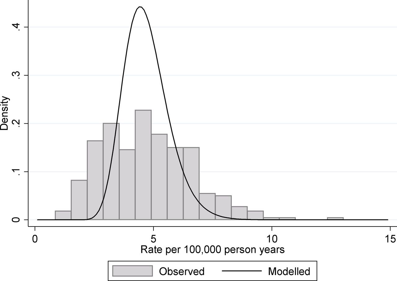
As part of the Public Health Outcomes Framework, Public Health England produce a large number of public health indicators at different geographical levels.19 These levels range between large regions of England (nine covering the country) to district and unitary authorities which relate to populations from around 2000 to a little over one million. While many of these indicators are based on large sample sizes and thus are only slightly affected by chance variation, many measure rare events so that chance can play a substantial role. One such indicator is 4.10. Suicide rate applied at the district and unitary authority levels. These data are usually presented as an age standardised rate, but for simplicity we use the crude rate calculated as the number of suicides divided by the population at risk. Data are restricted to people 10 years old and over and for the time period 2013–2015. For illustration purposes, we present the figures for women. As a rate indicator, the natural model to use is a Poisson regression. Fitting a random intercept, Poisson regression to the data produces an estimated mean log rate of −9.98 and an estimated between-unit SD of 0.199. From this, we estimate the true underlying 95% midrange of suicide rates across districts/unitary authorities to be 3.12–6.82 suicides per 100 000 person years, and a rate ratio covering this midrange to be 2.18. This can be interpreted as a little over a twofold variation in suicide rate between different districts in England. If we compare these to the observed values, which included contributions from both true organisational and chance variation, we find that the 95% observed midrange covers the range 1.61–8.87 suicides per 100 000 person years, which equate to just over a fivefold variation. This discrepancy between observed variation and the underlying true variation is shown in figure 2. Only 20.2% of the observed variance (on the log-rate scale) can be attributed to the real variation between geographical units with almost 80% of the observed variance being due to chance.

Suicide rates of women for English districts and unitary authorities. The histogram shows the distribution of observed rates in the period 2013–2015 and the solid line shows the fitted distribution from a random intercept Poisson model for the underlying variation.
Example 2: liver disease mortality rate for English local authorities
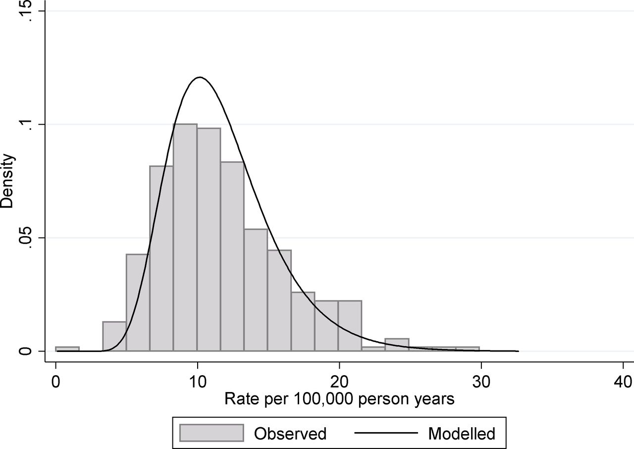
A second example from the same data source is indicator 4.06i—under 75 mortality rate from liver disease. Again this data relate to the period 2013–2015 and are presented here for women. As with the suicide rate, the data are calculated as the number of deaths divided by the population at risk and again a Poisson regression framework is the most appropriate as we are modelling count/rate data. In this case fitting, a random intercept Poisson regression to the data produces an estimated mean log rate −9.10 and an estimated between-unit SD 0.310. From this, we estimate the true underlying 95% midrange of rates to be 6.07 to 20.5 deaths per 100 000 person years, and a rate ratio covering this midrange to be 3.38, that is, over a threefold variation in early mortality form liver disease between different districts in England. If we compare these to the observed values (influenced by true and chance variation), we find that the 95% observed midrange covers the range 4.86 to 21.5 deaths per 100 000 person years, that is, over fourfold variation. This discrepancy between observed variation and the underlying true variation is shown in figure 3. Only 67.0% of the observed variance (on the log-rate scale) can be attributed to the real variation between geographical units with around a third of the observed variance being due to chance.

Under 75 mortality rate from liver disease for English districts and unitary authorities. The histogram shows the distribution of observed rates in the period 2013–2015 and the solid line shows the fitted distribution from a random intercept Poisson model for the underlying variation.
The different degree of chance variation between the suicide example and the liver disease mortality example can be seen if we consider the correlation of one indicator with the same indicator from a previous time period. This is shown in figure 4 for the two public health indicators considered which shown the data for 2013–2015 plotted against the preceding period 2010–2012. There are two principal drivers of less than perfect year-on-year correlations. The first driver is true annual change in the performance of organisations/geographies. The second driver is that the influence of chance on individual organisation/geography metrics is different from year to year. We see a much stronger association between liver disease mortality over the two time periods (correlation coefficient: 0.76) than for the suicide rate (correlation coefficient: 0.33). One might crudely conclude that suicide rates are inherently more variable over time. However, where the influence of chance is large the year-to-year variations in observed values will be large even if the underlying performance does not change and that this is likely the principal reason for the differences seen in the two panels of figure 4. More complex mixed-effects models than those discussed here can be used to further partition changes over time into real ones and those due to chance and estimate what the correlation between the two time periods would have been in the absence of chance.

The correlation between rates of (a) suicide and (B) under 75 mortality rate from liver disease between 2010–2012 and 2013–2015 for English districts and unitary authorities.
Example 3: blood pressure control in US health plans
Both examples 1 and 2 illustrate mixed-effects Poisson regression applied to a rate indicator. The third example illustrates mixed-effects logistic regression applied to a percentage indicator. Collected by the Centres for Medicare & Medicaid Services, the Healthcare Effectiveness Data and Information Set (HEDIS) is a tool used by more than 90% of America's health plans to measure performance on important dimensions of care and service.20 HEDIS data consist of healthcare process measures and intermediate outcome measures based on administrative data supplemented in some cases by information obtained from individual medical records. One measure is controlling high blood pressure, which assesses whether blood pressure was adequately controlled among adults 18–85 years of age who had a diagnosis of hypertension. For this analysis, data from 2015 and 2016 were pooled together for more precise estimation.
Across the 457 health plans with at least 100 members eligible for this measure and weighing plans equally, the mean pass rate was 68.1%. In this case, the indicator is presented as a percentage and so a mixed-effect logistic regression was used with a random intercept for plan. This model produces an estimated between-plan SD of 0.695 on the log-odds scale. From this, we estimate the true underlying 95% midrange of health plan pass rates to be 36.7% to 89.9%, and an OR covering this midrange to be 15.2. If we compare these to the observed health plan pass percentages (influenced by true and chance variation), we find that the 95% observed midrange covers the range 31.2%–89.9%, somewhat larger OR over this range of 19.8. This measure has high reliability and the estimated and observed variation are not too dissimilar; the similarity between observed variation and the underlying true variation is shown in figure 5.

The proportion of adult patients (18–85 years of age) with a diagnosis of hypertension who had adequately controlled blood pressure health plans in the. The histogram shows the distribution of observed proportions in the period 2015–2016 and the solid line shows the fitted distribution from a random intercept logistic model for the underlying variation.
Discussion
Chance variation is ever present. As we show here there can be times when it dominates variability in indicators between geographies or organisations. Unfortunately, for any one observation, it is impossible to establish just what the impact of chance on that single value is. However, using mixed-effects models, it is possible to determine the magnitude of chance variation and the true underlying variation between the observational units. What constitutes unduly large variation depends very much on context. However, using the methods presented here, such as presenting centiles of the distribution on native scales, or 95% midranges, can allow a reasonable judgement to be made as they are far easier to interpret in any given context than, say a variance of a random effect on the log-odds scale. Which particular measure of variation is used is really an issue of preference, and again different measures may be useful in different situations, or more accessible to different audiences. There are guiding principles which indicate when chance variation is likely to have a large impact (box 2), but mixed models can be applied even when this is not the case. Beyond research, where the applications of these models are vast, there are practical reasons why understanding the underlying magnitude of variability is important.
When might chance be a problem?
When the highest and lowest performers are dominated by smaller organisations/geographies
When units of analysis have variable sample sizes, the influence of chance is greater in the smaller units. The greater influence of chance in the small units leads to larger fluctuations and a higher likelihood that they will be among the top and bottom performers.
When the observed variation is similar to that you might expect by chance
We can estimate how much variation might be expected by chance in a rate indicator by considering the denominator count of events. The expected variation due to chance alone which would cover 95% of units is shown in table 1 calculated from the Poisson distribution. If the observed range of indicator values is not substantially larger than that shown in table 1, it is likely that chance is having a sizeable impact on the observed variability. Alternatively, the range shown in table 1 can be approximated by  where n is the typical count.
The situation with percentage indicators is a little more complex but a reasonable approximation can be gained using either the numerator or the denominator minus the numerator, whichever is smaller, in the above table/formula.
Expected variation due to chance predicted from the Poisson distribution for different counts of events.
In the quality improvement field and public health monitoring, there is interest in identifying variability between organisations or geographical units. Where wide variation is identified, there may be considerable effort put into identifying best practice and substantial investment in trying to improve low-performing organisations or regions. Sometimes, there are reputational or financial implications to organisations being classified as poor performers. In these situations, overstating variation can lead to a misdirection of resources. Attaching financial incentives to improvement where variation between organisations is overstated may have adverse effects, if for no other reasons in so far as they introduce an opportunity cost, in turn negatively impacting the quality of patient care. Moreover, in the absence of careful analysis, such quality improvement efforts may be reinforced by apparent success that is actually attributable to regression to the mean.
The existence of true variability can often be taken as a sign that there is room for improvement and appropriately much research is aimed at understanding variation that may yield insights regarding how to improve health or healthcare. However, research which seeks to explain variation that can simply be attributed to chance is likely to be futile. There are statistical tools such as the mixed-effects models discussed here which quantify variation appropriately after excluding the influence of chance. We recommend that these should be in wide use by data producers, publishers and researchers to check the true size of variation rather than simply presenting statistics based on observed figures from a limited sample.
References
Footnotes
Contributors GAA conceived the paper. GAA and MNE jointly wrote the paper. Both GAA and MNE are statisticians with expertise in profiling of healthcare institutions. MNE leads the CMS Medicare CAHPS® (Consumer Assessment of Health Providers and Systems) Analysis project. GAA has advised NHS England on use of the Cancer Patient Experience data and Public Health England on the interpretation of variation.
Funding GAA was partly supported in this work by funding from Public Health England
Competing interests None declared.
Patient consent for publication Not required.
Provenance and peer review Not commissioned; externally peer reviewed.