Article Text

Abstract
Objective Surgical site infections (SSIs) are common costly hospital-acquired conditions. While statistical process control (SPC) use in healthcare has increased, limited rigorous empirical research compares and optimises these methods for SSI surveillance. We sought to determine which SPC chart types and design parameters maximise the detection of clinically relevant SSI rate increases while minimising false alarms.
Design Systematic retrospective data analysis and empirical optimisation.
Methods We analysed 12 years of data on 13 surgical procedures from a network of 58 community hospitals. Statistically significant SSI rate increases (signals) at individual hospitals initially were identified using 50 different SPC chart variations (Shewhart or exponentially weighted moving average, 5 baseline periods, 5 baseline types). Blinded epidemiologists evaluated the clinical significance of 2709 representative signals of potential outbreaks (out of 5536 generated), rating them as requiring ‘action’ or ‘no action’. These ratings were used to identify which SPC approaches maximised sensitivity and specificity within a broader set of 3600 individual chart variations (additional baseline variations and chart types, including moving average (MA), and five control limit widths) and over 32 million dual-chart combinations based on different baseline periods, reference data (network-wide vs local hospital SSI rates), control limit widths and other calculation considerations. Results were validated with an additional year of data from the same hospital cohort.
Results The optimal SPC approach to detect clinically important SSI rate increases used two simultaneous MA charts calculated using lagged rolling baseline windows and 1 SD limits. The first chart used 12-month MAs with 18-month baselines and best identified small sustained increases above network-wide SSI rates. The second chart used 6-month MAs with 3-month baselines and best detected large short-term increases above individual hospital SSI rates. This combination outperformed more commonly used charts, with high sensitivity (0.90; positive predictive value=0.56) and practical specificity (0.67; negative predictive value=0.94).
Conclusions An optimised combination of two MA charts had the best performance for identifying clinically relevant small but sustained above-network SSI rates and large short-term individual hospital increases.
- Infection outbreaks
- surveillance
- statistical process control
- surgical site infections
Statistics from Altmetric.com
Introduction
Surgical site infections (SSIs) are among the most common and costly healthcare-associated adverse events.1–3 Over 150 000 patients acquire a SSI in the USA each year, costing more than US$3 billion annually.1 4 5 Traditional surveillance approaches, including periodic assessment and feedback of infection data, have been shown to decrease SSI rates.6–9 These methods can be slow and difficult-to-interpret, however, limiting their ability to identify real-time SSI rate increases.10 11
Statistical process control (SPC) methods have the potential to complement traditional feedback by facilitating data interpretation and improving reaction times.12–16 By combining time series, statistical and graphical analysis of data in near real time,17 control charts help determine whether data exhibit natural (eg, within probabilistic thresholds) versus unnatural (eg, statistically significant increase or decrease) variation.18 19 These methods have been widely used in manufacturing and service industries20 21 and more recently for monitoring healthcare-associated infection rates.13 14 22–24
One barrier to their broader use in epidemiological surveillance, however, may be uncertainty about which specific SPC methods are best for detecting clinically important increases in infection rates.25 In pilot work, we recently demonstrated the potential for SPC to markedly improve SSI outbreak detection speed in a community hospital network,12 with substantial performance differences between different chart types and detection rules. The current study now focuses on more rigorously determining which chart types and design parameters maximise detection of significant SSI increases while minimising false alarms.
Methods
Data
The overall analysis of data and study design are summarised in figure 1. We first retrospectively analysed surgical data from 13 procedure types performed between September 2003 and June 2016 at 58 community hospitals in the southeastern USA participating in the Duke Infection Control Outreach Network (DICON).26 The procedures were coronary artery bypass grafting, cardiac valve replacement, colon surgery, herniorrhaphy, knee arthroplasty, hip arthroplasty, caesarean section, hysterectomy, vaginal hysterectomy, laminectomy, spinal fusion, carotid endarterectomy and peripheral vascular bypass. Four variables were queried from the DICON database for each surgery: hospital identifier, surgery date, SSI flag (yes/no) and National Healthcare Safety Network (NHSN) procedure code; no patient nor surgeon identifying information was retrieved.

Overview of study design and analysis workflow. Preprocessing steps (top) included sampling of hospital-procedure combinations of interest, calculation of monthly surgery and SSI counts, and partitioning of the data into training and validation subsets. Stage 1 (middle) focused on the generation and clinical assessment of a large sample of statistical signals that can then be used to evaluate the clinical utility of SPC charts. Stage 2 (bottom) involved the construction and assessment of a very large number of individual SPC charts and dual-chart combinations, leading to the identification of optimal approaches for SSI surveillance in the study setting. SSI, surgical site infection; SPC, statistical process control; WE, Western Electric; EWMA, exponentially weighted moving average; MA, moving average; σ, estimated SD.
For cross-validation,27 data were separated into a 12-year training subset (September 2003 to June 2015) and a 1-year validation subset (July 2015 to June 2016). For each procedure type, hospitals with fewer than 300 cases over the training period were excluded from analysis, resulting in 331 hospital-procedure combinations totalling 693 150 surgeries. For each combination, the proportion of surgeries resulting in an SSI was determined monthly both for each hospital individually and for all other DICON network hospitals combined but iteratively excluding each individual hospital. This resulted in 34 637 hospital-procedure-month combinations available for training and 3472 for validation (total of 38 109 data points; not all hospitals contributed data throughout the entire study period). All analyses were approved by the Duke University and Northeastern University institutional review boards.
Control charts
Three types of p-charts were constructed for each hospital-procedure combination: Shewhart, moving average (MA), and exponentially weighted moving average (EWMA). Mathematically based on binomial probability distributions, all three types of p-charts determine whether observed monthly proportions of binary events (eg, infections) differ statistically from either an individual hospital’s baseline rate or an external reference value (here, all other hospitals). These approaches were motivated by two standard methods for constructing control charts in other industries, either using retrospective data from the same setting or external benchmarks to assess, respectively, whether observed variability differs statistically from past performance (‘parameters estimated’ charts) or from other comparators (‘standards given’ charts),14 17 22 28 with both questions often being of interest.
Shewhart type charts are among the simplest SPC method for binomial data by directly monitoring observed proportions over time, whereas MA and EWMA charts pool more measurements into each plotted point via unweighted and weighted MAs, respectively. MA charts place equal weight on all prior measurements within a rolling window of some specified size (eg, the past 3 months), whereas EWMA charts place the greatest weight (typically between 0.1 and 0.3) on the most recent observation and exponentially decaying weights on each prior value.29 Due to their larger resulting sample sizes, these two chart types often can detect smaller sustained rate changes or gradual drifts faster than Shewhart-type charts, but with a trade-off of slower detection of larger or less sustained changes.
To analyse control chart detection performance, all chart calculations and subsequent analyses were conducted in two separate manners, also mimicking standard practice in industry and traditionally referred to as ‘phase-1’ and ‘phase-2’ control charts.14 17 22 28 In the first case (phase-1 charts), control limits were calculated from all data in the identified reference dataset, which then were used to test for statistical signals in the standard manner. In contrast, in the second case (phase-2 charts) all baseline rates were calculated iteratively to identify and remove from the final calculations any special cause variation, since this can artificially inflate the estimated mean and SD (σ), producing wider limits and possibly reduced detection of true signals. For similar reasons, when calculating and updating control limits from historical data, if recent values include the start of an increasing SSI trend they can artificially inflate the SD and upper control limit, and thus a time lag may be desirable between the baseline period from which limits are computed and the evaluated data point. See the accompanying online supplementary materials for further details on each type of SPC chart and their calculations.
Supplemental material
Signals
To first produce a broad initial set of potential clinically relevant signals for subsequent optimisation analysis, 50 different charts (25 Shewhart and 25 EWMA) were constructed for each hospital-procedure combination using a range of baseline periods (fixed and rolling) and time lags. All EWMA charts in this first part of the study used a conventional weight of 0.2.29 Baseline values were computed using local hospital-procedure data with control limits set at 3 SDs (σ) above and below the centre line; for the Shewhart p-charts, the supplementary within-limit Western Electric rules for detection of increases also were used.28 Specific months were flagged for review if at least one chart generated a statistical signal in that month. If multiple successive months were flagged, the month with the highest number of signals across the 50 charts was defined as the ‘signal date’ for clinical review. A total of 2709 retrospective months with statistically significant SSI changes were identified in this manner from the training dataset and 465 in the validation dataset across all hospital-month-procedure combinations; the validation results included additional months that did not exhibit statistical signals for robustness testing.
All signals were evaluated by three epidemiologists, focusing on the signal date and the 12 months preceding it to determine their clinical importance on a 1–4 scale, with ‘1’ indicating no concern of SSI outbreak, ‘2’ a low concern warranting watchful waiting during ensuing months, ‘3’ a moderate concern to be followed up with a more detailed investigation and ‘4’ a likely outbreak requiring immediate intervention. For each signal, the epidemiology team reviewed local data on the number and type(s) of infections, surgeon(s) involved, infecting organism(s), other clinical information and SSI rate at the signal hospital compared with the average rate across DICON. To avoid potential bias, reviewers were blinded to the type(s), number and design parameters of charts triggering each signal, as well as the magnitude and duration of each signal.
Chart optimisation
For simplicity, reviewer scores were categorised as either high severity (‘3’ or ‘4’, necessitating action) or low severity (‘1’ or ‘2’, presently requiring no action) and used to search across a wide range of chart types and design parameters to detect the largest number of high-severity signals (assumed true positives) and the lowest number of low-severity signals (false alarms). A numerical grid search was conducted on chart design parameters, varying the baseline period (3, 6, 9, 12, 18, 24 months), calculation lag (0, 3, 6, 12, 24 months), baseline data source (individual hospital or DICON network), control limit width (0.5, 1, 2, 3, 4 σ), and (if applicable) MA window size (3, 6, 9, 12 months) or EWMA weight (0.2, 0.4, 0.6, 0.8). To potentially increase detection accuracy, we repeated this analysis with various types of dual-chart combinations, which occasionally are used in other industries to detect multiple types of signals (here potential deviations from internal baselines and external benchmarks).30 31 For these dual charts, signal definition rules that were tested included logical conjunction (classifying as a signal if both charts signal at the same time), disjunction (either chart signals), exclusive disjunction (only one chart signals), forward disjunction (only the first chart signals but not the second), and backwards disjunction (only the second chart signals but not the first); the latter two cases are denoted ‘differences’ in the Results section.
For each individual and dual chart, we used the above retrospective data and signals to compute several performance measures including sensitivity, specificity, positive predictive value (PPV), negative predictive value (NPV), positive and negative likelihood ratios, Youden’s index (sensitivity+specificity-1), markedness (PPV+NPV-1), diagnostic odds ratios, accuracy (fraction correct), F1 score (harmonic mean of sensitivity and PPV), and average number of signals per month per hospital-procedure (see online supplementary materials for calculation definitions). Linear regression was used to assess the impact of design parameters on each performance measure and k-means clustering was used to stratify charts into classes with similar performance levels. All charts and combinations also were evaluated independently on the validation dataset. Given strong correlations between many of the performance measures, for simplicity optimal performance was defined as maximising Youden’s index, although all other measures were examined in secondary analysis. Optimal design parameters, defined here as the median values across the top 20 charts and calculations to avoid overfitting,32 33 were identified separately for all individual and dual charts. All analyses were conducted using the MATLAB software (MathWorks, Natick, Massachusetts, USA).
Results
Signal generation
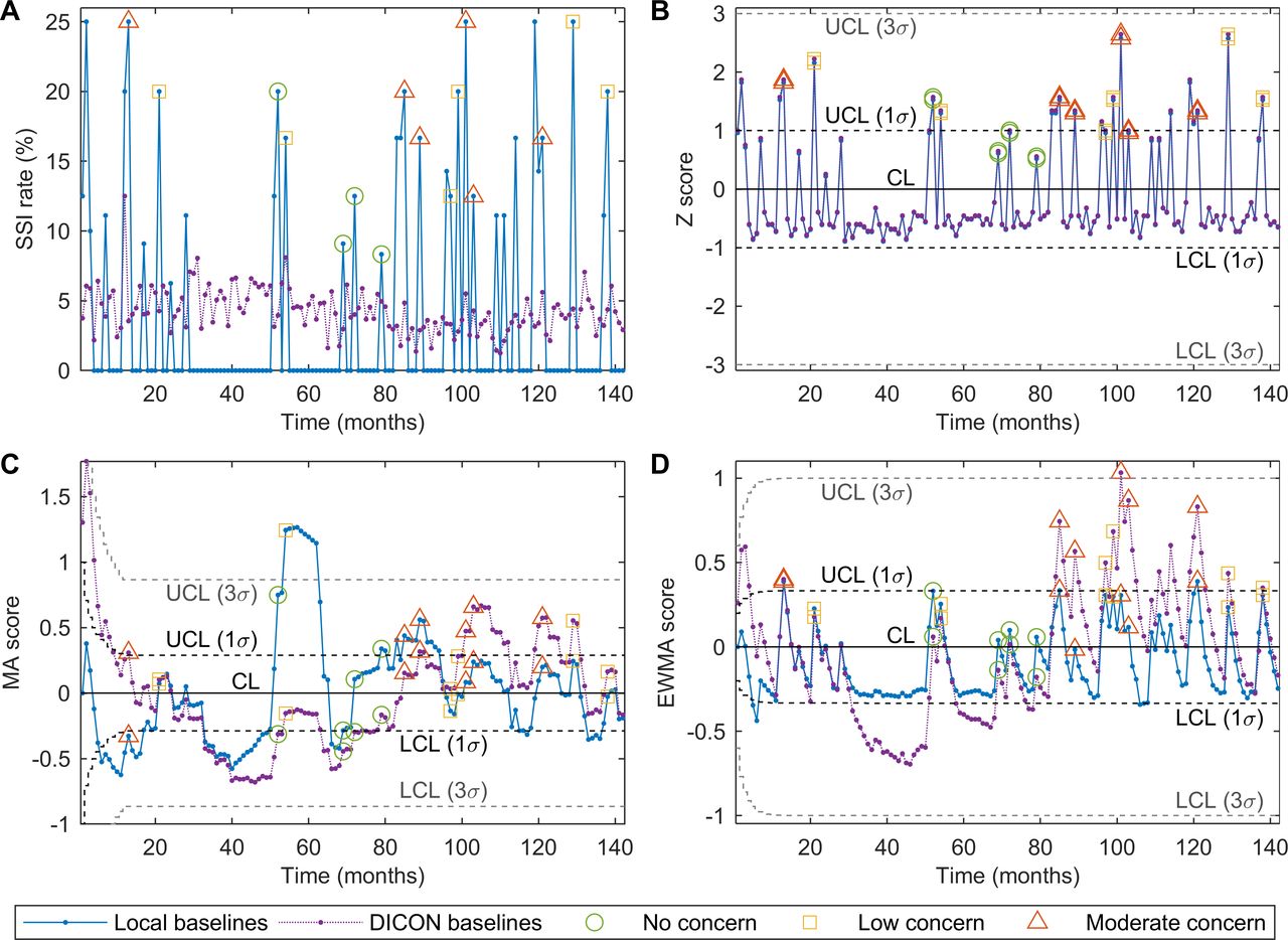
A total of 16 550 different SPC charts were created for the 331 hospital-procedure combinations meeting inclusion criteria, producing 5536 unique statistical signals of potentially important SSI rate increases, with on average 10 charts (SD=11) triggering each signal. A subset of 2709 (49%) representative months (one from every set of consecutive signals) were selected for review by the blinded epidemiologists. Over two-thirds of the reviewed signals were determined to be of no or low concern, with 467 (17%) scored as ‘1’ and 1381 (51%) as ‘2’; 832 (31%) signals were scored as ‘3’ (moderate concern) and only 29 (1%) received the most severe score of ‘4’. Higher scores generally were associated with sustained SSI rate increases. See figure 2 for a typical plot of SSI rates over time (figure 2A) and the same data plotted using Shewhart, MA and EWMA control charts (figure 2B–D).

Example of SPC charts for a representative hospital-procedure combination. (A) Monthly SSI rates for the selected combination and for the same procedure across all other DICON hospitals. No, signals rated as no concern (1); low, signals rated as low concern (2); Med, signals rated as moderate concern (3). (B) Shewhart p-chart using a 24-month rolling baseline window with a 24-month lag and either individual hospital (local) or DICON data to compute reference rates. (C) MA p-chart using a 12-month rolling baseline window with a 6-month lag and an MA span of 12 months. (D) EWMA p-chart using a 6-month rolling baseline window with no lag and a weight parameter of λ=0.2. σ, estimated SD; λ, EWMA weight parameter; CL, centre line; DICON, Duke Infection Control Outreach Network; EWMA, exponentially weighted moving average; LCL, lower control limit; MA, moving average; SPC, statistical process control; SSI, surgical site infection; UCL, upper control limit.
Chart optimisation
A total of 3600 different variations of individual SPC charts and approximately 32.4 million dual-chart combinations were created for each hospital-procedure combination and evaluated for statistical signals, first using phase-1 calculations and in a separate analysis using phase-2 calculations. In both cases, detection rates of clinically important events varied substantially across chart types, ranging from statistical signals being proportionally distributed across all severity levels to signals being predominantly of high clinical severity, and from few signals of any severity to many signals across all clinical severities. Overall, 12 different groupings of chart performance were identified via cluster analysis, with representative examples shown in table 1. Different types of charts, design parameters and baseline data sources tended to identify different signal types, while traditional control widths (3σ) generally were too wide to reliably detect signals of moderate to high severity.
Examples of SPC chart performance
Significant correlations were verified between 12 performance measures both for individual control charts and dual-chart combinations, falling into two groups of closely correlated measures: (1) sensitivity, NPV, F1 score, negative likelihood ratio and average number of signals per month per hospital-procedure combination and (2) specificity, PPV, positive likelihood ratio, markedness, diagnostic OR, and accuracy—and with Youden’s index falling between these two sets of measures. Similar results were observed for the validation dataset; only sensitivity, specificity and Youden’s index therefore were used in subsequent comparison and optimisation, although all measures were computed for secondary comparisons. Figure 3 summarises the sensitivity and specificity trade-offs of every individual and dual chart examined using phase 1 calculations (phase 2 results are discussed below and shown in online supplementary figure S1), with those on the frontier being Pareto optimal to all others—analogous to a receiver operating characteristic curve in the sense that only (and any) charts on this frontier are optimal by other criteria, depending on one’s trade-offs between sensitivity and specificity.
Supplemental material
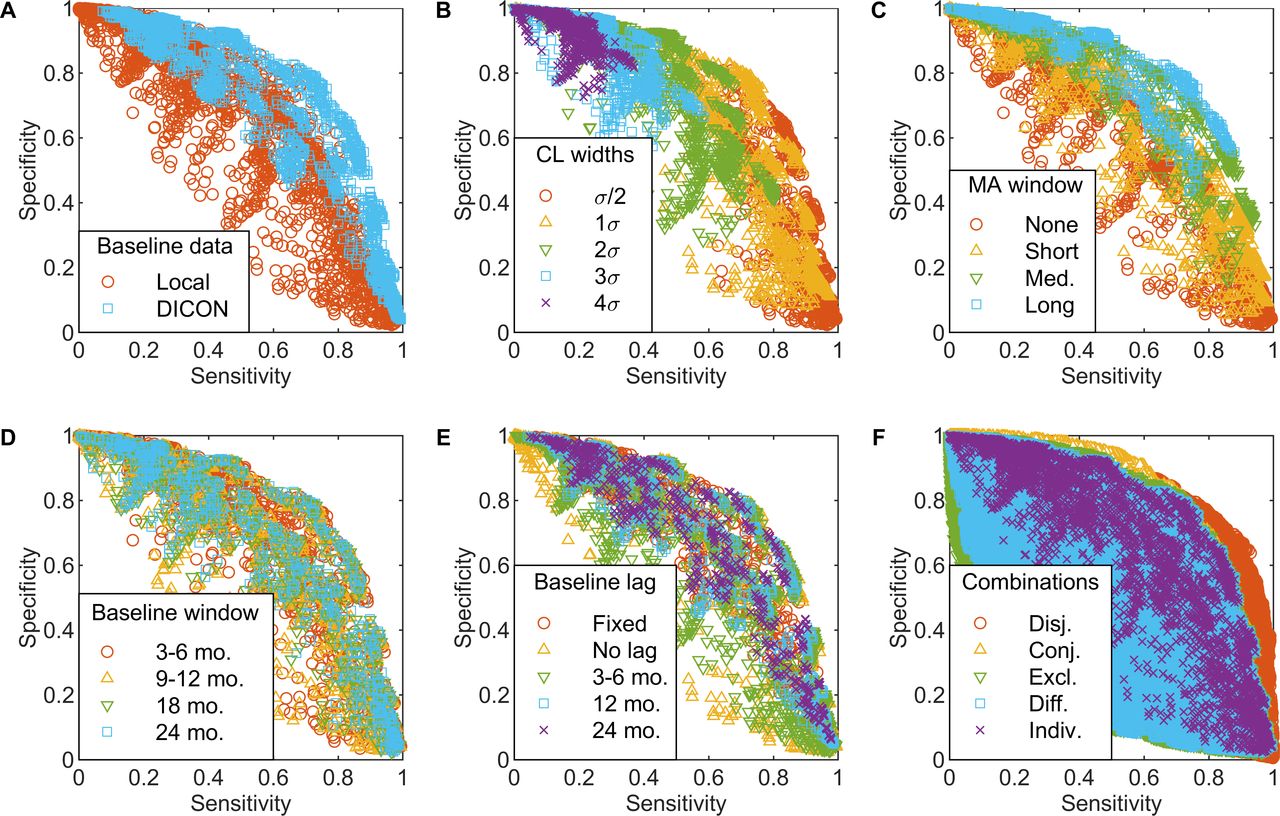
Impact of chart design parameters on chart performance. Sensitivity versus specificity for individual charts (A–E) and dual-chart combinations (F) under various design decisions. Each plotted point indicates the sensitivity and specificity of one chart or pair, with colour and symbol indicating different design parameter values (A–E) or types of dual-chart combinations (F). (A) Baseline data source. (B) Control limit width. (C) MA span and equivalent EWMA averaging horizon. (D) Baseline window size. (E) Baseline lag duration. (F) Types of dual-chart combinations (see Chart Optimisation in Methods section for detailed definitions). σ, estimated SD; Conj., conjunction; DICON, Duke Infection Control Outreach Network; Diff., forward or backward disjunction; Disj., disjunction; Excl., exclusive disjunction; EWMA, exponentially weighted moving average; Indiv., individual charts (shown for reference); Local, individual hospital; MA, moving average; Med., medium; mo., months.
Regression analysis (table 2) found that computing baseline SSI rates via network-wide rather than individual hospital data improved individual chart performance, increasing sensitivity by 0.111–0.121 with negligible effect on specificity (figure 3A). Control limit widths had the second highest impact on chart performance, with each additional σ decreasing sensitivity by 0.193–0.217 and increasing specificity by 0.122–0.239 (figure 3B). Larger MA windows (and, similarly, smaller EWMA weights), shorter baseline periods and rolling rather than fixed baselines generally increased specificity but at the expense of sensitivity, while longer baseline lags slightly improved all performance measures (figure 3B–E). For Shewhart charts, using supplementary within-limit detection rules increased sensitivity by roughly 0.084 while slightly decreasing specificity (table 2). Dual-chart approaches requiring signals by both (conjunction) or either (disjunction) chart, respectively, increased specificity and sensitivity compared with individual charts, while other dual-chart rules performed poorly (figure 3F). In separate regression analysis (not shown), many two-way interaction and quadratic terms also were significant, as might be intuitive (eg, between baseline window size and lag), underscoring the importance of a methodological search to identify optimal combinations of chart parameters together.
Impact of chart design parameters on chart performance
Optimal approaches
Although no single chart type nor set of design parameters performed best on all measures, MA charts generally outperformed Shewhart and EWMA charts for both individual and dual cases (summarised in table 3). The individual charts with the best balance between sensitivity and specificity (upper-right region of data cloud in figure 3A) were MA charts with rolling baseline windows, 12-month spans for the plotted MA and 1σ control limits. The optimal MA chart used medium-term (12-month) network-wide baseline SSI rates with 3-month lag and yielded an average sensitivity of 0.73 and specificity of 0.77 on the training data.
Optimised moving average charts
The best performing dual-chart approach further increased sensitivity to 0.90 and decreased specificity to 0.67 by using two different MA charts that generated a signal when either chart exhibited an out-of-control point (disjunction). The parameters of the first MA chart were very similar to the optimal individual chart, using a slightly different baseline period (18-month window with 6-month lag) but the same baseline data (network-wide), 12-month MA span and ±1σ control limits. In contrast, the second chart used a shorter baseline period (3 months with 3-month lag), but now based on individual hospital SSI data and a shorter MA span (6 months), again with ±1σ control limits. Note that if used alone, this second chart would have high specificity but poor sensitivity, whereas together these charts significantly improved sensitivity with only a minor reduction in specificity compared with the best individual chart.
Although less common in practice, similar results were produced when using phase-2 control chart calculations, again with MA charts generally outperforming Shewhart and EWMA charts, and with nearly identical sensitivity and specificity results as previously (online supplementary table S1). Minor differences were (1) the best individual chart now used a 6-month baseline lag versus previously a 3-month lag and (2) the portion of the best dual-chart based on network-wide baselines now used a shorter baseline period (6 months), slightly shorter lag (3 months) and 2σ limits. The optimal dual-chart again increased sensitivity over the optimal individual chart with again a slight reduction in specificity, although in both cases by a bit less than previously.
Validation
Generalisability of these optimised SPC methods was verified on the independent validation dataset of the most recent year of data. Using a similar approach as for the training dataset, 671 additional signals were identified within this validation data across all hospital-procedure combinations, with 465 (69%) of these signals reviewed by blinded epidemiologists. Results for the primary performance measures for individual and dual charts were highly correlated with the training dataset (figure 4). On average, using phase-1 calculations, specificity was 0.15 higher and sensitivity 0.10 lower for validation versus training data (figure 4A,B). The optimal charts from the training data also performed very well on the validation data: the best individual chart from the earlier analysis now yielded a sensitivity of 0.71 (vs 0.73 for the training data) and specificity of 0.86 (vs 0.77), whereas the best dual-chart now had a sensitivity of 0.88 (vs 0.77) and specificity of 0.75 (vs 0.67) (table 3). Note that while the performance rank of optimal combined chart drops for the training versus validation datasets from 7 to 661 (of 6 478 200 alternatives), this still is in the top 0.01% and in this sense only a minor difference.

Cross-validation results. Performance of individual charts (Indiv.) and dual-chart combinations (Comb.) on validation versus training subsets. (A) Sensitivity. (B) Specificity. (C) Youden’s index (sum of sensitivity and specificity—1).
Discussion
While SPC charts increasingly are used to monitor various healthcare adverse event rates,20 21 little work has been conducted on their empirical validation and performance optimisation. We performed blinded reviews of nearly 3200 signals (across both training and validation sets) to identify an optimised SPC strategy for detecting clinically important increases in SSI. In contrast, most prior investigations of SPC performance used small datasets to conduct comparisons, derived chart properties via statistical theory or based on signal importance for statistical (vs clinical) significance.13 15 16 34 While statistical theory and theoretic performance definitely are important, in his original work developing control charts Shewhart also emphasised the importance of their performance on real data.35 Additional study contributions include our search-based design optimisation and the consideration of multiple types of dual-chart monitoring approaches.
Results indicate that SPC methods (1) are an effective approach to complement traditional epidemiological surveillance and (2) can be optimised for specific infection types. In our SSI application, the optimal approach simultaneously used two MA charts based on different baseline rates (network-wide, individual hospital) and MA spans (long vs short), thereby having complementary strengths—the former for detecting small sustained increases in SSI rates compared with the whole DICON network and the second for detecting large short-term increases compared with that hospital’s own historical performance. Using only the former chart might fail to detect large unsustained SSI increases, whereas using only the latter might fail to rapidly detect small rate increases. This use of two charts together parallels a typical SPC strategy in other industries, such as combining an EWMA or MA chart to detect small sustained changes and a Shewhart chart to detect large changes.30
Detection performance also improved substantially by estimating baselines using a lagged rolling window, in contrast with common practice in typical SPC applications. In many healthcare settings, for example, baseline rates are based on either an initial 24-month baseline period or the last 24 months of data on a rolling basis with no lag.36 37 This practice, however, can be highly insensitive to many types of process changes beyond sudden shifts38 and in our analysis produced among the poorest performance across all 3600 charts examined, with very low sensitivities of 0.13 to 0.34. The optimal lag duration and rolling window size, however, may differ in other settings from those found here depending on the manner and rate by which the data being monitored tend to change over time; that is, fast step changes versus slow drifts. Similarly, using external benchmarks (eg, DICON network data, NHSN benchmark infection rates or others) to estimate baseline rates and control limits can be effective for detecting local SSI outbreaks, contrary to a common misunderstanding that chart limits only should be based on historical data from the same process. Both these findings are important in infection surveillance, as many rates have been trending slowly downwards over the past decade39 and as benchmarking of individual hospitals against external references is a common evidence-based approach for surveillance and feedback.
The tight control limits (±1σ) characteristic of the best performing charts in this study also are a notable difference from standard SPC practice. It is important to note, however, that results are not unilaterally advocating for 1σ limits in all SPC applications. In traditional applications for which the goal is to detect only true rate changes with negligible false positives, 3σ limits generally are (and should continue to be) used for important mathematical reasons.14 In our setting, however, we conversely are more interested in identifying any potentially relevant signals for further investigation since false negatives could have serious patient safety consequences and since the time to investigate false positives is of lesser concern. In such applications, tighter control limits can be appropriate to filter out definite negatives and flag any potential true positives for further investigation.
This study has a few minor limitations. Due to the large amount of data, it was not feasible to evaluate and score all signals produced by all control charts. Instead, in cases with multiple overlapping time periods of signals, the team reviewed only the month with the greatest number of chart signalling. To keep our scope manageable, we also considered only the three most common types of p-charts with distinctly different theoretic performance properties (Shewhart, MA, and EWMA). Other chart types such as cumulative sum and cumulative score also could be examined,24 although these tend to exhibit similar properties as EWMA charts.40 Since some hospital-procedure combinations had small sample sizes, we did not further stratify nor risk adjust data for differences in surgeon, patient severity or pathogen. We additionally assumed observations within a hospital-procedure combination to be independent and identically distributed in the non-outbreak case, ignoring any potential seasonal or autocorrelated natural variation. Finally, inaccuracies within SSI data (eg, over-reporting and under-reporting)41–43 also could affect results, although SSI surveillance data were collected and validated using the same standardised methods across all study hospitals.
Our study represents the largest empirical validation and optimisation of SPC methods in healthcare to date. The optimal chart selection and design parameters outperformed common practice, exhibiting high sensitivity with practical specificity, and demonstrated that well-designed SPC charts can be effective for SSI surveillance. Insights from this study were used to help design an ongoing multisite randomised controlled trial to evaluate prospectively the comparative effectiveness of traditional SSI surveillance with and without SPC charts (NCT03075813); results will be reported in future publications.
Acknowledgments
We thank Dong Yeob Kim, BS, for assistance with data analysis, Katherine Foy, RN, for assistance with study coordination and Brownwen Garner, MD, for assistance with signal adjudication.
References
Footnotes
Funding This study was funded by Agency for Healthcare Research and Quality (R01-HS023821-02).
Competing interests None declared.
Patient consent for publication Not required.
Provenance and peer review Not commissioned; externally peer reviewed.
Data availability statement All data relevant to the study are included in the article or uploaded as supplementary information.