Article Text

Abstract
Objectives Hospital board members are asked to consider large amounts of quality and safety data with a duty to act on signals of poor performance. However, in order to do so it is necessary to distinguish signals from noise (chance). This article investigates whether data in English National Health Service (NHS) acute care hospital board papers are presented in a way that helps board members consider the role of chance in their decisions.
Methods Thirty English NHS trusts were selected at random and their board papers retrieved. Charts depicting quality and safety were identified. Categorical discriminations were then performed to document the methods used to present quality and safety data in board papers, with particular attention given to whether and how the charts depicted the role of chance, that is, by including control lines or error bars.
Results Thirty board papers, containing a total of 1488 charts, were sampled. Only 88 (6%) of these charts depicted the role of chance, and only 17 of the 30 board papers included any charts depicting the role of chance. Of the 88 charts that attempted to represent the role of chance, 16 included error bars and 72 included control lines. Only 6 (8%) of the 72 control charts indicated where the control lines had been set (eg, 2 vs 3 SDs).
Conclusions Hospital board members are expected to consider large amounts of information. Control charts can help board members distinguish signals from noise, but often boards are not using them. We discuss demand-side and supply-side barriers that could be overcome to increase use of control charts in healthcare.
- Control charts, run charts
- Decision making
- Statistical process control
- Governance
Statistics from Altmetric.com
Introduction
Hospitals collect large amounts of data related to quality and safety. This information is presented to hospital board members who have a duty to scrutinise the data to help identify problems with care. However deriving inferences from data is not straightforward. A key issue concerns the role of chance, that is, random variation. There is a need to distinguish a signal (sometimes called special-cause) from noise (common-cause) variation, and it is sometime difficult to distinguish signals from noise purely by visual inspection.1
This article is concerned with the presentation of data in such a way as to help board members make this distinction by identifying the role of chance.2 First we document how quantitative data is presented in National Health Service (NHS) board papers and then discuss potential barriers to representing the play of chance in charts and how they may be overcome.
NHS Hospital Boards
While accountability for hospital safety and quality lies with the whole board, many boards establish special committees dedicated to such purposes, which may have access to more information than is provided to the whole board. The board is supported by an elected council of patient, staff and local resident governors, all reporting up through the NHS infrastructure (Clinical Commissioning Groups, Public Health England and the Department of Health) to the secretary of state for health, with monitoring and regulation provided by other agencies.3
Why focus on charts?
Data relating to quality and safety can be presented in the form of tables or charts. While tables are an excellent presentation method to help decision makers identify past, unique data (eg, what was the infection rate in July?), charts better portray patterns in data (eg, is the infection rate increasing?).4 As quality improvement relies on recognising patterns in data, we concentrate on charts. The following section provides a classification of chart presentations.
Classification of chart presentation methods
Line and bar charts
Line and bar charts are the most commonly chosen presentation methods.5 Line charts better highlight trends across time and bar charts differences between discrete groups (eg, patients, staff, hospitals).6 More complicated charts combine information across time and between groups. The interpretation of information in line and bar charts may be facilitated by including reference indicators, as we now describe.
Reference indicators that do not depict the role of chance
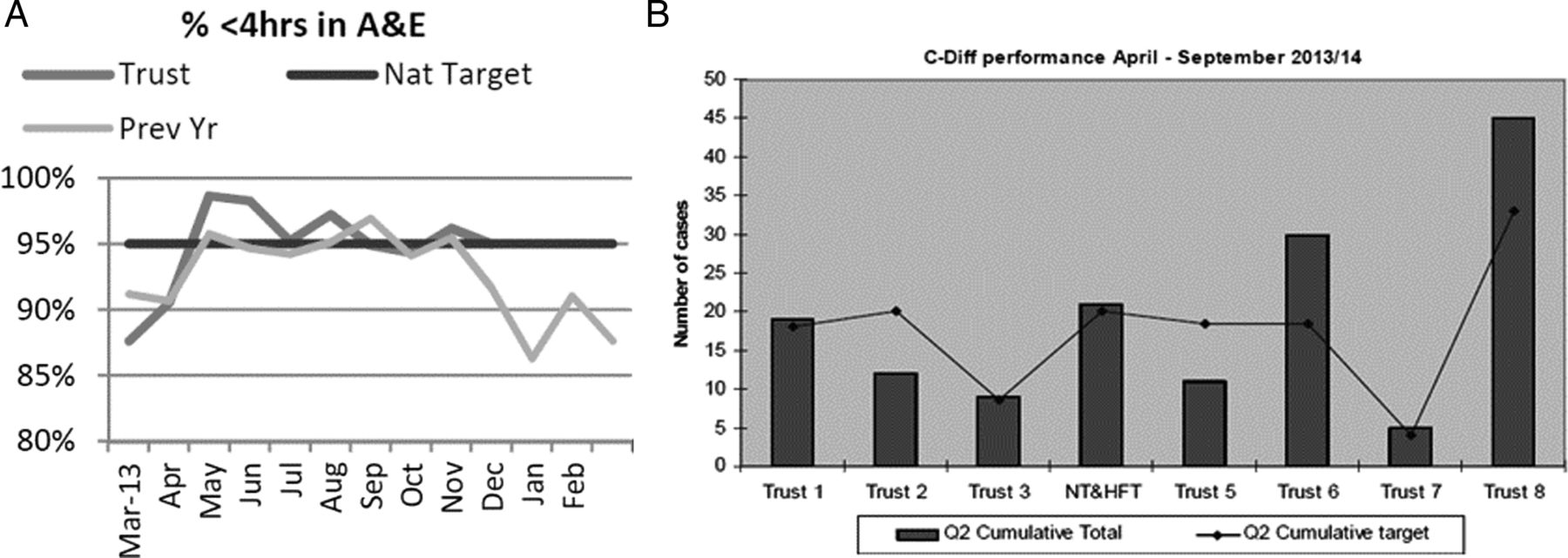
Reference indicators are any features of a chart that helps the user interpret the data. Reference indicators may indicate a standard that is external to the data, for example, a regulator may require that 95% of patients attending an accident and emergency department are seen within 4 h of arrival. Reference indicators of this type facilitate identification of data that exceed preset thresholds.7 Examples of such charts are shown in figure 1A,B. Reference indicators that indicate trends (eg, lines of best fit) reveal patterns internal to the structure of the data. Examples of such charts are shown in figure 2A,B. Neither of these reference indicators depicts the role of chance.

Charts taken from actual board papers with reference indicators depicting a standard that is external to the data (altered to be greyscale). (A) Contains a line chart showing the Trust’s 4 h performance target in the accident and emergency department, the current year, the previous year and the national target of 95%. (B) Contains a bar chart, showing different Trusts’ cumulative C-Diff performances and their respective targets .

Charts taken from actual board papers with reference indicators depicting data trends (altered to be greyscale). (A) Contains a line chart; the unmarked line shows a 4-month linear trend. (B) Contains a bar chart; the line shows the average performance for the previous 12 months, including the 4 months displayed.
Reference indicators depicting the role of chance
There are at least two commonly used types of reference indicators that depict the role of chance graphically: control charts and error bars. Control charts are a presentation method that includes reference indicators that make the role of chance explicit. They were originally developed for use in the manufacturing industry. Their use has since expanded to healthcare.8 Control charts contain at least three reference indicators: a centre line to signify the central tendency of data collected from a working process, and control lines surrounding the centre line to signify variation due to chance. The amount of variation for which control lines account is at the creator's discretion; typically they are placed 2 or 3 SDs from the centre line.9
The idea is that data falling between the control lines are likely to be the result of chance (common-cause variation). Data falling outside the control lines are more likely to be signals (result of special-cause variation).i Control lines act as thresholds based on statistical calculations to help target further investigations efficiently.11 ,12
The horizontal axis for charts making comparisons between groups can be arranged such that data representing the group with the smallest sample size appears first followed by data with increasingly larger sample sizes. This rearrangement causes the control lines to take on a funnel-like appearance, termed a ‘funnel chart’.13
Different methods of presenting the same information on a chart found in an NHS board paper are shown in figure 3. Figure 3A, copied directly from the board paper, is a time-series line chart showing readmission rates by month. In this chart, the peak readmission rate, December, stands out, and so may trigger a board member to call for an investigation. Figure 3B shows the same information remade as a control chart. The peak is still shown, but the addition of control lines contextualises the peak readmission rate as falling within the play of chance at 3 SDs and the lowest datum in May becomes more apparent. In so doing a board member's desire to investigate the high point may wane and their attention to the low point may wax. An example of a chart in board papers that could be remade into a funnel charts (ie, that shown in figure 3B) cannot be shown in the current paper as the necessary information is missing, that is, the sample size from which the data arose. One may note that error bars and control lines both represent dispersion of data, but in different ways. A more complete discussion of the distinction between hypothesis testing and control charts can be found in the literature.14
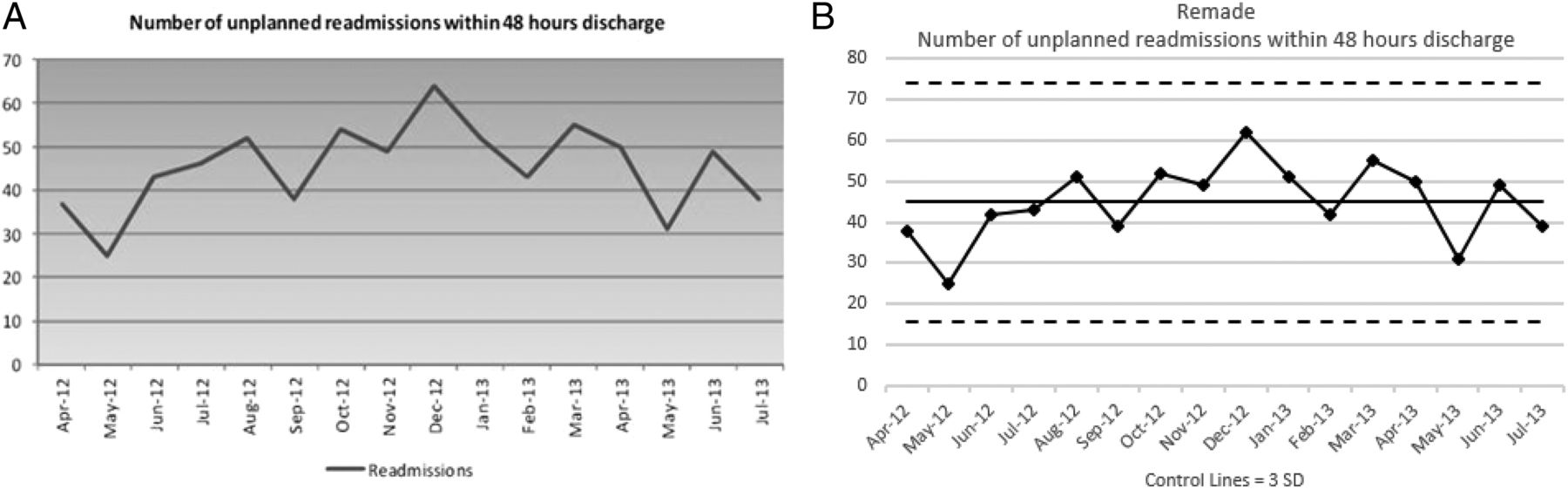
Chart in (A) taken from actual board papers (altered to be greyscale). (A) Contains a time-series line chart showing patient readmissions across months. (B) Contains the same data remade into a control chart at 3 SDs.
Our aim is to survey the quality and safety charts presented in NHS acute care trusts’ board papers. In the following section, we describe the methods by which we obtained and analysed the charts in NHS's publically available board papers according to the described classification system.
Methods
Of the 163 English acute care trusts in the NHS Choices’ service directory, 30 trusts were selected at random.15 Each Trust was assigned a number and then Excel's random number generator was used to generate 30 numbers without replacement. The Trusts for which the assigned numbers were generated were selected. No geographical constraints were applied, but by chance these trusts include all nine historic regions of England, and remain anonymous. After selecting the trust to be included, temporal constraints were applied to ensure the analysis encompassed an entire year (May 2013–April 2014); each selected trust was randomly assigned a month without replacement so that every month was selected at least twice, but no more than three times.ii One board paper from each selected trust was obtained through each trust's website.
Categorical discriminations were performed to understand the contents of the charts in these board papers. The first discrimination noted the charts’ broad content: quality and safety, financial, patient surveys, staff and activity. These categories were informed by past literature on hospital performance measures.16 Further discriminations analysed only the charts containing quality and safety data, using the classification of presentation methods discussed in the introduction (summarised in table 1). All discriminations were performed independently by the first author (KAS) and a coauthor blind to the purpose of this article (JC).
Inter-rater reliabilities
Results
Categorical discriminations
The initial, inter-rater reliabilities were high (average Cohen’s κ=0.94) across the different discriminations and the majority of disagreements were settled after discussion between KAS and JC (average Cohen's κ=0.99). The remaining 11 disagreements were arbitrated by a third author (RJL). More detailed information appears in table 1.
Broad content
In total, 1488 charts were located in the 30 board papers. The median board paper was 148 pages (range=53–456) and contained 39.5 charts (range=0–124). Quality and safety was the most frequent type (Mdn=16, range=0–54), followed by financial information (Mdn=7.5, 0–34), patient surveys (Mdn=4.5, range=0–38), staffing (Mdn=4, range=0–50), activity (Mdn=2, range=0–15) and others (Mdn=0, range=0–27). This article will now focus on those charts presenting quality and safety information.
Quality and safety contents
In total, 589 quality and safety charts were located across the 30 board papers. The median board paper contained 16 charts of this type, but with a wide range of 0–54. The types of quality and safety issues depicted, from most to least common, were: waiting/delays (n=112), incident reportsiii (n=100), healthcare acquired infections (n=99) and mortality (n=85). Categories included less often, from most to least, were: pressure ulcers (n=30), falls (n=27), length of stay (n=19), venous thromboembolism prophylaxis (n=15), readmissions (n=14), cleanliness (n=13), medication errors (n=11) and information related to the management of catheters, urinary or vascular (n=8) (see table 2). The results now presented relate to the 589 charts pertaining to quality and safety.
Quality and safety contents
Classification of presentation methods for quality and safety charts
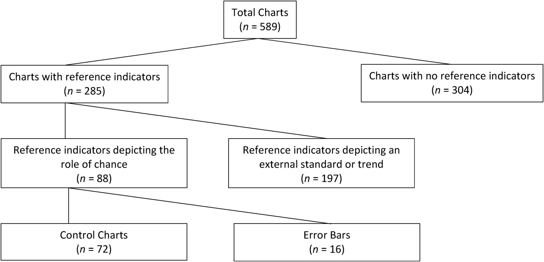
The 589 quality and safety charts will be classified in two different ways: first using the total number of charts as the denominator (eg, 88 charts contained reference indicators that depict the role of chance) and second using the median number of charts appearing in the 30 board papers as the denominator (eg, the median board paper contained one chart depicting the role of chance) (see table 3). Figure 4 shows how the 589 total charts split into those including or not including a reference indicator, whether those indicators represented the role of chance and how they did so.
Chart presentation methods
How the 589 total charts split according to whether they included reference indicators, whether the reference indicators highlight the role of chance and how the role of chance was displayed.
Line and bar
Of the 589 charts dealing with quality/safety, over half were line charts (n=347 (58.9%) Mdn=8) and approximately a quarter were bar charts (n=158 (26.8%) Mdn=4). Charts including both lines and bars or other formats, for example, pie charts, were much less common (ns=33 (5.6%) and 51 (8.7%), respectively, Mdns=1).
Performance across time and between groups
Of the 589 charts, most displayed comparisons across time (n=413 (70.1%) Mdn=9), followed by charts presenting comparisons both across time and between groups (n=112 (19.0%) Mdn=1) and those comparing groups, for example, wards or hospitals, at a given time (n=64 (10.9%) Mdn=1).
Reference indicators not depicting the role of chance
There were 285 charts that included reference indicators. Of these, 197 (69.1%, Mdn=4.5) did not depict the role of chance. Of these 197 charts, 137 (69.5%, Mdn=2) depicted an externally imposed standard and 38 (19.3%, Mdn <1) depicted a trend. An even smaller number of charts (22 (11.2%), Mdn <1) displayed both standards and trends.
Reference indicators depicting the role of chance
Of the 285 charts that included reference indicators, only 88 (30.9%, Mdn=1) highlighted the role of chance. Of the 88 charts depicting the role of chance, 16 (18.2%, Mdn<1) included error bars and 72 (81.8%, Mdn<1) included control lines.
Of the 30 board papers, only 17 (56.7%) board papers displayed any charts depicting the role of chance. Nine board papers included at least one chart with error bars and 14 included at least one control chart. Thus over half of the board papers did not contain any control charts.
Of the 72 control charts, 40 (55.6%, Mdn <1) featured time-series and 32 (44.4%, Mdn <1) between-group comparisons. Only six of the control charts specified the control limits (eg, 2 vs 3 SDs). Certain types of quality/safety indicators were more likely to be featured as control charts. Of the 40 time-series control charts, the most frequently occurring contents in order, from most to least, include: safety incidents (n=11), mortality (n=11), infection (n=7), waiting (n=4), pressure ulcers (n=2), length of stay (n=2), medication errors (n=1), falls (n=1) and the number of times patients were moved (n=1). Of the 32 between-group control charts, 16 charts, all from one board paper, used straight lines to compare infection or infection rates between hospitals. The remaining 16 between-group control charts were all funnel charts. The contents of these charts included, in order from most to least: mortality (n=11), incidents (n=2), infection (n=1), doctor-to-patient ratios (n=1) and knee replacement outcomes (n=1).
Discussion
This article surveyed the quality and safety charts presented in 30 NHS acute care trusts’ board papers. To our knowledge this is the first article describing how such information is presented to boards. The quality and safety charts available in these papers differed quantitatively and qualitatively. Although not the intended focus of this research, the wide variation in the number of charts is surprising (range 0–124), suggesting that there is little consensus on the quantity and types of information that should be presented to the board in graphical form. It is plausible that the number of charts, specifically depicting summative incidents, reflect an open culture conducive to safety.
The role of chance was rarely depicted and where it was depicted, the charts were silent as to where the control lines had been set. This is suboptimal because without this information the role of chance is easily overlooked and common-cause variations can be misdiagnosed.17
Our results pertain to England and whether these findings apply elsewhere is unanswered. We hope that our study will provoke investigation of how charts are presented to decision makers (and whether or not the role of chance is depicted). Our focus on English hospitals may seem solipsist at first glance, since it is focused on but one issue in but one country. However, the results speak to broader issues of public engagement in science and statistics. The hospital board is one of many places where citizens and managers need to be numerate in order to take a view on issues that affect them.
While both control lines and error bars convey the role of chance, there are reasons to prefer control lines. Error bars allow performance measures to be compared, but this often cannot be accomplished by visual inspection alone since inferences require an accompanying statistical test. In contrast, control charts allow the reader to use visual inspection to derive statistical inferences without separate statements of statistical significance. Further, error bars are poorly understood by lay people and academics alike.18 By comparison control charts are a ‘powerful means of communicating results to lay audiences or clinical personnel who are unfamiliar with statistical tests, probability values, effect sizes, and confidence intervals’.19
Some readers may note that analyses of time-series line charts, that is, run charts, can be guided by four rules, wherein an unusual pattern is designated by a: (1) shift, (2) trend, (3) run or (4) astronomical point in the data series.20 Precise definitions are available for the first three rules and no reference indicators are needed (eg, a trend is five or more consecutive points all going in the same direction). These rules are based on a false positive rate of 0.05 for normally distributed data. Encouragingly, board members could be taught to identify these patterns. The last rule however depends on chance variation which can often be difficult to discern without control lines.21
Our data do not explain why control charts are seldom used. We postulate that this could be due to an issue in demand (board members not requesting the data on control charts) and supply (staff are not able to supply the data in this format).
Demand
Barrier 1: Board members may not be aware of control charts
As the use of statistical process control is relatively new in healthcare, it may not have been part of many board members’ formal education.22 This is a barrier because if board members are not aware of control charts, they do not have the capability to request them.
Recommendation 1:
Active education may overcome this barrier. These efforts could take the form of a brief tutorial at a board meeting and/or instructional annotations on control charts as they are added to board reports. An introduction to control charts should be offered to new board members as part of their induction, at least until control charts become commonplace in healthcare. More generally, citizens need to understand simple statistical information to make more informed decisions about their care.
Barrier 2: Board members may not feel comfortable in their ability to interpret control charts
While we might expect board members to have more experience and knowledge of typical charting techniques, they might be unfamiliar or uncomfortable with the interpretation of such control charts, particularly regarding control lines.
Recommendation 2:
This barrier may be overcome initially by providing text or annotations to the charts to highlight when data are likely special-cause data. However, we worry that such text might overshadow the most important information, that is, the data. In time it would be preferable that board members were empowered to identify special-cause data themselves. This is also a capability issue which again may be addressed through training. Below we now briefly propose information these educational efforts should include.
Control lines, which are typically dashed lines, are often set 3 SDs above and below the centre line. This placement ensures that there is a small chance that an investigation of a signal will be unjustified. However, more cautious board members may consider this suitable for industrial uses but too stringent for healthcare, preferring a 2 SD control line.23 Such a practice increases the chance of a false positive signal more than many realise. Up to 25% of data can be located beyond 2 SDs (Chebyshev’s inequality).24 A common-sense approach may be to include control limits of both 2 and 3 SDs. Determining where the control lines are set on charts for different measures should reflect the cost of investigation and the cost of not investigating, in terms of money, quality and safety. This is a question of judgement and cannot be resolved statistically, and it will vary from one type of measure to another.
Supply
Barrier 1: Staff may not know how to create control charts
Assuming staff know what control charts are, a reason staff do not provide control charts may be that they do not have the practical tools to do so at their fingertips—a question of opportunity.
Recommendation 1:
Staff should be encouraged to use to computer software to help them create control charts. However while numerous software tools exist, many are likely to cause more frustration than aid because they are unfamiliar, expensive and create files that can only be shared if others have the same program (eg, SPSS, Minitab, Sigma 6). Using a more common program such as Excel might be easier for an organisation first exploring control charts. Staff familiar with Excel's functions can set up templates for other staff to use. Another option is to install an Excel add-in, either at a cost or using peer-reviewed freeware.25
Barrier 2: Staff are not confident they have a sufficient number of data points to construct a control chart.
Another reason staff may not provide control charts is that they do not think they have a sufficient amount of data points to plot on the chart.
Recommendation 2:
While recommendations vary, a desirable number of data points required to set up the control lines ranges from 10 to 35.26 The number of data points available to hospital staff often fall outside this range. The number of data points considered within a control charts can often be increased or reduced, for instance, by looking at shorter/larger time intervals and carefully aggregating data (eg, plotting data by week rather than by day). As the number of available data can only be increased by collecting it more frequently, we urge hospitals to use automatic tools to record data as frequently as possible. For rare events, special control chart techniques have been described by Woodall and Driscoll.27
Barrier 3: Staff are not confident they are selecting the correct type of control chart
Staff members may fail to use a control chart because they are uncertain which control chart is best.
Recommendation 3:
Perfection should not become an enemy of the good. Fears about selecting the wrong chart may be mitigated by realising that underlying principles are similar across different types. There are seven basic control charts types: Xbar, XmR, XmS, C, U, P and NP. As a default, we recommend using a XmR chart, which has proven robust for most time-series data and is a good place to start.28 Many more sophisticated varieties are available, for example, CUSUM and EWMA, for those who are comfortable with the basic types of control charts.29 The table in the online supplementary appendix 1 (adapted from Steven Wachs, Integral Concepts) may be used to help select an appropriate control chart for different dimensions of quality and safety. Other decision tools are available in the literature.30 ,31
Supplemental material
A more fundamental issue relates to the importance of stating where the control lines have been set. Few of the control charts we located in board papers indicated where the control lines had been set. This is a concern because if the board members do not know where the control lines are set (eg, 2 or 3 sigma), they cannot assess the chance of making type 1 and 2 errors in their decisions.
Of course board members’ decisions should not be solely influenced by information provided in charts. Rather such data should be contextualised in the other information available to the board. For example, if pressures sores increase within a ward but not enough to breach the upper control line, the board may want to consider the nurse-to-patient ratio in that ward before ultimately deciding whether further action is warranted. Further research is indicated not just for how decision makers can make the best use of statistical information within a single dataset but also on how information across multiple datasets can be synthesised to inform decisions.
Conclusion
In summary, NHS board papers in England contain many quality and safety charts. Unfortunately, few of these charts allow board members to appreciate the role of chance in the data. To our knowledge, this is the first report documenting the types of charts used to present data to hospital boards. While the control charts are increasingly being used to monitor health-related variables around the world, we suspect that they are still underused in many countries (and look forward to seeing such comparisons).32 The introduction of control charts into NHS board papers is a simple process that would greatly improve board members’ ability to consider the role of chance in their decisions, and ultimately provide better management for patient care.
References
Footnotes
Correction notice This article has been updated since it first published Online First. Figure 3 has been updated.
Contributors RJL was the project's inspiration. He obtained the grant and guided the project throughout. KAS was the chief front-line researcher who gathered and organised the data, and drafted and amended the manuscript. AJP contributed to the manuscripts with respect to the theoretical basis underlying and practical use issues regarding control charts. JC collaboratively reviewed the charts with KAS. N-BK helped develop the manuscripts inclusion of the many types of control charts that may be used in healthcare settings. IV helped develop the paper in the final stages.
Funding The project was supported by West Midlands Academic Health Science Network (AHSN) and the National Institute for Health and Research (NIHR) under the Collaborations for Leadership in Applied Health Research and Care (CLAHRC) programme, North West London and West Midlands.
Disclaimer The paper presents independent research, and the views expressed are those of the author(s) and not necessarily those of the AHSN. This article presents independent research commissioned by the National Institute for Health Research (NIHR) under the Collaborations for Leadership in Applied Health Research and Care (CLAHRC) programme, North West London and West Midlands. The views expressed in this publication are those of the author(s) and not necessarily those of the NHS, the NIHR or the Department of Health.
Competing interests None declared.
Provenance and peer review Not commissioned; externally peer reviewed.
↵i When considering time-series data, special-cause variations are also indicated when data series follow a statistically aberrant pattern, such as five data points all ascending or descending. Using multiple sets of control lines can facilitate the identification of some such patterns. For additional information, see Champ et al.10
↵ii As some trusts do not meet every month, a month could be randomly selected that was not available. When this occurred, trusts’ months were exchanged. For example, Trust 1's randomly selected month may have been December, but during that month there was no board meeting. In addition, Trust 2's randomly selected month may have been February. If Trust 1 had a February meeting and Trust 2 had a December meeting, then their selected months were exchanged. Accordingly, Trust 1's month was now February and Trust 2's was now December. If Trust 2 also did not have a December meeting, then Trust 3 would have been considered.
↵iii Incidents reports include any graph which was an amalgamation of specific instances without specifically stating the type of incidents included, such as harm free days and serious incidents requiring investigation.