Article Text

Abstract
Objectives: A problem can arise when a performance indicator shows substantially more variability than would be expected by chance alone, since ignoring such “over-dispersion” could lead to a large number of institutions being inappropriately classified as “abnormal”. A number of options for handling this phenomenon are investigated, ranging from improved risk stratification to fitting a statistical model that robustly estimates the degree of over-dispersion.
Design: Retrospective analysis of publicly available data on survival following coronary artery bypass grafts, emergency readmission rates, and teenage pregnancies.
Setting: NHS trusts in England.
Results: Funnel plots clearly show the influence of the method chosen for dealing with over-dispersion on the “banding” a trust receives. Both multiplicative and additive approaches are feasible and give intuitively reasonable results, but the additive random effects formulation appears to have a stronger conceptual foundation.
Conclusion: A random effects model may offer a reasonable solution. This method has now been adopted by the UK Healthcare Commission in their derivation of star ratings.
- over-dispersion
- risk stratification
- random effects model
- performance indicators
Statistics from Altmetric.com
Quantitative performance indicators are increasingly being used to monitor providers of health care, particularly when comparing each “institution”—which may be a health authority, hospital, or even an individual surgeon—against a “standard” or “target”, which may be externally imposed or simply an average rate. A common technique for making such comparisons is to produce a confidence interval for the (possibly risk adjusted) performance in each institution and to compare it with the standard—for example, the New York State Department of Health compares individual surgeons and hospitals against the state-wide average mortality rate for coronary artery bypass graft surgery.1 It is natural to present such analyses as “forest” or “caterpillar” plots similar to those commonly used in meta-analysis. Figure 1A shows 95% confidence intervals for 30 day mortality in 25 hospitals conducting bypass grafts in England in 2002–2003,2 in which the standard is the national average (these and all other data in this paper can be downloaded from Commission for Health Improvement (CHI)3 which contains full details of the construction of the indicator and the names of all institutions).

30 day mortality following coronary artery bypass grafts in 25 English NHS acute trusts, 2002–2003.2 (A) A “forest” plot showing 95% confidence intervals compared with the “target” overall average rate. (B) A “funnel” plot of observed rate against number of operations showing trusts that differ from the target at the two sided p<0.05 and p<0.002 levels, essentially corresponding to 2 and 3 standard deviations from the target.
An alternative way of presenting such data is by a “funnel” plot, which has been recommended as a means of avoiding the rather spurious ranking explicit in caterpillar plots and is used in an increasing number of applications;4–9 it also avoids any difficulties assigning 95% intervals for low counts. This plots the observed indicator against a measure of its precision (typically the sample size), superimposes the target as a horizontal line, and indicates thresholds at which the observed indicator is significantly different from the target; 95% and 99.8% limits correspond to testing whether the observation is significantly different from the target at the two sided p<0.05 and p<0.002 levels. This relates to the use of control charts10 which typically use 3 standard deviations as indicating a system is not “in control”: 3 standard deviations essentially corresponds to the 99.8% limits and 2 standard deviations to 95%. The two sets of limits might be taken as indicating a “warning” and an “alarm”.
A funnel plot of the English data on coronary artery bypass grafts is given in fig 1B, showing five hospitals in the “warning” sector and one “alarm”. It needs to be strongly emphasised that these indications take no formal account of the multiple comparisons implicit in the funnel plot and that crossing a threshold does not indicate high or low “quality”, but it may be useful to investigate reasons for the apparent discordance.
OVER-DISPERSION
Figure 2 shows readmission rates within 30 days following discharge from hospitals in England.11 The pattern is clearly different from that of fig 1 in that the majority of hospitals now lie outside the 99.8% threshold indicating “in control” institutions; the number lying in each of the five bands formed by the four control limits is shown in row 2 of table 1.
Emergency readmission following discharge from 140 English hospitals, 2002–2003. Results of a banding procedure that classifies institutions according to the thresholds indicated on the funnel plots

Emergency (within 30 days) readmission rates following discharge from 140 NHS acute trusts, 2002–2003.11
This clearly illustrates the phenomenon of “over-dispersion”, in which the observed variability cannot be attributed to chance and a few divergent institutions. This typically arises when there is insufficient risk adjustment; there are many small institutional factors that contribute to excess variability and these may not be particularly important nor indicate poor quality care. The consequence is that, if one is not careful, the majority of institutions can be labelled as abnormal and this appears a contradiction in terms. The procedure used by the CHI (which since April 2004 has become part of the Healthcare Commission) for banding trusts in 2003 closely resembled this process,3 and gave rise for this indicator to the bandings shown in row 1 of table 1 which, in turn, contributed to the “star rating”. Essentially, although the differences highlighted may be statistically significant from the national average, they are not practically significant in the sense of systematically differing from the inevitable distribution of performance seen in the bulk of institutions, and this led to an excess of institutions in 2003 being placed into band 1 and band 5 for this indicator. This behaviour suggests that the indicator is not measuring a homogeneous quantity across institutions, and the basic process is not “in control” in the traditional language of control charts. Another important example is the severe over-dispersion found when analysing general practice mortality rates in a retrospective assessment of the feasibility of detecting serial murderer Dr Harold Shipman.12
Possible ways of handling this problem are discussed below, together with its application in population based indicators. Technical details of all the techniques are given in the online Appendix (available at http://www.qshc.com/supplemental), and full details for the funnel plots are provided in a paper by Spiegelhalter.9
Throughout this paper it is assumed that the aim is to identify “divergent” performance from an overall standard or target following the ethos of the star rating exercise carried out by the CHI (now the Healthcare Commission). More subtle exercises, such as driving quality improvement through careful monitoring of indicators within institutions over time, may also benefit from over-dispersion but are not considered here.
OPTIONS FOR DEALING WITH OVER-DISPERSION
Do not use the indicator
The fact that the underlying process does not appear to be “in control” suggests a careful examination of whether the indicator is a suitably cost effective and sensitive instrument to use to compare institutions, since the factors that generate variability between institutions do not appear to be well understood, at least to the extent that they can be adjusted for. However, some indicators may be of such salience that this is not an option.
Improve risk stratification
It may be possible to measure factors that are contributing to the excessive variability and hence bring the process under “control”. For example, finer procedure grouping could be used in the measurement of readmission rates. While this should, of course, be pursued, it is unlikely to be wholly successful in all contexts. In particular, the readmission rate indicator is already constructed with a complex adjustment using health related groups11 and it is doubtful if further refinement will be beneficial.
Analysis by clustering
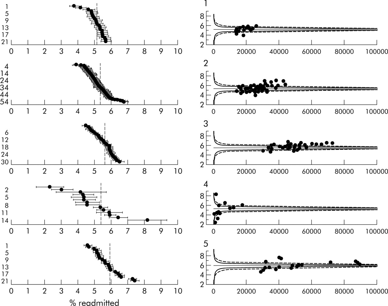
Rather than making a simultaneous comparison between all institutions, it may be possible to “cluster” them into more homogenous groups so that one is comparing “like with like”. Such “benchmarking” can be considered a form of risk stratification in which the cluster, which clearly needs to be defined in advance, is treated as a risk factor.
Figure 3 shows readmission rates broken down by the five types of NHS trusts provided by CHI in their data. The plots show that the few acute specialist hospitals have a very distinct pattern, being smaller and having both extreme high and low rates. For example, the two lowest rates belong to trusts specialising in cancer (Christie Hospital, 2.2%) and neurology and neurosurgery (Walton Centre, 3.0%), while the highest rate is for Birmingham Women’s Health Care trust (8.1%) which may operate a deliberately open door policy.

Readmission rates in acute trusts stratified by type of trust. (1) Small acute or multi-service. (2) Medium acute or multi-service. (3) Large acute or multi-service. (4) Acute specialist. (5) Acute teaching.
Figure 3 suggests there is little reduction in over-dispersion by clustering trusts, and row 3 of table 1 shows that clustering does not make much difference to the bandings.
Using an interval as a target
One could view the problem as arising from the fact that all institutions are expected to adhere to a precise target instead of allowing a “normal range”. Such an interval could be an explicit judgement of what constitutes an acceptable range of performance, or be based on the empirical distribution of indicators in previous years. It could even be set to provide a reasonable number in each band; this forces a preset proportion of institutions to be “abnormal” which might be appropriate if, for example, there were limited resources for further investigation.
Figure 4A shows the application of this procedure to the readmission data where the interval is (somewhat arbitrarily) set as the overall rate of 5.5±0.5% (that is, a 10% relative interval), giving a target interval of 5–6%. Overlap with the ends of this interval is then assessed in exactly the same way as with a point target.
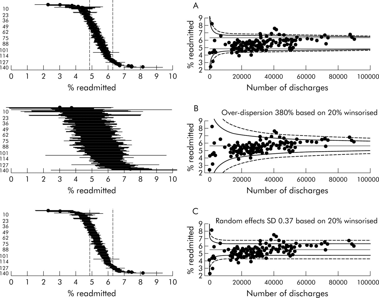
(A) Assuming an “acceptable range” of 5–6% in performance and assessing deviations from the top and bottom of the interval. (B) Allowing multiplicative over-dispersion to expand the funnel limits by a factor √φ. (C) An additive random effects model in which the population standard deviation τ is used to change the point target into a distribution. The caterpillar plot shows a target range given by the mean ±1.96τ.
This option is simple to implement but could appear somewhat arbitrary. Row 4 of table 1 shows that, although the bulk of trusts now lies in the “average” category, few are placed in categories 2 and 4. The funnel plot makes the reason for this clear: there is minimal use of the sampling variability in each trust.
Estimating an over-dispersion factor
A standard “quasi-likelihood” approach to statistical models that do not adequately fit the data is to expand the variance associated with each observation by a fixed factor; this essentially reduces the effective sample size on which the rate is based. The degree of over-dispersion, denoted φ, can be fairly easily estimated from the data13 using a technique described in the online Appendix (http://www.qshc.com/supplemental). We are interested in estimating the over-dispersion of “in control” institutions so, ideally, any divergent ones should be excluded from the estimation process since otherwise they may exert undue influence over the estimate and lead to their own behaviour appearing less extreme. If it is not feasible to select a set of “in control” institutions, then φ should be estimated using a robust technique that avoids outlying institutions having a strong effect. A simple method is described in the online Appendix in which a certain proportion of the data are “Winsorised”—that is, pulled in to less extreme values.
Figure 4B shows the resulting funnel plot and row 5 of table 1 shows the resulting banding. The “expanded” funnel fits the data better and now does not identify the low volume/low rate set as being particularly odd. The numbers in each band seem reasonable.
The over-dispersion factor could be (provisionally) based on data from previous years, which also allows the precise technique to be adapted to have the desired behaviour.
Assuming a random effects model
This method assumes that each institution has its own true underlying rate (the “random effects”), which themselves are distributed around the overall average with a standard deviation denoted τ. We specify an “in control” distribution of these random effects and identify discordance with that distribution using a simple adjustment to the standard p value technique. This procedure acknowledges that, for somewhat heterogeneous indicators based on large numbers of cases, there are inevitable between-institution differences that are not of practical significance. Essentially, the range explored in “Using an interval as a target” (discussed above) is replaced by a distribution which is intended to describe unavoidable variability between the bulk of institutions. The resulting funnel plot is a compromise between the two previous options: wider for small sample sizes and tending towards a constant width for larger sample sizes, but with substantial band width. Figure 4C shows the resulting funnel plot and row 6 of table 1 shows the resulting banding, both of which appear quite reasonable.
There is a danger that the very institutions one is trying to detect could be “accommodated” by such an approach, and it is therefore important that robust methods are used to estimate the standard deviation of the random effects distribution. A simple extension of the formula used for calculating the over-dispersion factor is appropriate.14 Again the parameters could be provisionally based on previous data.
POPULATION DATA
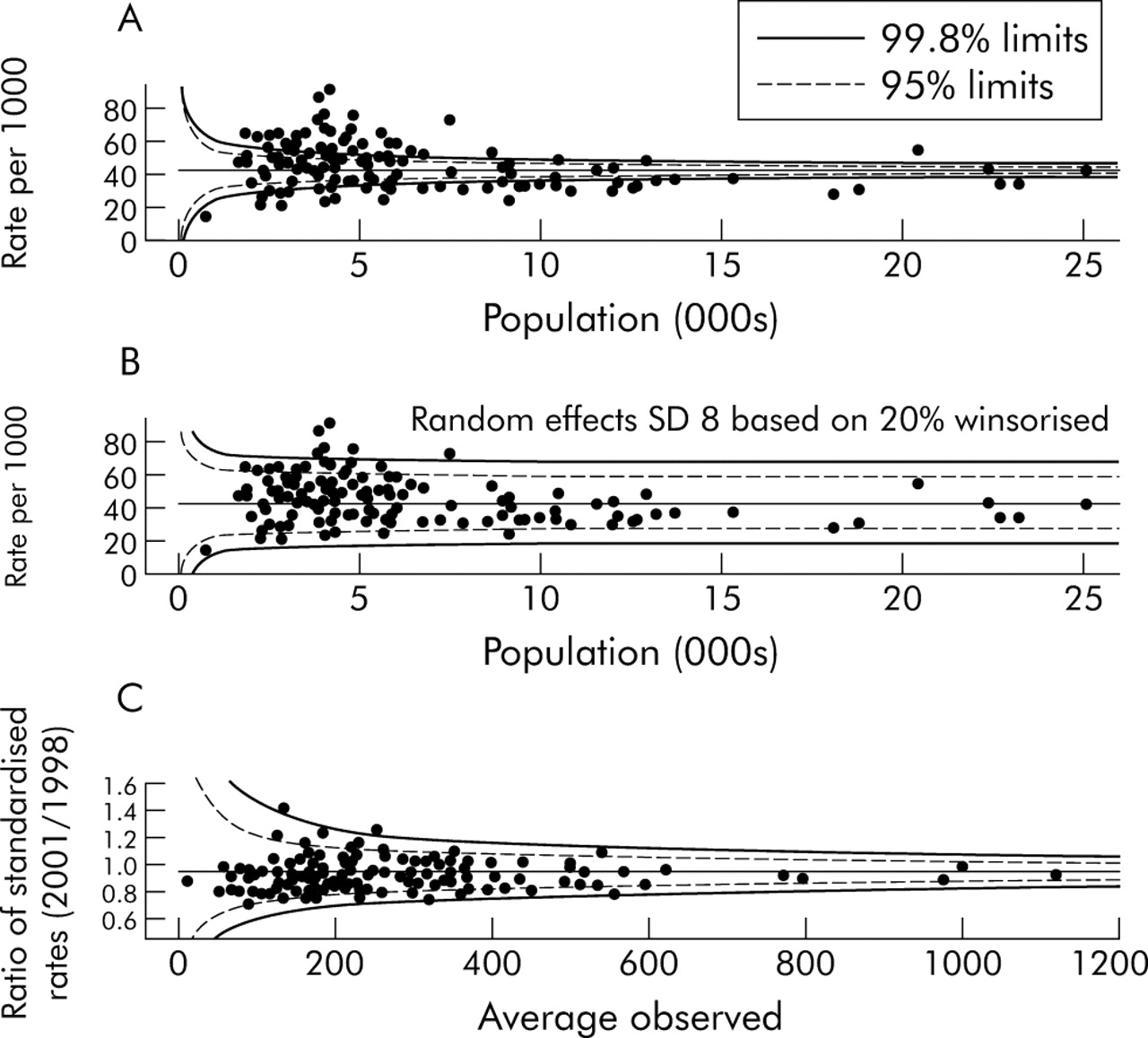
These techniques can also be applied to population based data when comparing, for example, health authorities with regard to public health performance indicators. Figure 5A is a funnel plot of standardised incidence ratios for teenage pregnancy in English health authorities in 2000–2001,15 showing substantial over-dispersion even for authorities with small expected numbers. Applying the random effects approach to these data leads to fig 5B which shows a reasonable fit and plausible bandings, Lambeth and Southwark being the areas with the highest rates.

(A) Under 18 conception rate for English health authorities, 2000–2001.15 There appears to be a “volume effect”, with larger authorities having lower pregnancy rates. (B) A fitted random effects model. (C) Change in teenage pregnancy rates between 1998 and 2001 showing that no allowance for over-dispersion is necessary. Redbridge and Haringey primary care trusts are those above the upper “alarm” threshold.
The primary indicator used by CHI was in fact the change in teenage pregnancy rates, for which a government target of 15% reduction between 1998 and 2001 has been set. This indicator leads to fig 5C, which shows no evidence of over-dispersion.
The substantial cross sectional over-dispersion combined with the “in control” nature of the improvements over time suggest that, while there are strong influences on teenage pregnancy rates that are not being adjusted for, the drivers for change are reasonably common to all health authorities.
As an additional observation, it is interesting that for both readmission rates and pregnancy there appears to be an indication for a volume effect, with smaller hospitals having lower readmission rates and smaller authorities having higher pregnancy rates. This is not investigated further here, except to point out that a funnel plot serves to highlight such relationships.6
DISCUSSION
It could be argued that substantial over-dispersion is an adequate reason for dropping an indicator. If the indicator is retained, then an effort should be made to understand the reasons for the variability and to adjust accordingly. Nevertheless, situations will arise when there is still residual over-dispersion and it is desirable to have a simple statistical method for estimating the degree of over-dispersion and adjusting the control limits.
Our current preference is for the random effects model, as this seems best to mimic the belief that there are unmeasured factors that lead to systematic differences between the true underlying rates in institutions. We also note that with longitudinal data it is possible to choose empirically between additive random effects models and multiplicative over-dispersion models using standard analysis of variance techniques. This technique was in fact adopted as part of the production of the UK Healthcare Commission’s “star ratings” for 2003–2004.16
A logical consequence of the random effects formulation that we have not explored here is that estimates of the rates in individual institutions should really now be “shrinkage” estimates, in which the observed results are pulled in towards the overall average by a degree that depends on both the between-institution and within-institution variability17,18 using either an “empirical Bayes” or a full Bayes technique. Such estimates have been recommended as automatically dealing with the phenomenon of “regression to the mean”, whereby extreme behaviour tends to return to closer to the norm since a component of that extremeness is likely to have been a run of either good or bad luck. It remains to be seen whether such estimates will be generally comprehensible and acceptable to the institutions themselves.
Finally, it should be acknowledged that the type of banding exercise described here is not a “hard” science. Different techniques give different results and it would be quite inappropriate if a change in one band led to severe differences in consequences. This is similar to the danger of considering the crossing of the “magic” p<0.05 barrier as being the arbiter of a positive scientific study but, in the context of performance indicators, there is an even greater potential for misinterpretation as the indicator is only a proxy for some underlying idea of “quality”.
Acknowledgments
The author thanks the staff at the Healthcare Commission for all their help in the development of this work, including Martin Bardsley, David Cornwell, Ian Blunt, Theo Georghiou, Anne Maclaren and Adrian Cook. All views expressed in this paper are personal and do not necessarily reflect official policy.
REFERENCES
Supplementary materials
The appendix is available as a downloadable PDF (printer friendly file).
If you do not have Adobe Reader installed on your computer,
you can download this free-of-charge, please Click hereFiles in this Data Supplement:
- [view PDF] - P-values, Z-scores and funnel plots.