Article Text

Abstract
There is considerable interest in the use of statistical process control (SPC) in healthcare. Although SPC is part of an overall philosophy of continual improvement, the implementation of SPC usually requires the production of control charts. However, as SPC is relatively new to healthcare practitioners and is not routinely featured in medical statistics texts/courses, there is a need to explain the issues involved in the selection and construction of control charts in practice. Following a brief overview of SPC in healthcare and preliminary issues, we use a tutorial-based approach to illustrate the selection and construction of four commonly used control charts (xmr-chart, p-chart, u-chart, c-chart) using examples from healthcare. For each control chart, the raw data, the relevant formulae and their use and interpretation of the final SPC chart are provided together with a notes section highlighting important issues for the SPC practitioner. Some more advanced topics are also mentioned with suggestions for further reading.
Statistics from Altmetric.com
There is considerable interest in the use of statistical process control (SPC) in healthcare.1–5 While SPC is part of an overall philosophy aimed at delivering continual improvement, the implementation of SPC usually requires the production of control charts.1 Since SPC is relatively new to healthcare and does not routinely feature in medical statistics texts/courses, there is a need to explain some of the basic steps and issues involved in selecting and producing control charts.1 The case for SPC has been made previously16; here we show how to plot control charts. With the help of illustrative examples, this paper aims to provide guidance on the selection and construction of control charts that are relevant to healthcare. Some more advanced topics will also be mentioned with suggestions for further reading.
The primary objective of using control charts1 is to distinguish between common (chance) and special (assignable) causes of variation. The former is generic to any (stable) process and its reduction requires action on the constraints of the process,7 whereas special cause variation requires investigation to find the cause and, where appropriate, action to eliminate it. The control chart is one of an array of quality improvement techniques that can be used to deliver continual improvement. Other quality improvement tools have been described elsewhere.8–11
PRELIMINARY ISSUES
Before constructing control charts, it is essential to have a clear aim and clear action plans on how special cause data points will be investigated, or how a process exhibiting only common cause variation might be improved. Ensure that individuals involved in the project are aware of the SPC approach to understanding variation.1 Furthermore, the data collection method should be designed to provide a dataset that adequately reflects the underlying process. Issues such as measurement system analysis, sampling, rational subgrouping and operational definitions are relevant to this and have been discussed elsewhere.8–11
In industrial practice, it has been found useful to distinguish between two phases in the application of control charts.12 In phase I, historical data are used to provide a baseline, assess stability, detect special causes and estimate the parameters that describe the behaviour of the process. Phase II consists of ongoing monitoring with data samples taken successively over time and an assumed underlying probability distribution which is appropriate to the process. Shewhart control charts are highly recommended for phase I whereas cumulative sum (CUSUM) and exponentially weighted moving average (EWMA) charts have been shown to detect smaller process shifts in phase II, although it is generally acknowledged that a combination of charts is likely to be advantageous.12
INTERPRETING A CONTROL CHART
Control charts include a plot of the data over time with three additional lines—the centre line (usually based on the mean) and an upper and lower control limit, typically set at ±3 standard deviations (SDs) from the mean, respectively. When data points appear, without any unusual patterns, within the control limits the process is said to be exhibiting common cause variation and is therefore considered to be in statistical control (or stable). However, control charts can also be used to identify special causes of variation. There are several guidelines that indicate when a signal of special cause variation has occurred on a control chart. The first and foremost is that a data point appears outside the control limits. Since the control limits are usually set at 3 SD from the mean, we can state that for a process which is producing normally distributed data (only really demonstrable in artificial simulations) the probability of a point appearing outside the precisely determined phase II control limits (upper or lower limit) is about 1 in 370. Although such a calculation gives some guidance about the “statistical performance” of this particular rule, it is important not to deem normality as a precondition on the use of a control chart11–13—we return to this issue later.
Several other tests can also detect signals of special cause variation based on patterns of data points occurring within the control limits.8–11 Although there is disagreement about some of the guidelines, three rules are widely recommended:
A run of eight (some prefer seven) or more points on one side of the centre line.
Two out of three consecutive points appearing beyond 2 SD on the same side of the centre line (ie, two-thirds of the way towards the control limits).
A run of eight (some prefer seven) or more points all trending up or down.
Lee and McGreevey14 recommended the first rule and the trend rule with six consecutive points either all increasing or all decreasing. Any test for runs must be used with care. For example, Davis and Woodall15 showed that the trend rule does not detect trends in the underlying parameter, and the CUSUM chart can work better than the runs rules in phase II, as shown by Champ and Woodall.16 Practitioners should note that, as the number of supplementary rules used increases, the number of false alarms will also tend to increase.
Another rule is that patterns on the control chart should be read and interpreted with insight and knowledge about the process. This will help the user to identify those unusual patterns that also indicate special cause variation but may not be covered in the three rules above. For example, imagine a process that performs suboptimally every Monday (and in so doing, produces a data point near, but not beyond, the lower control limit). If a day-by-day control chart is plotted, the pattern for Monday would be repeated every seven data points. Although the three rules above do not capture this scenario, clearly, consideration of the process would raise the question, why Mondays? On the other hand, there is a natural human tendency to see patterns in purely random data.
SELECTING THE RIGHT CONTROL CHART
There are many different types of control chart,51011 and the chart to be used is determined largely by the type of data to be plotted. Two important types of data are: continuous (measurement) data and discrete (or count or attribute) data. Continuous data involve measurement—for example weight, height, blood pressure, length of stay and time from referral to surgery. Discrete data involve counts (integers)—for example, number of admissions, number of prescriptions, number of errors and number of patients waiting.
For continuous data that are available a point at a time (ie, not in subgroups) the xmr-chart (also known as the individuals chart) is often appropriate. For discrete data, the p-chart, u-chart and the c-chart are relevant. We will show how to construct the xmr-chart, p-chart, u-chart and c-chart using worked examples. Several software packages that produce control charts are now available. We used WinChart Professional, developed by Prism Europe Consultancy (http://www.winchart.net/index.htm) to produce our charts, but all the charts can be easily prepared using popular spreadsheet packages.
The xmr-chart
Consider the data in the top panel of fig 1, which shows the systolic blood pressure (mmHg) readings for a patient (A Ibrahim, personal communication, 2005) in the morning over 26 consecutive days. Since these are measurement data, we shall plot them using an xmr-chart. The xmr-chart consists of two charts—the x-chart and the mr-chart. The x-chart is a control chart of the n observed values, x1, x2, …, xn, and the mr-chart is a control chart of the moving ranges of the data (explained below).

The first step in producing an xmr-chart is to calculate the magnitudes of the differences between successive values of the data (ie, the moving ranges). In our case, the difference between the second and first reading is 172−169 = 3, …, and the difference between the twenty-sixth reading and the twenty-fifth reading is 174−181 = −7, but we drop the minus sign as we are only interested in the magnitude of the difference, not the direction. The moving ranges are also shown in the top panel of fig 1.
In the second step, to produce the x-chart, plot the blood pressure readings (x) on a chart against time. The central line for this chart is given by the mean of x, which is denoted by  and is calculated thus:

So,  indicates where to place the central line (ie, at 173.2 on the y-axis). The control limits are based on Shewhart three-sigma limits with sigma (the process standard deviation) being estimated by the mean moving range
  divided by the empirical constant 1.128. Thus, since 3/1.128 = 2.66, the control limits for the x-chart are given by the formula:

The value of  is obtained as follows:
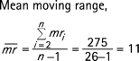
Hence the control limits are:
The middle panel of fig 1 shows the x-chart for these data. The reading at day 6 is indicated as being unusually low.
In the last step, for producing the moving range (mr) chart, plot the moving ranges against time. The centre line is simply the mean moving range  and the upper control limit is given by
  which gives 35.9. The lower control limit for a mr-chart is taken to be 0. The mr-chart is shown in the lower panel of fig 1.
Notes
Although the estimation of the process standard deviation (sigma) is based on an underlying normal distribution, it is important to appreciate that the xmr-chart is robust (like other exploratory tools) to departures from the assumption of normality. Thus it is not necessary to ensure that the data behave according to the normal distribution before plotting a control chart.510–12 When the data are clearly not normally distributed the statistical performance measures of the charts evaluated under the assumption of normality cannot be trusted to be accurate.5
One characteristic of time-ordered data that should be assessed is independence over time. Independence means that there is no relationship or autocorrelation between successive data points. With positively autocorrelated data, there will be a tendency for high values to follow high values and low values to follow low values, resulting in cyclic behaviour. With negatively autocorrelated data (less common in applications) high values tend to follow low values and vice versa. Wheeler17 shows that even with moderate autocorrelations, the xmr-chart behaves well (ie, the control limits remain similar), but when the correlation is large (eg, with a lag 1 correlation coefficient r>0.6) then the control limits need to be widened by a correction factor. However, Maragah and Woodall18 found that even moderate autocorrelation can adversely influence the statistical performance of a chart to the extent that time-series based methods may be more appropriate for autocorrelated data. A common approach is to model the time series and use control charts on the residuals to detect changes in the process.
It is possible that sometimes the lower control limit will be below 0. If the data under question come from a process in which negative measurements are not feasible then the lower control limit is customarily reset to 0 to reflect this. It is often stated that 20–25 data points are needed on an xmr-chart before the limits are sufficiently “firmed-up” so that if a process is showing common cause variation over these 20–25 data points then we can confidently conclude that it is stable.9 This is reasonable advice, but it does not imply that a control chart with fewer data points is not useful.17 With fewer data points, the resulting control limits are regarded as being “soft”17 or “provisional” control limits. In practice, where there is a stream of data, “provisional” control limits can be computed and refined (firmed up) with additional data in due course. Another important reason for re-computing the control limits is when knowledge about the underlying process deems it necessary (eg, a revised definition of the data, material changes to the process, etc.). Jensen et al19 reviewed the literature on the effect of estimation on control chart performance. They showed that sample sizes need to be fairly large to achieve the statistical performance expected under the known parameters case.
Limitations
The xmr-chart is a robust, versatile chart that has been used with a variety of processes. However, when the underlying data exhibit seasonality or the data are for rare events then preliminary work with the data is required before it can be placed on an xmr-chart.20 There is disagreement in the literature on the use of the xmr-chart.5 Some have argued that the EWMA chart is superior to the xmr-chart in phase II applications. Others have shown that for time-between-events data, or successes-between-failures data, other charts2122 are superior. However, the xmr-chart continues to be a useful, if not always optimal, tool for identifying special causes of variation in many practical applications.17 Even when the data are from a highly skewed distribution (eg, exponential waiting times, see Normality section below) a straightforward double square root transformation (y = √√x) will often render the data suitable for an xmr-chart.23 According to Wheeler, the xmr-chart is even useful when considering count (attribute) data (see Wheeler1720 for further details).
It is customary to produce the xmr-chart using the mean (of the data and the moving ranges) statistic for the centre line. However, the median statistic may also be used, but the constants used in the formulas to produce the three-sigma limits will be different11 (3.145 instead of 2.66 for the x-chart and 3.865 instead of 3.267 for the mr-chart). Wheeler and Chambers11 suggest that when the mean moving range appears to be inflated by just a few data points, xmr-charts based on the median may be a more suitable choice, because the median statistic, although less efficient in its use of the data compared with the mean, affords greater resistance (to extreme data points) than the mean.
Normality
It is sometimes argued that a precondition to the use of a control chart is for assumptions of normality to be met.1317 This is not correct. (This issue has been discussed in depth by Woodall.12) Control charts have been shown to be robust to the assumptions of normality. Furthermore during phase I applications the distributional assumption cannot even be checked because the underlying process may not be stable. As special causes of variation are removed the process becomes more stable. Also the form of the hypothesised distribution becomes more apparent and useful in defining the statistical performance characteristics of the control chart. According to Woodall,5 during phase I applications, practitioners need to be aware that the probability of signals of special cause variation depend primarily on the shape of the underlying distribution, the degree of autocorrelation and the number of samples.
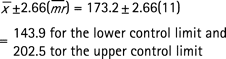
The preceding arguments do not imply that there is nothing to gain in checking assumptions of normality. A useful exploratory graphical method for assessing normality is the normal probability plot1023 (which is available in most statistical software packages). A normal probability plot is a graphical method for determining if a given set of data are consistent with an underlying normal distribution. We will illustrate its use with data (n = 100) generated from an exponential distribution with a rate parameter of 0.2, producing a highly skewed simulated time-to-event data set. The left panel of fig 2 shows a normal probability plot using the raw data. If the data were plausibly normal then the points would be expected lie close to the diagonal line of a normal probability plot. This is clearly not the case. However, if we transform the data using the double square root transformation y = √√x (see fig 2 right panel), the transformed data are now much more plausibly normal and therefore more appropriate for plotting on an xmr-chart. So, with the caveat that normality is not a precondition on the use of a control chart, we suggest that the production of a normal probability plot is potentially useful, especially in identifying highly skewed data. But ensure that concepts of “statistical outliers” on the normal probability plot are not confused with “signals” of special cause variation on a control chart. The former may be used as evidence against normality (in a formal statistical test for normality) but the latter may guide a practitioner towards finding and removing special causes of variation.

The p-chart
Consider the data in the top panel of fig 3. The data show the number of patients who were admitted with a fractured neck of femur and the number who died over 24 consecutive quarters (M Narayan-Lee, personal communication, 2006). To find out whether variation in mortality over time is consistent with common cause variation, we shall use a p-chart (where p stands for proportion).

To plot a p-chart for the above data, use the notation given in the data rows of fig 3. Plot the proportion of deaths (p) on the y-axis and the time (quarters) on the x-axis and then add the central line and the control limits as they are calculated. To determine the central line, compute the overall mean mortality:

Thus,  indicates where to place the central line (ie, at 0.25 on the y-axis). To derive the control limits we apply this overall
  to each of the quarters cases (ni) in turn using the formula:

So, for example, for quarter 1 (n1 = 56) we get the following control limits:


This calculation is repeated for each quarter to finally produce the control chart shown in fig 3. The control limits thus produced are stepped (see fig 3) because they reflect the changes in the sample sizes between quarters. There is no evidence of special cause variation. Improvement in this case requires a closer look at the constraints of the process,7 perhaps with the aid of a Pareto chart10 showing the most frequent reasons for death.
Notes
The assumptions of the p-chart17 are that the events (deaths in our case) are: (a) binary (can only have two states, eg, alive/dead, infected/not infected, admitted/not admitted, etc); (b) have a constant underlying probability of occurring; and (c) that they are independent of each other. One simple process that can meet all these requirements is the repeated tossing of a coin, but it is indeed impossible for a healthcare process to meet all these assumptions exactly. Nevertheless experience indicates that the p-chart is useful in practical circumstances, even where there is gross departure from the ideal conditions. For instance, Deming24 shows an example of inspection data that appeared to have much less variation than expected. The control limits were very wide and the data appeared to “hug” the central line. This “under-dispersion” was subsequently traced to an inspector who was too frightened to record the proper failure rates, choosing instead to make up the figures to be just below the minimum target. Clearly, assumptions (b) and (c) were being violated.
Conversely, when the observed variation is much greater than expected a substantial number of the data points fall outside the control limits. This is termed “over-dispersion” and often indicates that assumption (b) and/or (c) have been violated. While there are statistical techniques for allowing for “over-dispersion”, this technical fix25–27 does not itself address the fundamental question of why “over-dispersion” exists. This requires detective work to understand the underlying process and learn why it is behaving in this way. (Wheeler recommends using the xmr-chart in this situation.17)
When using the p-chart to plot percentages, all the proportions, the centre line and the control limits are multiplied by 100. In the case where the upper control limit is above 1, or the lower control limit is below 0, such limits are customarily reset to 1 and 0, respectively, because proportions cannot be negative or larger than 1. We do not have a signal if the observed value was to fall exactly on the reset limit.
The standard deviation of a binomial variable is usually derived using  , hence giving the control limits as
  . According to Xie et al28 this approximation is good as long as
  and
and  as is the case in the worked example above, because under these conditions the binomial distribution is fairly symmetrical and so the Shewhart three-sigma concept works well. However, when these conditions are not satisfied, then a different approach is required. One method is to calculate the exact limits using the probability distribution function of the binomial distribution, which, with modern software such as popular spreadsheet packages and statistical packages, is relatively straightforward. Other approaches involving transformations and regression-based limits have also been documented.1029
A common application of a graph similar to the p-chart is a comparison of the performance of healthcare providers530 over a fixed period. In this instance there is no time order to the data. The proportions, such as the proportions of readmissions, are plotted as a function of the subgroup sizes (n). The resultant chart is a “funnel” shape which is visually attractive and statistically intuitive because the funnel shows how the variation due to “chance” reduces with increasing sample sizes. This avoids the misleading ranking of the providers in league tables and its attendant negative consequences.330
The u-chart
Consider the data in the top panel of fig 4 which shows the number of falls in a hospital department over a 13-month period.31 To investigate the type of variation in these data we shall use a u-chart.

To plot a u-chart for the above data, plot the fall rate per patient-day (u) on the y-axis and the time (months) on the x-axis. Then add the central line and the control limits as they are calculated. To determine the central line, compute the overall fall rate ( ) which is given by the total number of falls divided by the total number of patient-days:

Thus,  indicates where to place the central line (ie, at 0.00371 on the y-axis). To derive the control limits we apply this overall average
  and the number of days in each time period (ni) in turn using the formula:

So for example, for October 2004, (n1 = 1048) we get the following control limits:

This calculation is repeated for each time period to finally produce the control chart shown in fig 4. When the calculated lower control limit falls below 0 it is customarily reset to 0 because count/attribute data cannot fall below 0. As can be seen from fig 4, the control limits thus produced are stepped because they reflect the changes in the area of opportunity (number of patient-days) between sampling periods. There is evidence of special cause variation in August 2005, which merits further investigation.
Notes
The assumptions of the u-chart are that the events: (a) occur one at a time with no multiple events occurring simultaneously or in the same location; and (b) are independent in that the occurrence of an event in one time period or region does not affect the probability of the occurrence of any other event. Although it is rare for all these assumptions to be met exactly in practice, experience indicates that the u-chart is useful in practical circumstances, even where there is a marked departure from the ideal conditions.
Typically low frequency events (eg, number of major complications following surgery) are plotted using u-charts. This is appropriate because the calculations for the control limits are based on an underlying Poisson distribution which is reasonable for infrequent events. To aid communication though, the low frequency event is often re-expressed—for example, using our falls data, in October 2004 there was 1 fall in 1048 patient-days, which is 0.000954 falls per patient-day, but this can be re-expressed as a rate per 100 patient-days by multiplying by 100 (1/1048*100 = 0.0954). Such an adjustment will make no difference to the analysis since a u-chart with the y-axis as falls per 100 patient-days will give the same messages as the one with falls per patient-day, albeit in a unit of analysis which may be more intuitive to healthcare practitioners.
The c-chart
Consider the data in the top panel of fig 5 which shows the number of emergency admissions over 23 consecutive Mondays (1 December 2003 to 3 May 2004) to one large acute hospital in England (personal communication). If we regard the people in this hospital’s catchment area as being the underlying population from which these admissions occur, we can see that (a) the events are relatively low frequency (in comparison with the size of the underlying population) but (b) the size of that underlying population is unknown. Assuming that the underlying population is large and fairly constant, we can analyse these data using a c-chart, which is essentially a u-chart with ni = 1, i = 1, 2, …, n.

For a c-chart, plot the number of admissions (c) on the y-axis and the days (time) on the x-axis, and then add the central line and the control limits as they are calculated. To determine the central line, compute the overall mean number of admissions  which is given by the total number of admissions divided by the total number of days:

Thus,  indicates where to place the central line (ie, at 80.3 on the y-axis). The control limits are set at
  ±3 times the square root of
  since, as can be shown, the standard deviation of a Poisson distribution is the square root of the mean, viz,
  , this gives:

The final c-chart is shown in fig 5.
Notes
The assumptions of the c-chart are that the events: (a) occur one at a time with no multiple events occurring simultaneously or in the same location; and (b) are independent in that the occurrence of an event in one time period or region does not affect the probability of the occurrence of any other event. Although it is impossible for all these assumptions to be met exactly in practice, experience indicates that the c-chart is useful in practical circumstances, even where there is significant departure from the ideal conditions. It is important to note that the u-chart is preferred to the c-chart when sample sizes or areas of opportunity are available and vary considerably. When such an area of opportunity information is not available then the c-chart is the only real option, provided that it is reasonable to assume that the underlying areas of opportunity are relatively large and fairly constant—as is the case in our emergency admissions example here.
The control limits for a c-chart are derived from  . When
  >1010 as is the case here, the Poisson distribution is roughly symmetrical and so the Shewhart three-sigma concept works well. However, when
  >10 is not satisfied, then a different approach is required. One method is to calculate the exact limits using the probability distribution function of the Poisson distribution with the help of computer software or statistical tables.10 Other approaches, using transformations as well as regression-based limits, have also been suggested.29 When
  the computation of the lower control limit produces a value below 0,10 which is customarily reset to 0 because the process is not capable of producing a negative count. However, the negative lower control limit is also an indication that the Poisson distribution is not symmetrical and the computation of exact limits is then recommended. Furthermore, according to Wheeler,17 the c-chart will break down when the mean number of events falls below 1, at which point plotting the time between events can be helpful.20
In this worked example we plotted the number of emergency admissions on consecutive Mondays instead of consecutive days. The reason for this is related to rational subgrouping. Some processes are made up of different underlying cause–effect subprocesses and an emergency admission to hospitals is one example. So for instance we do not expect the probability of an emergency admission to hospital to be the same for weekends (Saturday/Sunday) and weekdays, nor do we expect Fridays to be the same as other weekdays. In other words, the process exhibits seasonality. In order not to violate the requirements of rational subgrouping, we split the emergency admissions data by day of week and used Mondays as an illustrative example. If a control chart for emergency admissions for consecutive days is required then methods which first deseasonalise the data must be used.20
Other types of control charts
We have considered the four types of control chart that will have frequent applicability to healthcare. Many more types of control chart and related plots are documented in the literature.1017 These include EWMA control charts, CUSUM plots, Q-charts22 and number-between-events charts,21 to mention but a few. While several of these charts have apparently superior performance compared with the basic charts described here, it is important to note that generally speaking, they are often not meant to completely replace Shewhart control charts; rather they are considered to be useful adjuncts.12 An interesting feature of the application of control charts to healthcare is the incorporation of patient case-mix adjustment, which has been described elsewhere.52532–34 Case-mix adjustment is often required to make meaningful comparisons between healthcare providers.35
CHOICE OF THREE-SIGMA LIMITS
Shewhart argued—on the basis of mathematical theory (Tchebysheff theorem)36 and also on the basis on experience and pragmatism—that stable processes produce variation within limits and that, in the search for economic control of variation, these limits can usefully be set at three-sigma. Several decades of experience in a whole range of application domains, including healthcare, has shown that three-sigma limits are indeed useful. Nevertheless this does not imply that the limits cannot be changed. According to Nelson,13 the rationale for widening or narrowing the limits is a judgement call in which the costs of looking for special cause variation, when it does not exist, need to balanced against the costs of overlooking such a signal, when it does exist. However we must emphasise that wherever the control limits are set at a finite positive distance from the centre line we risk one of two types of mistake24:
type I: to treat an outcome resulting from a common cause as if it were a special cause;
type II: to treat an outcome resulting from a special cause as if it were a common cause.
It is impossible to reduce the frequency of both errors to 0, but what we can do is minimise the economic losses due to either kind of mistake. Nevertheless, despite some of the controversies regarding the theoretical basis of control charts,12 there is ample evidence, increasingly from healthcare, to show that in the context of continual improvement, control charts offer major benefits which are well worth the effort.
Acknowledgments
We thank Mr A M Ibrahim for giving us permission to use his blood pressure measurements data and Mrs M Narayan-Lee for the fractured neck of femur and emergency admissions data sets used in this article. Thanks are also due to StatIt.com (www.statit.com) for kind permission to use the falls data.
Appendix
REFERENCES
Footnotes
None declared.
Linked Articles
- Correction