Article Text

Abstract
Improvement of health care requires making changes in processes of care and service delivery. Although process performance is measured to determine if these changes are having the desired beneficial effects, this analysis is complicated by the existence of natural variation—that is, repeated measurements naturally yield different values and, even if nothing was done, a subsequent measurement might seem to indicate a better or worse performance. Traditional statistical analysis methods account for natural variation but require aggregation of measurements over time, which can delay decision making. Statistical process control (SPC) is a branch of statistics that combines rigorous time series analysis methods with graphical presentation of data, often yielding insights into the data more quickly and in a way more understandable to lay decision makers. SPC and its primary tool—the control chart—provide researchers and practitioners with a method of better understanding and communicating data from healthcare improvement efforts. This paper provides an overview of SPC and several practical examples of the healthcare applications of control charts.
- quality improvement research
- statistical process control
Statistics from Altmetric.com
All improvement requires change, but not all change results in improvement.1 The key to identifying beneficial change is measurement. The major components of measurement include: (1) determining and defining key indicators; (2) collecting an appropriate amount of data; and (3) analysing and interpreting these data. This paper focuses on the third component—the analysis and interpretation of data—using statistical process control (SPC). SPC charts can help both researchers and practitioners of quality improvement to determine whether changes in processes are making a real difference in outcomes. We describe the problem that variation poses in analysis, provide an overview of statistical process control theory, explain control charts (a major tool of SPC), and provide examples of their application to common issues in healthcare improvement.
VARIATION IN MEASUREMENT
Interpretation of data to detect change is not always a simple matter. Repeated measures of the same parameter often yield slightly different results—for example, re-measurement of a patient’s blood pressure, a department’s waiting times, or appointment access satisfaction—even if there is no fundamental change. This inherent variability is due to factors such as fluctuations in patients’biological processes, differences in service processes, and imperfections in the measurement process itself.
How large a fluctuation in the data must be observed in order to be reasonably sure that an improvement has actually occurred? Like other statistical methods, SPC helps to tease out the variability inherent within any process so that both researchers and practitioners of quality improvement can better understand whether interventions have had the desired impact and, if so, whether the improvement is sustainable beyond the time period under study.
The researcher designs formal studies in which data are collected at different points in time or place for comparison, such as a randomised clinical trial to evaluate the impact of a new cholesterol lowering drug. In this type of study the goal may be to test the null hypothesis that there is no difference between an experimental group and a control group who did not receive the drug. Many formal research designs exist to handle the numerous possible variations of such studies,2 including double blind randomised clinical trials.
At the other end of the spectrum, the improvement practitioner often takes a simpler approach to research designs. This person may be interested in comparing the performance of a process at one site with itself—for example, looking at data collected before and after a change has been introduced—or in contrasting the performance of two or more sites over time. However, both the researcher and the practitioner essentially end up addressing the same question—namely, “What can be concluded from sets of measurements taken before and after the time of a change, given that these measurements would probably show some variation even if there had been no purposeful change?”
An advantage of SPC is that classical statistical methods typically are based on “time static”statistical tests with all data aggregated into large samples that ignore their time order—for example, the mean waiting time at intervention sites might be compared with that at non-intervention sites. Tests of significance are usually the statistical tool of preference used to see if one group is “significantly different”from the other. These are useful methods and have good statistical power when based on sufficiently large data sets. The delay in accumulating a sufficient amount of data, however, often limits the application of these methods in practice in health care and practitioners may resort to simple bar charts, line graphs, or tables to present the data. In this case the practitioner can only make a qualitative statement about whether or not there “seems”to be an improvement.
In contrast, SPC methods combine the rigour of classical statistical methods with the time sensitivity of pragmatic improvement. By integrating the power of statistical significance tests with chronological analysis of graphs of summary data as they are produced, SPC is able to detect process changes and trends earlier. While this may be a less familiar branch of statistics to many researchers, it is no less valid. SPC also distils statistical theory into relatively simple formulae and graphical displays that can easily be used by non-statisticians.
THEORY OF STATISTICAL PROCESS CONTROL
The basic theory of statistical process control was developed in the late 1920s by Dr Walter Shewhart,3 a statistician at the AT&T Bell Laboratories in the USA, and was popularised worldwide by Dr W Edwards Deming.4 Both observed that repeated measurements from a process will exhibit variation—Shewhart originally worked with manufacturing processes but he and Deming quickly realized that their observation could be applied to any sort of process. If a process is stable, its variation will be predictable and can be described by one of several statistical distributions.
One such model of random variation is the normal (or Gaussian) bell shaped distribution which is familiar to most healthcare professionals. While repeated measurements from many processes follow normal distributions, it is important to note that there are many other types of distributions that describe the variation in other healthcare measurements such as Poisson, binomial, or geometric distributions. For example, the random variation in the number of wound infections after surgery will follow a binomial distribution since there are only two possible outcomes—each patient either did or did not have a postoperative infection with about the same probability (assuming that the data are adjusted for patient acuity, surgical techniques, and other such variables).
SPC theory uses the phrase “common cause variation”to refer to the natural variation inherent in a process on a regular basis. This is the variation that is expected to occur according to the underlying statistical distribution if its parameters remain constant over time. For example, the random variation between body temperatures within a population of healthy people is a result of basic human physiology, while the random variation in week to week wound infection rates is a result of factors such as training, sources of supplies, surgical and nursing care practices, and cleanliness procedures. Processes that exhibit only common cause variation are said to be stable, predictable, and in “statistical control”, hence the major tool of SPC is called the “statistical control chart”.
Conversely, the phrase “special cause variation”refers to unnatural variation due to events, changes, or circumstances that have not previously been typical or inherent in the regular process. This is similar to the concept in traditional hypothesis tests of data exhibiting statistically significant differences, a key distinction being that we now test for changes graphically and over time using small samples. For example, heavy demand for A&E services brought on by an influenza epidemic may create special cause variation (statistically significant differences) in the form of increases in A&E waiting times. As another example, suppose that the daily mean turn around time (TAT) for a particular laboratory test is 64 minutes with a minimum of 45 minutes and a maximum of 83 minutes; this mean has been observed for several months. One day the mean jumps to 97 minutes because a major power outage caused the computers to go down, the lights to go out, and the pneumatic tube system to become inoperative. On this particular day the process is said to be “out of control”and incapable of performing as it had in the past due to the “special cause”of the power outage.
Note that special cause variation can be the result of either a deliberate intervention or an external event over which we have little control. Special causes of variation can also be transient (being short staffed in A&E one day due to illness of a key person) or can become part of the permanent common cause system (eliminating a staff position through a budget cut).
Interventions in a research study or change ideas in a quality improvement project are deliberate attempts to introduce special causes of variation. Statistical tools are therefore needed to help distinguish whether patterns in a set of measurements exhibit common or special cause variation. While statistical process control charts and hypothesis tests are both designed to achieve this goal, an important difference is that SPC provides a graphical, simpler, and often faster way to answer this question. The basic principles of SPC are summarised in box 1.
Box 1 Basic principles of SPC
-
Individual measurements from any process will exhibit variation.
-
If the data come from a stable common cause process, their variability is predictable within a knowable range that can be computed from a statistical model such as the Gaussian, binomial, or Poisson distribution.
-
If processes produce data with special causes, measured values will deviate in some observable way from these random distribution models.
-
Assuming the data are in control, we can establish statistical limits and test for data that deviate from predictions, providing statistical evidence of a change.
These observations lead to two general approaches for improving processes. Because processes that exhibit special cause variation are unstable and unpredictable, they should be improved by first eliminating the special causes in order to bring the process “into control”. In contrast, processes that exhibit only common cause variation will continue to produce the same results, within statistical limits, unless the process is fundamentally changed or redesigned.
Moreover, if a process remains in control, future measurements will continue to follow the same probability distribution as previously—that is, if a stable process produces data that follow a normal distribution and it is not further disturbed by special causes, we can expect about 95% of future measurements to fall within ±2 standard deviations (SD) around the mean. We can make similar statements about prediction ranges associated with any other statistical distribution. In general, regardless of the underlying distribution, almost all data will fall within ±3SD of the mean if the underlying distribution is stable—that is, if the process is in statistical control.
The control chart therefore defines what the process is capable of producing given its current design and operation. If a different level of performance is wanted in the future, we must intervene and introduce a change in the process—that is, a special cause. If we simply want to sustain the current level of performance, special causes of variation must be prevented or eliminated. Control charts can often help to detect special cause variation more easily and faster than traditional statistical methods, and therefore are valuable tools for evaluating the effectiveness of a process and ensuring the sustainability of improvements over time.
THE CONTROL CHART: THE KEY TOOL OF SPC
Shewhart developed a relatively simple statistical tool—the control chart—to aid in distinguishing between common and special cause variation. A control chart consists of two parts: (1) a series of measurements plotted in time order, and (2) the control chart “template”which consists of three horizontal lines called the centre line (typically, the mean), the upper control limit (UCL), and the lower control limit (LCL). Examples are shown in figs 1–5. (Fig1)(Fig2)(Fig3)(Fig4)(Fig5) The values of the UCL and LCL are usually calculated from the inherent variation in the data rather than set arbitrarily by the individual making the chart. A firm understanding of the standard distributions used for common cause process variation is therefore essential for the appropriate application of control charts (see later).
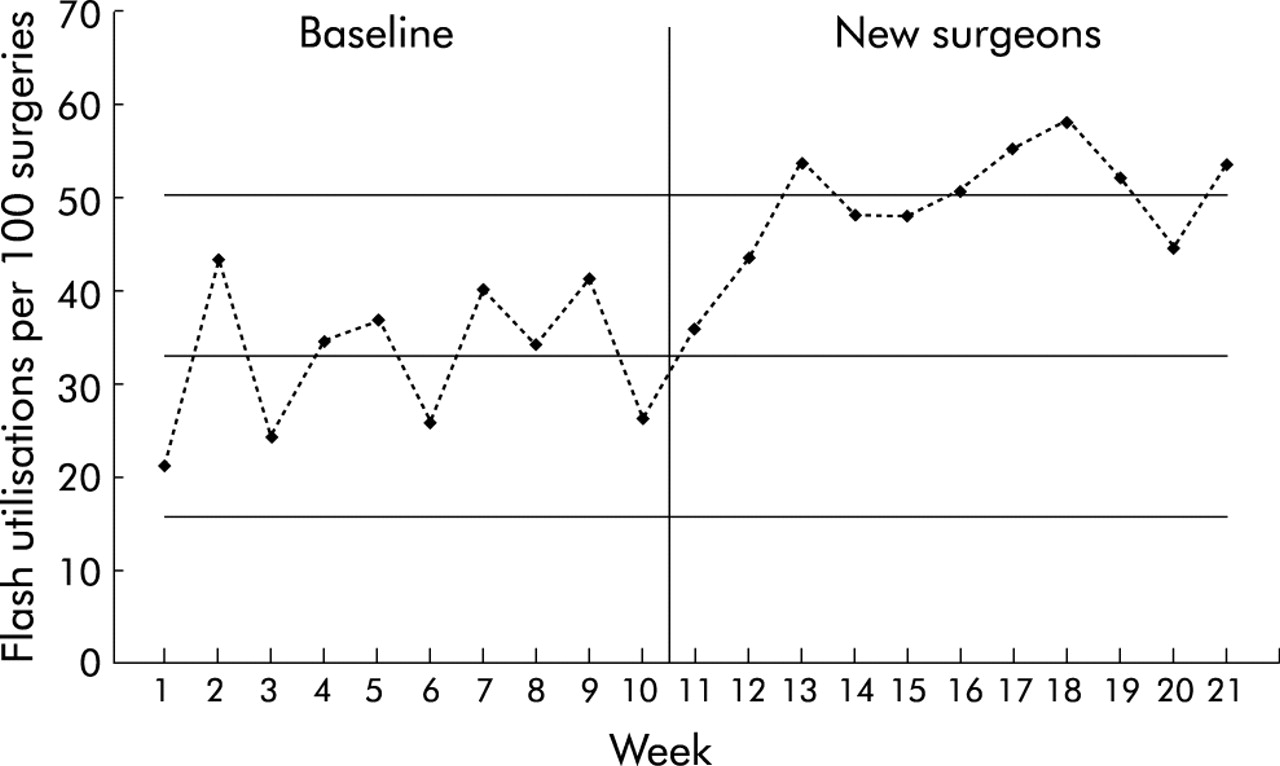
Control chart for flash sterilization rate: baseline compared with period following arrival of new surgical group.
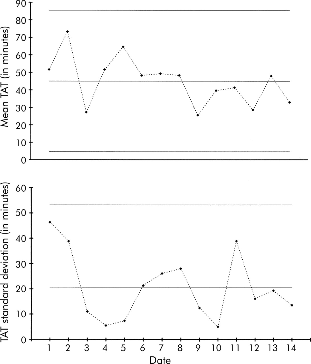
Control chart of turn around time (TAT) for day shift routine orders for complete blood counts in the A&E department.

Control chart for surgical site infections.

Control chart of appointment access satisfaction (percentage of patients very satisfied or higher with delay to see provider).
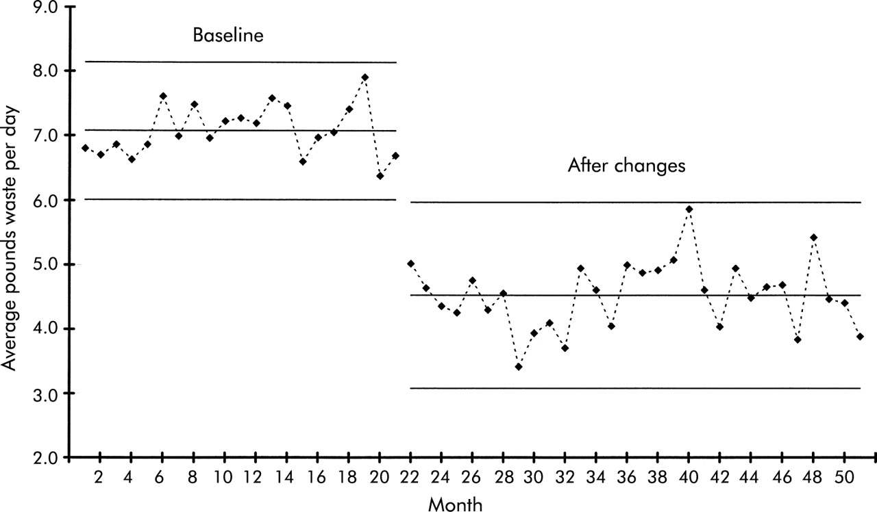
Control chart of infectious waste.
To interpret a control chart, data that fall outside the control limits or display abnormal patterns (see later) are indications of special cause variation—that is, it is highly likely that something inherently different in the process led to these data compared with the other data. As long as all values on the graph fall randomly between the upper and lower control limits, however, we assume that we are simply observing common cause variation.
Where to draw the UCL and LCL is important in control chart construction. Shewhart and other SPC experts recommend control limits set at ±3SD for detecting meaningful changes in process performance while achieving a rational balance between two types of risks. If the limits are set too narrow there is a high risk of a “type I error”—mistakenly inferring special cause variation exists when, in fact, a predictable extreme value is being observed which is expected periodically from common cause variation. This situation is analogous to a false positive indication on a laboratory test. On the other hand, if the limits are set too wide there is a high risk of a “type II error”analogous to a false negative laboratory test.
For example, for the familiar normal distribution, in the long run 99.73% of all plotted data are expected to fall within 3SD of the mean if the process is stable and does not change, with only the remaining 0.27% falling more than 3SD away from the mean. While points that fall outside these limits will occur infrequently due to common cause variation, the type I error probability is so small (0.0027) that we instead conclude that special variation caused these data. Similar logic can be applied to calculate the type I and type II errors for any other statistical distribution.
Although traditional statistical techniques used in the medical literature typically use 2SD as the statistical criteria for making decisions, there are several important reasons why control charts use 3SD. For the normal distribution approximately 95% of the values lie within 2SD of the mean so, even if the process was stable and in control, if control limits are set at 2SD the type I error (false positive) rate for each plotted value would be about 5% compared with 0.27% for a 3SD chart. Unlike one time hypothesis tests, however, control charts consist of many points (20–25 is common) with each point contributing to the overall false positive probability. A control chart with 25 points using 3SD control limits has a reasonably acceptable overall false positive probability of 1–(0.9973)25 = 6.5%, whereas using 2SD limits would produce an unacceptably high overall false positive probability of 1–(0.95)25 = 27.7%! The bottom line is that the UCL and LCL are set at 3SD above and below the mean on most common control charts.5
In addition to points outside the control limits, we can also look more rigorously at whether data appear randomly distributed between the limits. Statisticians have developed additional tests for this purpose; for example, a common set of tests for special cause variation is:
-
one point outside the upper or lower control limits;
-
two out of three successive points more than 2SD from the mean on the same side of the centre line;
-
four out of five successive points more than 1SD from the mean on the same side of the centre line;
-
eight successive points on the same side of the centre line;
-
six successive points increasing or decreasing (a trend); or
-
obvious cyclic behaviour.
In return for a minor increase in false positives, these additional tests greatly increase the power of control charts to detect process improvements and deteriorations. The statistical “trick”here is that we are accumulating information and looking for special cause patterns to form while waiting for the total sample size to increase. This process of accumulating information before declaring statistical significance is powerful, both statistically and psychologically.
A final important point about the construction of control charts concerns the mechanics of calculating the SD. As with traditional statistical methods, many different formulae can be used to calculate the SD depending on the type of control chart used and the particular statistical distribution associated with that chart. In particular, the formula for the SD is not the one typically used to calculate the empirical SD as might be found in a computer spreadsheet or taught in a basic statistics class. For example, if we are monitoring the proportion of surgery patients who acquire an infection, the appropriate formulae would use the SD of a binomial distribution (much like that for a conventional hypothesis test of proportions); if monitoring a medication error rate the appropriate formulae would use the SD of a Poisson distribution; and when using normally distributed data the appropriate formulae essentially block on the within sample SD in a manner similar to that used in hypothesis tests of means and variances. Details of calculations for each type of control chart, when to use each chart, and appropriate sample sizes for each type of chart are beyond the scope of this paper but can be found in many standard SPC publications.5–10
EXAMPLES
The following examples illustrate the basic principles, breadth of application, and versatility of control charts as a data analysis tool.
Flash sterilization rate
The infection control (IC) committee at a 180 bed hospital notices an increase in the infection rate for surgical patients. A nurse on the committee suggests that a possible contributor to this increase is the use of flash sterilisation (FS) in the operating theatres. Traditionally, FS was used only in emergency situations—for example, when an instrument was dropped during surgery—but recently it seems to have become a more routine procedure. Some committee members express the opinion that a new group of orthopaedic surgeons who recently joined the hospital staff might be a contributing factor—that is, special cause variation. This suggestion creates some defensiveness and unease within the committee.
Rather than debating opinions, the committee decides to take a closer look at this hypothesis by analysing some data on the FS rate (number of FS per 100 surgeries) to see how it has varied over time. The committee’s analyst prepares a u chart (based on the Poisson distribution, fig 1) to determine the hospital’s baseline rate and the rate after the arrival of the new surgeons.
During the baseline period the mean FS rate was around 33 per 100 surgeries (the centre line on the baseline control chart) and the process appeared to be in control. However, arrival of the new surgeons indicated an increase (special cause variation) to a mean FS rate of about 50 per 100 surgeries. For example, the third data point (week 13) is beyond the baseline UCL, as are weeks 17, 18, 19, and 21. Additionally, several clusters of two out of three points are more than 2SD beyond the mean, several clusters of four out five points are beyond 1SD, and all of the new points are above the baseline period mean. All these signals are statistical evidence of a significant and sustained shift in process performance. The IC committee can now look further into this matter with confidence that it is not merely an unsupported opinion.
It must be noted that this analysis does not lead to the conclusion that the new surgeons are to blame for the increase. Rather, the data simply indicate that it is highly likely that something about the process of handling surgical instruments has fundamentally changed, coincident with the arrival of the new surgeons. Further investigation is warranted.
Laboratory turn around time (TAT)
Several clinicians in the A&E department have been complaining that the turn around time (TAT) for complete blood counts has been “out of control and constantly getting worse”. The laboratory manager decides to investigate this assertion with data rather than just opinions. The data are stratified by shift and type of request (urgent versus routine) to ensure that the analysis is conducted by reasonably homogeneous processes. Since TAT data often follow normal distributions, X-bar and S types of control charts are appropriate here (fig 2). Each day the mean and SD TAT were calculated for three randomly selected orders for complete blood counts. The top chart (X-bar) shows the mean TAT for the three orders each day, while the bottom chart (S) shows the SD for the same three orders; during the day shift the mean time to get results for a routine complete blood count is about 45 minutes with a mean SD of about 21 minutes.
If the clinicians’complaints were true, out of control points and an overall increasing trend would be observed. Instead, it appears that the process is performing consistently and in a state of statistical control. Although this conclusion may not agree with the clinicians’views, common cause variation does not necessarily mean the results are acceptable, but only that the process is stable and predictable. An in control process can therefore be predictably bad.
In this case the process is stable and predictable but not acceptable to the clinicians. Since the process exhibits only common cause variation, it is appropriate to consider improvement strategies to lower the mean TAT and reduce the variation (lower the centre line and bring the control limits closer together). This would produce a new and more acceptable level of performance. The next steps for the team are therefore to test an improvement idea, compare the new process with these baseline measurements, and decide whether the process has improved, stayed the same, or worsened.
Surgical site infections
An interdisciplinary team has been meeting to try to reduce the postoperative surgical site infection (SSI) rate for certain surgical procedures. A g type of control chart (based on the geometric distribution) for one type of surgery is shown in fig 3. Instead of aggregating SSIs in order to calculate an infection rate over a week or month, the g chart is based on a plot of the number of surgeries between occurrences of infection. This chart allows the statistical significance of each occurrence of an infection to be evaluated11 rather than having to wait to the end of a week or a month before the data can be analysed. This ability to evaluate data immediately greatly enhances the potential timeliness of the analysis. The g chart is also particularly useful for verifying improvements (such as reduced SSIs) and for processes with low rates.
An initial intervention suggested by the team is to test a change in the postoperative wound cleaning protocol. As shown in fig 3, however, this change does not appear to have had any impact on reducing the infection rate. Although this intervention did not result in an improvement, the control chart was useful to help prevent the team from investing further time and resources in training staff and implementing an ineffective change throughout the hospital.
After more brainstorming and review of the literature, the team decided to try experimenting with the shave preparation technique for preparing the surgical site before surgery. Working initially with a few willing surgeons and nurses, they developed a new shave preparation protocol and used it for several months. The control chart in fig 3 indicates that this change resulted in an improvement with the SSI rate reducing from approximately 2.1% to 0.9%. (For this type of chart the mean SSI rate is the reciprocal of the centre line: 1/47 = 2.1% compared with 1/111 = 0.9%.) Note that on this type of chart data plotted above the UCL indicate an improvement, as an increase in the number of surgeries between SSIs equates to a decrease in the SSI rate.
Appointment access satisfaction
A GP practice is working hard on improving appointment access and has decided to track several performance measures each month. A small survey has been developed to gauge patients’satisfaction with several aspects of appointment access (delay, telephone satisfaction, in office waiting times, able to see provider of choice, etc). The percentage of patients who respond “very good”or “excellent”to the question of how satisfied they were with the delay to get an appointment with their primary care provider is plotted on a p control chart (based on the binomial distribution) shown in fig 4.
After exploring ideas that had been successful for other practices, the staff implemented several changes at the same time: reducing the number of appointment types, simplifying the telephone scripts, and offering appointments with the practice nurse in lieu of the doctor for certain minor conditions. As shown in the control chart, there was a notable improvement in appointment access satisfaction soon after these changes were implemented. Since the changes were not tried one at a time, however, we do not know the extent to which each change contributed to the improvement; further testing could be conducted to determine this, similar in approach to traditional screening experiments. This chart can also be used to monitor the sustainability of improvements by detecting any future special cause variation of a decrease in appointment access satisfaction.
Infectious waste monitoring
If several staff were asked to identify the criteria for determining what constitutes infectious waste in a hospital, a wide variety of responses would probably be obtained. Faced with this lack of standardization, most hospitals spend more time and money disposing of infectious waste than is necessary. For example, recent studies in the US found that less than 6% of a hospital’s waste can be considered infectious or hazardous. It has also been estimated that an average size hospital spends the equivalent of a new CAT scanner every year disposing of improperly classified infectious waste such as soft drink cans, paper, milk cartons, and disposable gowns. Armed with this knowledge, a team decides to address this issue.
Since the team had no idea how much infectious waste they produced each day, they first established a baseline. As shown on the left side of fig 5 (an XmR chart based on the normal distribution), the mean daily amount of infectious waste during the baseline period was a little over 7 lb (3.2 kg). The process was stable and exhibited only common cause variation, so an intervention improvement strategy is appropriate. If the process is not changed, the amount of infectious waste in future weeks might be expected to vary between 6 lb (2.8 kg) and 8.2 lb (3.7 kg) per day. To reduce the mean amount of infectious waste produced daily, the team first established a clear operational definition of infectious waste and then conducted an educational campaign to make everyone more aware of what was and was not infectious waste. They next developed posters, designed tent cards for the cafeteria tables, made announcements at departmental meetings, and assembled displays of inappropriate items found in the infectious waste containers. The results of this educational effort are shown on the right side of fig 5. The process has shifted to a new and more acceptable level of performance. Since the process has clearly changed, new control limits have been calculated for the data after the improvement. The new mean daily production of infectious waste is a little more than 4 lb (1.8 kg) per day.
The control chart provided the team with a useful tool for testing the impact of these efforts. In this case, the shift in the process was very noticeable and in the correct direction. It is interesting, however, that, although the mean amount of waste was reduced, these same improvements inadvertently also caused the day-to-day variation to increase (note the wider control). Not all changes lead to the desired results. A challenge for the team now is to reduce the variation back to at least its original level.
DISCUSSION
These examples illustrate several general points about control charts. Control charts can be used in the daily management of healthcare processes to analyse routinely collected data and reduce “management by opinion”, as in the cases of flash sterilisation and laboratory turn around time. Control charts can help policy makers avoid wasted investments in changes that sound good but do not actually deliver, as was the case in the surgical site infection example. That case further illustrated how control charts might be able to detect statistically significant signals from the patterns in the data more quickly than with traditional statistical methods. The appointment access satisfaction example illustrated the general application of control charts for conducting rapid screening experiments as an efficient prelude to a more traditional experiment.12 The infectious waste example illustrated the advantage of control charts for a layperson to see the statistical significance of both the shift in the mean and the change in the variability of the measurement under study.
More generally, these examples illustrate how control charts help teams to decide on the correct improvement strategy—whether to search for special causes (if the process is out of control) or to work on more fundamental process improvements and redesign (if the process is in control). In each example the control charts can also be used as a simple monitoring aid to assure that improvements are sustained over time.
One of the benefits of using control charts is that they do not require as much data as traditional statistical analysis which relies on large aggregated data sets. For example, the g chart in fig 3 uses each incident of infection as a data point for decision making, the X bar and S charts in fig 2 are based on samples of three randomly selected laboratories per day, and the u chart in fig 1 uses rates based on the mean of 80 surgeries per week performed in the hospital. Generally speaking, 20–30 such data points are needed to calculate the UCL and LCL, but after that each new data point can be judged for its statistical significance. The exact number of data points needed to construct a reasonable chart will depend on: (1) the type of chart being used; (2) the manner in which the data have been organized and collected; (3) the distributional characteristics of the data—for example, if it is suspected that the data contain extremes (skewness) it would be wise to collect 25–30 data points before calculating the control limits; and (4) the importance of detecting a process change rapidly (the greater the importance, the larger the sample).
Key messages
-
Measurement data from healthcare processes display natural variation which can be modelled using a variety of statistical distributions.
-
Distinguishing between natural “common cause”variation and significant “special cause”variation is key both to knowing how to proceed with improvement and whether or not a change has resulted in real improvement.
-
Statistical process control (SPC) is a branch of statistics comparable in rigour and validity to traditional statistical methods.
-
Control charts (tools of SPC) can often yield insights into data more quickly and in a way more understandable to the lay decision maker than traditional statistical methods.
Each of the charts used in the examples presented here is based on a different underlying random distribution model. There are at least a dozen different types of control charts in common use in manufacturing and other industries, with three or four new types being developed each year. The various types differ by the statistic plotted—for example, means, percentages, counts, moving means, cumulative sums, interval between events, etc—and the distribution assumed—for example, normal, binomial, Poisson, geometric, etc. Other control charts have been developed for special purpose applications—for example, naturally cyclic processes, short run processes, start up processes, risk adjustment applications, rare events. All have different formulae for calculating centre lines and control limits.
Regardless of the complexity or underlying statistical theory, however, most control charts have the same visual appearance (a chronological graph of frequent process data with a centre line, UCL, and LCL) and are interpreted in a similar way as discussed above. Moreover, experience in a variety of industries outside health care indicates that individuals with little formal statistical training can use control charts to bring more statistical rigour to their decision making.
CONCLUSIONS
Control charts are powerful, user friendly, and statistically rigorous process analysis tools that can be used by quality improvement researchers and practitioners alike. These tools can help managers, process improvement practitioners, and researchers to use objective data and statistical thinking to make appropriate decisions.