Article Text

Abstract
Objective To introduce a new type of risk-adjusted (RA) exponentially weighted moving average (EWMA) chart and to compare it to a commonly used type of variable life adjusted display chart for analysis of patient outcomes.
Data Routine inpatient data on mortality following admission for acute myocardial infarction, from all public and private hospitals in Queensland, Australia.
Methods The RA-EWMA plots the EWMA of the observed and predicted values. Predicted values were obtained from a logistic regression model for all hospitals in Queensland. The EWMA of the predicted values is a moving centre line, reflecting current patient case mix at a particular hospital. Thresholds around this moving centre line provide a scale by which to assess the importance of trends in the EWMA of the observed values.
Results The RA-EWMA chart can be designed to have equivalent performance, in terms of average run lengths, as variable life adjusted display chart. The advantages of the RA-EWMA are that it communicates information about the current level of an indicator in a direct and understandable way, and it explicitly displays information about the current patient case mix. Also, because it is not reset, the RA-EWMA is a more natural chart to use in health, where it is exceedingly rare to stop or dramatically and abruptly alter a process of care.
Conclusion The RA-EWMA chart is a direct and intuitive way to display information about an indicator while accounting for differences in case mix.
- Control charts
- risk adjustment
- EWMA
- RA-EWMA
- health care quality
- statistical process control
- patient outcomes
Statistics from Altmetric.com
- Control charts
- risk adjustment
- EWMA
- RA-EWMA
- health care quality
- statistical process control
- patient outcomes
Risk-adjusted (RA) control chart schemes are used to sequentially analyse healthcare outcomes where the probability of an adverse event varies with differences in patients' risk profiles. The RA cumulative sum (CUSUM) chart1 is effective in detecting sustained shifts in outcome rate2 and tests sequences of the logarithm of sequential probability ratio tests.3 Unfortunately, this statistic does not have an intuitive or physical interpretation.
Control charts of cumulative counts of the expected minus observed deaths4 5 are more intuitive than RA-CUSUMs. The variable life adjusted display (VLAD) statistics have been interpreted as “net lives saved”.2 None of the control limits that have been proposed for such charts are directly interpretable in terms of run-length performance.2
A solution to this problem is a surveillance scheme that combines the VLAD and RA-CUSUM.6 The VLAD plot indicates the trends, and the RA-CUSUM2 signals that the trends are potentially important. Another approach is an EWMA statistic of the observed less expected mortality counts, using Bayesian principles to set an alarm threshold.7
In this article, we introduce a simple and explicit RA-EWMA scheme that displays the observed and predicted values for an indicator, such as in-hospital mortality, rather than combining them into a plot of the expected less observed outcomes. We provide the details of its design and compare its performance in monitoring the mortality of acute myocardial infarction (AMI) patients admitted to hospital with that of the combined VLAD and RA-CUSUM chart.6
Methods
Data and risk model
Routine administrative data were collected from 13 350 patients admitted for AMI who presented at 116 public or private hospitals in Queensland (2003–2007). The ICD-10-AM codes8 and inclusion criteria used to define the patient population are published on the Queensland Quality Measurement Program website.9
Our logistic regression model used data for all Queensland hospitals (2003–2004) to estimate the risk-factor parameters for 30-day, in-hospital mortality following admission for AMI. The risk factors (5-year age groups, sex, dysrhythmias, congestive heart failure, hypertension, diabetes, chronic renal failure, dementia, stroke and malignancy) were identified in other studies10 11 and confirmed as predicting short-term mortality for AMI. The Queensland Quality Measurement Program obtained c-statistic values of 0.77 to 0.82 for its similar models.
RA-EWMA chart
This article extends EWMA chart methods12 by describing a RA-EWMA that plots EWMA(observed) and EWMA(predicted).
Under in-control conditions and for event rates in the range 5–95%, the distributions of EWMA(observed) and EWMA(predicted) are sufficiently similar and are robustly normal and symmetrical. By modifying the formula to compute the variance of a standard EWMA12, the variance of the jth observation is given by
The standard formula12 is used to calculated the upper and lower control limits as
In-control average run lengths (ARL0) and out-of-control average run lengths (ARL1) for various odds ratios (OR) reflecting mortality higher than the combined-hospital average, λ=0.01
For a moving average filter, like the RA-EWMA, λ is chosen to effectively attenuate noise in the data and smooth an erratic but unbiased risk model, but to allow the passage of trends without distortion.13 In figure 1, we construct EWMA plots with varying values of λ. For maximum smoothing (λ=0.005), we can discern the trends in the observed outcomes; however, the plot of the expected outcomes barely deviates from its starting value. For λ=0.01, the RA-EWMA trends are clear for observed outcomes and discernable for the expected probabilities. For values of λ>0.01, the EWMA of the observed outcomes becomes more difficult to interpret. We chose λ=0.01 for this application. Our experience with RA monitoring in intensive care is that a choice of λ between 0.005 and 0.020 is needed so the distributions of the observed and predicted EWMA plots are comparable.
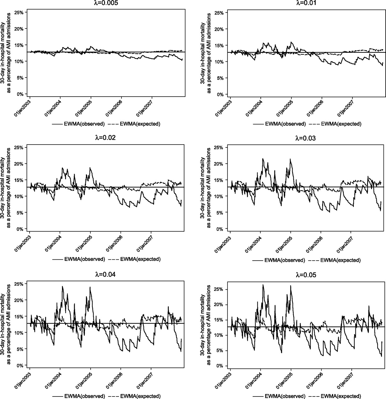
Risk-adjusted exponentially weighted moving average (RA-EWMA) plots for different values of λ, in-hospital acute myocardial infarction (AMI) mortality, Hospital A, 2003–2007.
We estimated ARLs from the start of monitoring to the cross of the upper threshold by simulation using the predicted and observed values from the years 2003 and 2004. Simulations were run 10 000 times for various shifts in the mortality rate (table 1). Based on these simulations, an acceptable trade-off between ARL0 and ARL1 for this application was L=2.07, which gave ARL0=1000 and an acceptable ARL1 for various shifts. For example, a shift in the mortality rate corresponding to an odds ratio of 2.0 gave ARL1=50. Thus, a false alarm would be expected within about 1000 AMI cases if the odds of death were unchanged. However, if the odds of death doubled, then 50 AMI would be admitted, on average, before EWMA(observed) would be greater than the upper threshold of EWMA(predicted).
Note that the RA EWMA is not reset.
Variable life adjusted display
The design procedure for VLAD charts, used in this article, is based on a scheme proposed by Sherlaw-Johnson.6 Because some results in this study suggested that the observed mortality rate continued to be higher than expected after the RA-CUSUM component of the VLAD had signalled and was reset, we added a fast initial reactive feature14 using start and resetting values of h/2. This is recommended when there is a possibility that a process is not fully in control at the start of monitoring.15 We set h=3.3 based on simulations with ARL0=1000 and ARL1=58 (for OR 2.0), similar to those for RA-EWMA, with λ=0.01 and L=2.07 (table 1).
Results
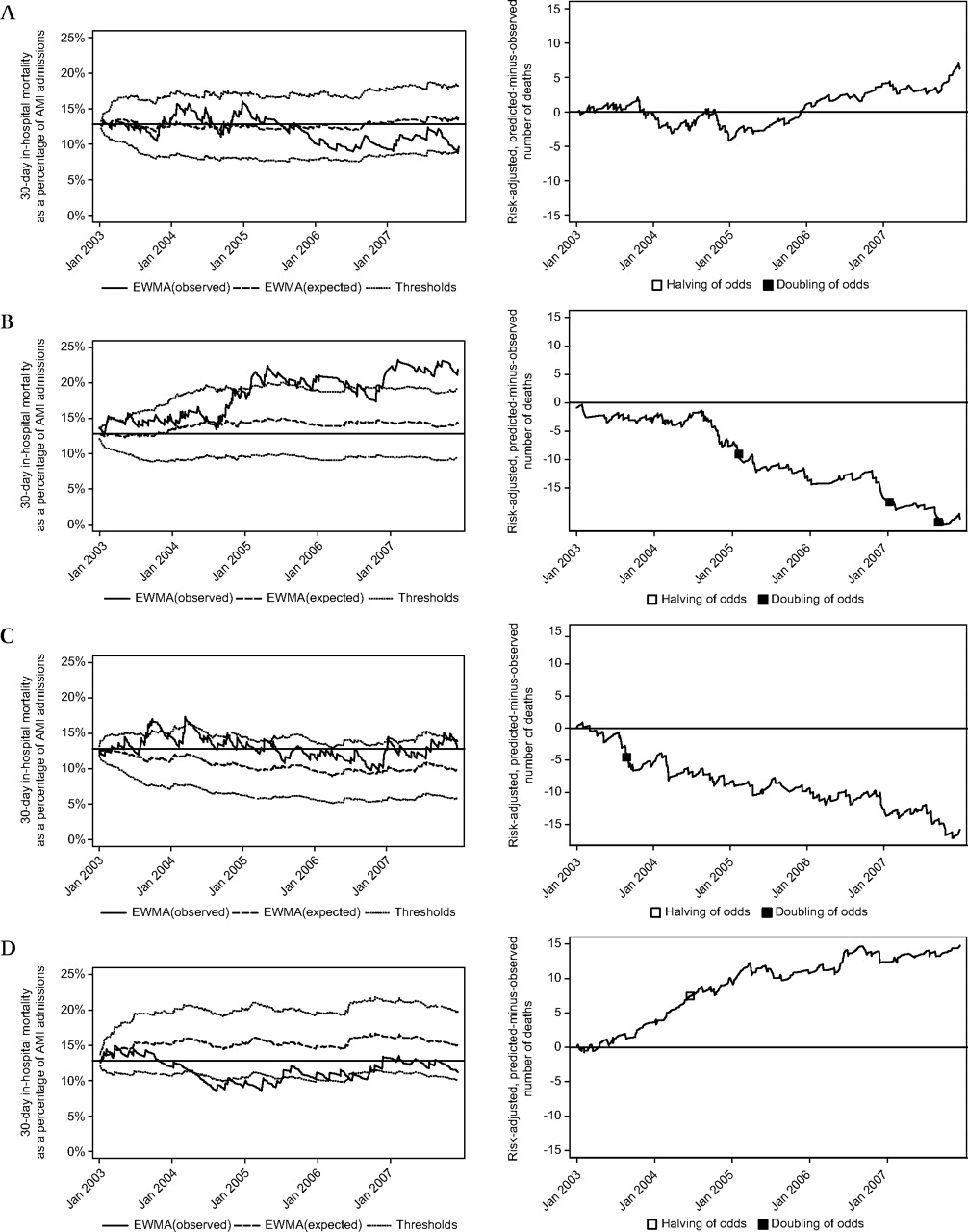
The RA-EWMA and VLAD control charts for four Queensland hospitals are shown in figure 2. These were chosen to illustrate the features of the RA-EWMA.

Risk-adjusted exponentially weighted moving average (RA-EWMA) and variable life adjusted display (VLAD) charts, in-hospital acute myocardial infarction (AMI) mortality, four selected hospitals, Queensland, 2003–2007.
Based on the RA-EWMA chart, Hospital A was in control for almost all of the 5-year period, except for the final month (December 2007). There were no signals on the VLAD chart.
EWMA(predicted) for Hospital B was consistently above the average mortality rate for all Queensland hospitals (12.8%). This suggests that Hospital B saw patients at higher risk of death than the average and the thresholds around EMWA(predicted) are shifted upwards with EWMA(predicted). Notwithstanding case mix, EWMA(observed) indicates that the observed mortality rate was higher than that predicted over the 5-year period.
The continuing downward trend in the sum of the predicted–observed values of the VLAD indicated that the observed mortality was higher than expected. However, the RA-CUSUM component of the VLAD only signalled twice in 23 months that the mortality rate was significantly greater than expected. In Hospital B's circumstances, it appears to be more difficult to interpret the VLAD plot as continuous higher than expected mortality compared with the RA-EWMA, which clearly indicates an ongoing lack of improvement.
Hospital C had predicted values that were lower than the State average. This might be because Hospital C truly treats AMI patients who are less likely to die than the State average. The RA-EWMA chart still signalled, indicating higher than predicted, risk-adjusted mortality. From October 2007 to December 2007, the EWMA(observed) was just above the pooled hospital average of 12.8%; however, because the thresholds are shifted downwards with EWMA(predicted), the observed mortality rate is potentially excessive. The EWMA(predicted) can be thought of as providing a moving centre line that communicates differences in patient case mix.
Hospital D had predicted values that were higher than the State average. The EWMA(observed) indicated that the mortality rate was lower than the State average for much of the 5-year period. The VLAD chart signalled once.
Discussion
EWMA charts are widely used in industry; however, few applications of RA and EWMA in health exist outside of the critical care application.16 17 Benneyan used a RA-EWMA for surgical site infections, standardised for the National Nosocomial Infection Surveillance risk categories.18 Grigg and Spiegelhalther7 described a RA-EWMA scheme to monitor hospital outcomes that differ from ours in several respects. Their chart addresses the “underlying risk for a baseline patient treated”. Their Bayesian perspective uses an underlying baseline risk with a statistical (β) distribution where the distribution's parameters are updated after each observation. The β parameters are derived using constant variance and their RA-EWMA as the estimated mean. The chart plots the RA-EWMA and the bounds of the 95% credible interval (CI) of the distribution of the underlying baseline risk and signals when the CI does not include some trigger value, such as the initial value of the baseline risk.
Our RA-EWMA explicitly compares EWMA(observed) and EWMA(predicted). Thresholds around the EWMA(predicted), which functions as a moving centre line,16 provide a scale by which to assess the importance of discrepancies between the simultaneous estimates of predicted mortality rate and the observed mortality rate.
The RA-EWMA chart has advantages over other risk-adjusted charts more commonly used in health, such as the VLAD. The RA-EWMA is simple to design and the parameter choice is straightforward. The vertical axis units are simply mortality. The VLAD y-axis is the cumulative difference between the predicted and observed deaths, and the RA-CUSUM units have no direct interpretation.
The RA-EWMA displays separate plots of the expected and observed mortality rates that provide a visual display of their differences over time. The explicit display of predicted values allows users at a particular hospital to check the face validity of the risk-adjustment model. For example, if a large academic referral hospital had predicted mortality that was lower than the State average, then users might question the validity of the risk adjustment.19
One of the benefits claimed for control charts is that the accumulation of evidence occurs over time. This is expunged when the charts like the VLAD and RA-CUSUM are reset. To some extent, this is countered by using a rapid response reset (eg, h/2). Resetting is neither necessary nor desirable with the RA-EWMA, which makes it more suitable for health applications where it is extraordinarily rare to suddenly suspend or profoundly alter the process of care, unlike applications in engineering where a machine can be quickly stopped and recalibrated.
A disadvantage of the RA-EWMA is that it can be slow to react to an increase in mortality if the EWMA(observed) is close to the threshold (inertia problem),20 although Lucas and Saccucci point out that this is not a common occurrence.20 21 Nevertheless, we guard against inertia by using the RA-EWMA as part of a co-ordinated safety and data analysis structure that includes analysis of index events (mortality review, sentinel events and near misses) and process reviews.
Routine inpatient data used in this study have limitations of data quality and control of confounding. Consequently, the analyses are best viewed as a starting point for learning about variations in outcomes. They are not hypotheses tests of good or bad quality care but more closely resemble exploratory data analysis.2 Their role is to help understand how a system is performing, diagnose problems and develop theories for possible solutions, using a framework such as the pyramid model of investigation.22 23
Conclusion
This article presents a new type of EWMA chart. It has a moving centre line with thresholds to help scale trends in EWMA(observed). It has an intuitive, direct interpretation. It is not reset and is a more natural chart to use in health where it is rare to stop or abruptly alter a process of care. The disadvantage is that it could be slow to identify an abrupt change in outcomes and, consequently, it should not be used in isolation.
References
Footnotes
Competing interests None.
Provenance and peer review Not commissioned; externally peer reviewed.