Article Text

Statistics from Altmetric.com
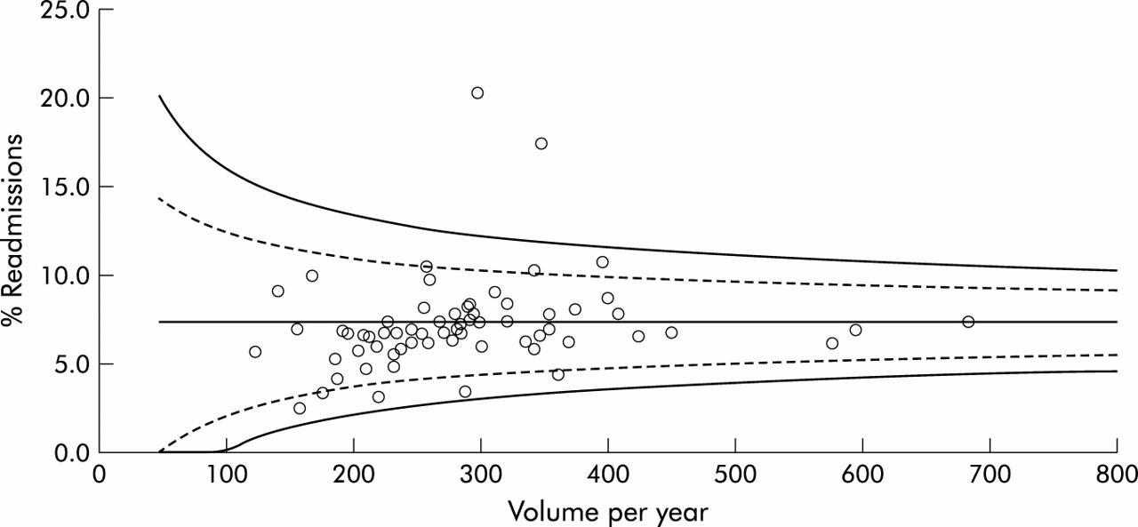
Mohammed and colleagues1,2 have suggested the use of Shewhart control charts as a means of presenting performance indicator results without spurious ranking into “league tables”. They choose to plot the observed number of events against the volume of cases on a square root scale; unfortunately this choice appears unintuitive, obscures the observed event rates, and leads to rather approximate control limits. A small adjustment—plotting the event rates against the volume of cases—leads to the “funnel plot” which is widely used in meta-analysis to check for publication bias3 and has also been used to compare mortality rates in paediatric cardiac surgery.4 An example is shown in fig 1⇓ for emergency re-admission rates following treatment for a stroke in large acute or multi-service hospitals in England and Wales in 2000–1; exact 95% and 99.9% binomial control limits (essentially corresponding to 2 and 3 standard deviations) around the overall event rate of 7.4% are superimposed to indicate possible thresholds for “alert” and “alarm”.5 Two centres stand out as having clearly divergent performance while the remainder essentially display expected variability. There is some suggestion that smaller centres have lower event rates but, after removing the divergent centres, a logistic regression shows a non-significant relationship.
Funnel plots discourage inappropriate ranking while providing a strong visual indication of “divergent” performance or “special cause” variation. Advantages over the specific suggestion of Mohammed and colleagues include the display of the observed event rates, an informal check of the relationship between event rate and volume of cases, an emphasis on the increased variability expected from smaller centres, intuitive choice of axes and hence easy plotting, and exact binomial control limits obtainable from the most popular spreadsheet package. I suggest that funnel plots could provide a useful adjunct to any performance monitoring system.

“Funnel plot” of emergency re-admission rates following treatment for a stroke in large acute or multi-service hospitals in England and Wales in 2000–1.