Article Text

Statistics from Altmetric.com
- diagnostic errors
- continuous quality improvement
- performance measures
- quality measurement
- significant event analysis, critical incident review
In their 2015 report, Improving Diagnosis in Health Care, the National Academy of Medicine asserted that most individuals ‘will experience at least one diagnostic error in their lifetime, sometimes with devastating consequences’1 and ‘improving the diagnostic process is not only possible, but it also represents a moral, professional, and public health imperative.’1 A key barrier to eliminating diagnostic errors is the lack of operational measures to track diagnostic performance.2 3
Novel approaches using ‘big data’ to identify statistically meaningful patterns offer unique opportunities to operationalise measurement of diagnostic errors and misdiagnosis-related harms.4 In a study of ~190 000 US inpatient stroke admissions, the authors found missed opportunities to diagnose stroke early were often linked to clinical presentations with dizziness or vertigo.5 A graphical temporal profile analysis of treat-and-release emergency department (ED) visits showed an exponential increase in visit frequency in the days before stroke admission, establishing these as likely misdiagnoses.5
We operationalised this approach by constructing a diagnostic performance dashboard to monitor diagnostic quality and safety. Kaiser Permanente-Mid Atlantic Permanente Medical Group (KP) and the Johns Hopkins University School of Medicine (JHM) partnered to build a learning ecosystem using visual analytics tools. Visual analytics combines expert knowledge with machine computational power for smart data exploration.6 Visual representations allow users to see the big picture and visually explore relevant data. Interactive data discovery supports ‘slice-and-dice’ operations with data drill-through capabilities, enabling exploratory data mining, hypothesis testing and decision making.
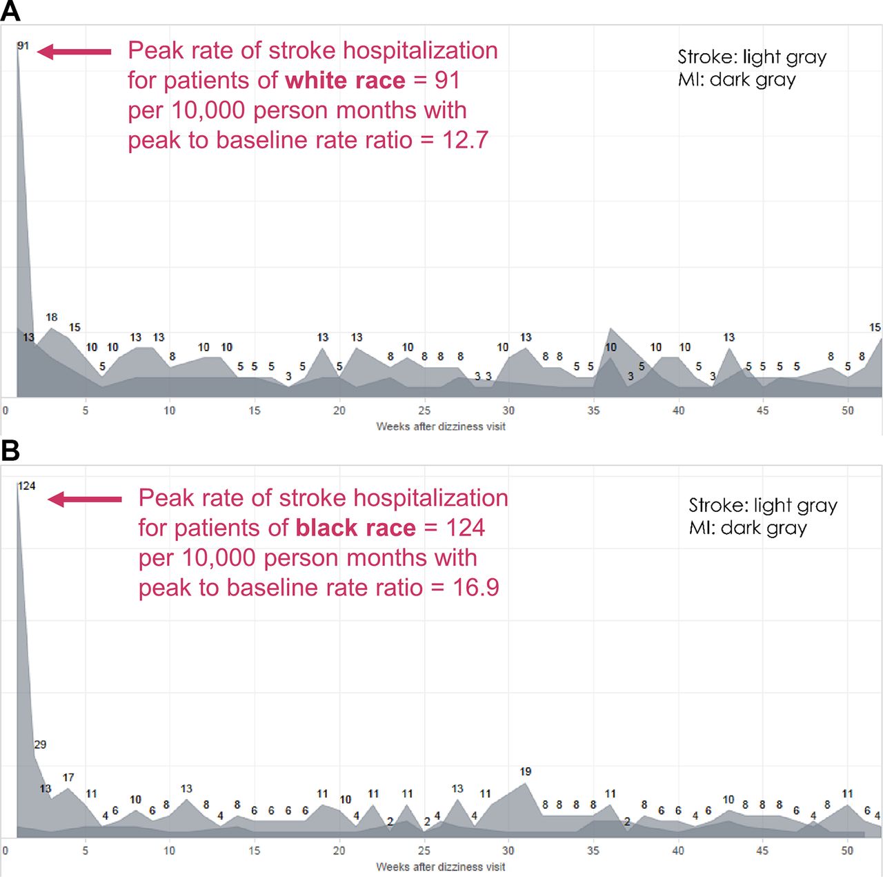
Leveraging the exploratory data analytic technique known as ‘SPADE’,4 we used 5 years of KP patient-level electronic health record and hospital claims data to construct an interactive dashboard to quantify the apparent rate of initially undiagnosed cerebrovascular accidents (‘missed strokes’) among patients with dizziness or vertigo clinical presentations. We established a retrospective cohort of patients discharged from ambulatory care settings (including non-KP hospital EDs) with an inner ear or non-specific dizziness diagnosis (‘benign dizziness’)4 and followed them forward in time to identify stroke hospitalisations. We plotted these graphically as a temporal profile curve and built a data exploration interface (figure 1) with real-time visual analytics tools that allow an administrative user (ie, without programming expertise) to (1) explore the data, (2) perform rapid hypothesis testing and (3) gather quick insights into data patterns and trends. The demonstration video (video 1) illustrates a real-time data exploration process by race. The short-term rate of return for missed stroke is higher for black patients than for white patients, with a peak-to-baseline ratio (incidence rate ratio) 33% higher, suggesting a greater odds of missed stroke (figure 2A and B). It is important to note that these patterns, including the health disparity, are nearly identical to those that have been shown in numerous prior studies from around the USA and the world,5 7 indicating that this is not a problem unique to KP or the EDs at non-KP hospitals to which KP providers refer. It remains unknown whether potential missed opportunities were preventable, but novel solutions are being developed and are on the horizon.8

Graphical user interface for a prototype diagnostic performance dashboard. The main graphical display shows rate-of-hospitalisation curves for stroke (the target disorder, shown in light grey) and myocardial infarction (the comparison condition, shown in dark grey) after a treat-and-release ambulatory visit ending in a ‘benign dizziness’ diagnosis. The high initial rate of stroke hospitalisation (peak incidence rate in the first few weeks) relative to the subsequently stable trough after the first month (baseline incidence rate) suggests the early hospitalisations were missed cerebrovascular events. The peak-to-baseline ratio (incidence rate ratio) estimates the increased odds of missed stroke relative to baseline long-term stroke risk for the patient population shown. ED, emergency department.

Exploratory analysis of racial disparities in missed stroke. (A) Rate-of-hospitalisation curves (for target disorder stroke; for comparison condition myocardial infarction (MI)) for patients of white race. (B) Rate-of- hospitalisation curves (for target disorder stroke; for comparison condition MI) for patients of black race. The peak incidence rate is 36% higher for black patients than white patients. Although the baseline incidence rate is slightly higher for black patients, the peak-to-baseline ratio (incidence rate ratio) is still 33% higher, suggesting that racial differences in stroke diagnosis are not attributable to biological differences or differential response to treatment.
To our knowledge, this is the first ever prototype of an interactive diagnostic performance dashboard using big data to visualise diagnostic errors and misdiagnosis-related harms. Through this effort, KP and JHM are working to create processes to prevent further events like those described here. Our intent is for this approach to be used across a broad range of common symptoms and diseases to facilitate operational management of diagnostic errors by targeting specific problems, providers or patients at high risk. We believe that monitoring diagnostic performance while implementing solutions will be critical for learning healthcare systems to tackle this major public health problem.
Voice-over for Video 1
This video demonstrates real-time use of an interactive diagnostic performance dashboard that employs the SPADE method of analysing symptom–disease pairs to measure diagnostic errors. In this specific use case, readily available electronic health record and hospital claims data are being used to track and monitor stroke hospitalisations after benign dizziness discharges from outpatient care. The primary data visualisation shows the rate of stroke returns per 10 000 patient- months among those initially diagnosed as non-specific dizziness or an inner ear vestibular disorder. Graphically, it is clear that the short-term risk of stroke hospitalisation in the first week or two is markedly higher than the long-term base rate evident in subsequent weeks. This pattern suggests these patients had stroke initially but required subsequent hospitalisation to reach the final diagnosis. This main graphic is surrounded by relevant quantitative information on patient demographics, initial visit details, return visit details and mortality.
This interactive dashboard can be used to conduct exploratory data analysis to identify important patterns. For example, we can compare the rate of likely missed strokes in patients who are black versus those who are white. First, note the overall appearance of the rate-of-return curve in aggregate. We now select just patients of white race, which demonstrates a peak rate of return-to-baseline ratio of about 12.7. We then switch to a view of patients of black race, which shows that the short-term rate of return for missed stroke is higher, with a peak-to-baseline ratio of about 16.9. This result showing a 33% greater likelihood of missed stroke among black patients is consistent with findings from prior research studies using large-scale data. Identifying this healthcare disparity through data visualisation demonstrates the potential power of a diagnostic performance dashboard to operationally monitor diagnostic quality and safety within an organisation, which has heretofore not been possible.
Video demonstrating the use of prototype diagnostic performance dashboard for exploratory analysis of racial disparities in the rate of stroke hospitalisation after a missed cerebrovascular event (Kaiser Permanente-Mid Atlantic Permanente Medical Group patients, 2010–2015).
Footnotes
Contributors All authors have made substantial contributions to the conception or design of the work, or the acquisition, analysis or interpretation of data; drafting the work or revising it critically for important intellectual content and have approved the final work.
Funding This study was funded by Johns Hopkins - Kaiser Permanente Collaborative Pilot Program.
Competing interests None declared.
Patient consent Not required.
Ethics approval Mid-Atlantic Permanente Research Institute, Johns Hopkins University School of Medicine.
Provenance and peer review Not commissioned; internally peer reviewed.